CSS Art - How to Build a Pure CSS Analog Clock with Gradients & Variables - Part 2
The clock is ticking—finish this iconic, timeless design using only CSS. Experiment with CSS properties and functions, let your creativity shine.

Introduction
Ready to put the finishing touches on your analog alarm clock? In this step-by-step article, you’ll explore a variety of CSS properties and functions to complete this iconic and timeless design.
- In Part 1, you built the foundation of the clock—the body, face, and number components.
- In Part 2, this article, you’ll learn how to create the remaining details that bring the clock to life: the bells, hammer, feet, hour and minute hands, and the dial.
CSS properties and functions you’ll learn in this article:
box-shadow::beforeand::afterpseudo-elementborder-top-left-radiusborder-top-right-radiusborder-bottom-left-radiusborder-bottom-right-radiuslinear-gradient()radial-gradient()
Preview

Alarm clock components you’ll be making in this article:
- Bells
- Bell Hammer
- Clock Feet
- Hour and Minute Hands
- Dial
Before diving into the next sections, we recommend reviewing Part 1 of this two-part series. It covers the essential foundation—creating the clock body, face, numbers, and color palette—so you’ll be fully prepared for what’s ahead.
Prerequisites
Essential CSS and HTML knowledge will help you understand the concepts and techniques introduced in this article. Jump over to this article if you require an HTML and CSS primer.
We assume you have configured tools to modify CSS. If not, this article will guide you through the setup process.
HTML Structure
<div class="container">
  <div class="bell-tip"></div>
  <div class="left-bell"></div>
  <div class="right-bell"></div>
  <div class="bell-hammer"></div>
  <div class="clock-feet"></div>
  <div class="clock-body"></div>
  <div class="clock-face">
    <div class="number twelve">12</div>
    <div class="number three">3</div>
    <div class="number six">6</div>
    <div class="number nine">9</div>
  </div>
  <div class="hour-hand"></div>
  <div class="minute-hand"></div>
  <div class="dial"></div>
</div>
container is the outermost enclosure. It enables the content to be centered and draws a light gray border. The rest of the <div>s represent each image component.
Keep the HTML structure as is for the image to display correctly.
Body and Container <div> CSS
CSS code for the body and container <div>.
/* Body and Container Settings */
/* Center shapes */
body {
  margin: 0;
  padding: 0;
  height: 100vh;
  display: flex;
  justify-content: center;
  align-items: center;
  flex-wrap: wrap;
}

/* Set background and border color */
.container {
  width: 500px;
  height: 500px;
  border: 5px solid lightgray;
  background: transparent;
  position: relative;
  margin: 5px;
  display: flex;
  justify-content: center;
  align-items: center;
}
Left Bell
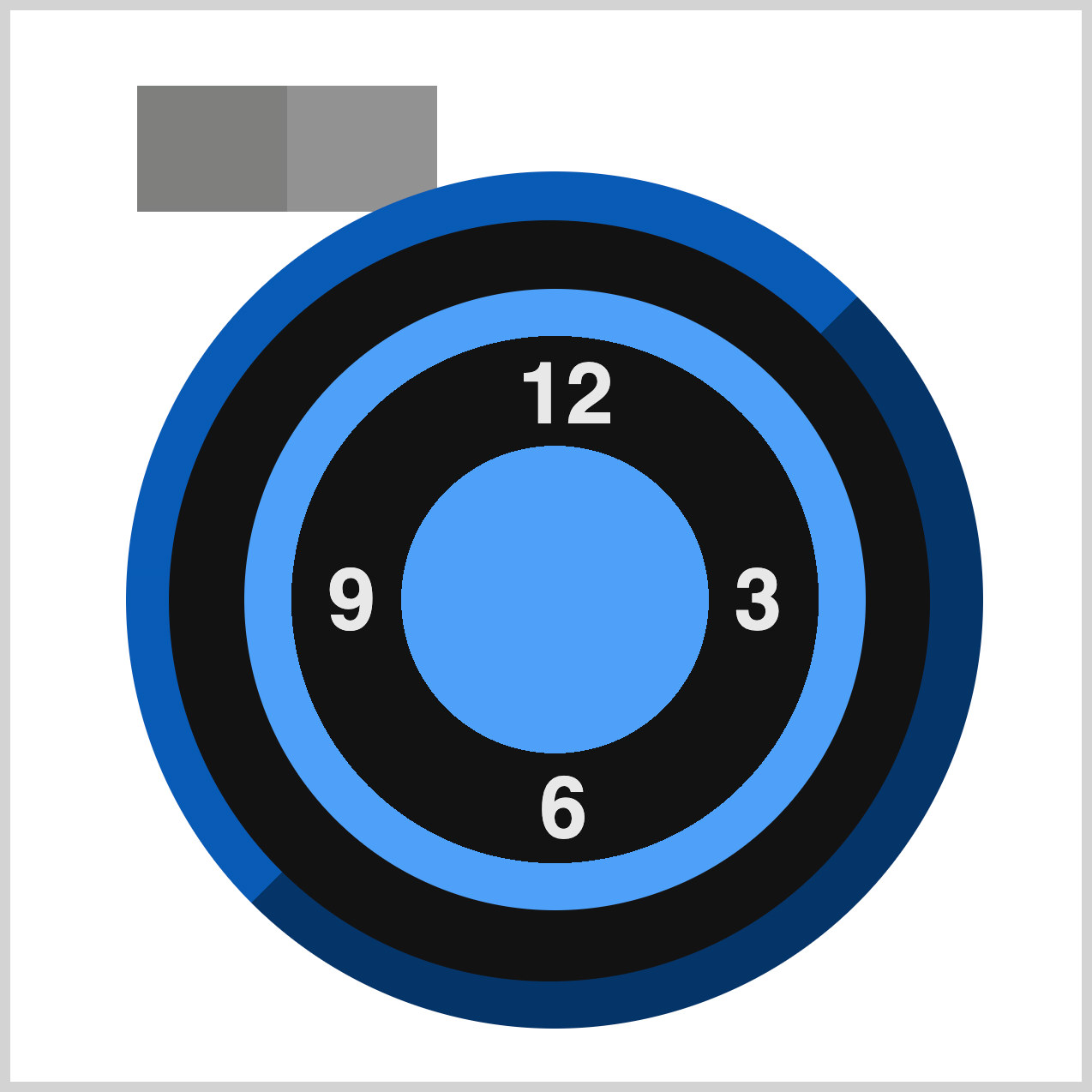
The Left Bell uses the CSS linear-gradient() function to create a sleek two-tone color effect. To give it a smooth, curved bell-like appearance, you’ll apply the border-radius property. This property rounds the corners of the element, transforming a simple rectangle into a more organic shape.
/* Left Bell */
.left-bell {
  width: 140px;
  height: 59px;
  top: 35px;
  left: 59px;
  background: linear-gradient(
    90deg,
    var(--dark-gray) 0 50%,
    var(--gray) 50% 100%
  );
}
The Left Bell element is designed with precise dimensions and positioning: it’s 140px wide, 59px high, and placed 35px from the top and 59px from the left edge of its container.
To create its two-tone look, we use the CSS linear-gradient() function:
90deg: This angle makes the gradient run horizontally, from left to right.var(--dark-gray) 0% 50%: The first color, dark gray, fills the left half of the shape.var(--gray) 50% 100%: The second color, gray, fills the right half.
This combination gives the bell a clean, split-color effect. Next, you’ll add the border-radius property to round the edges and achieve that smooth, bell-like curve.
.left-bell {
  border-top-left-radius: 55px;
}
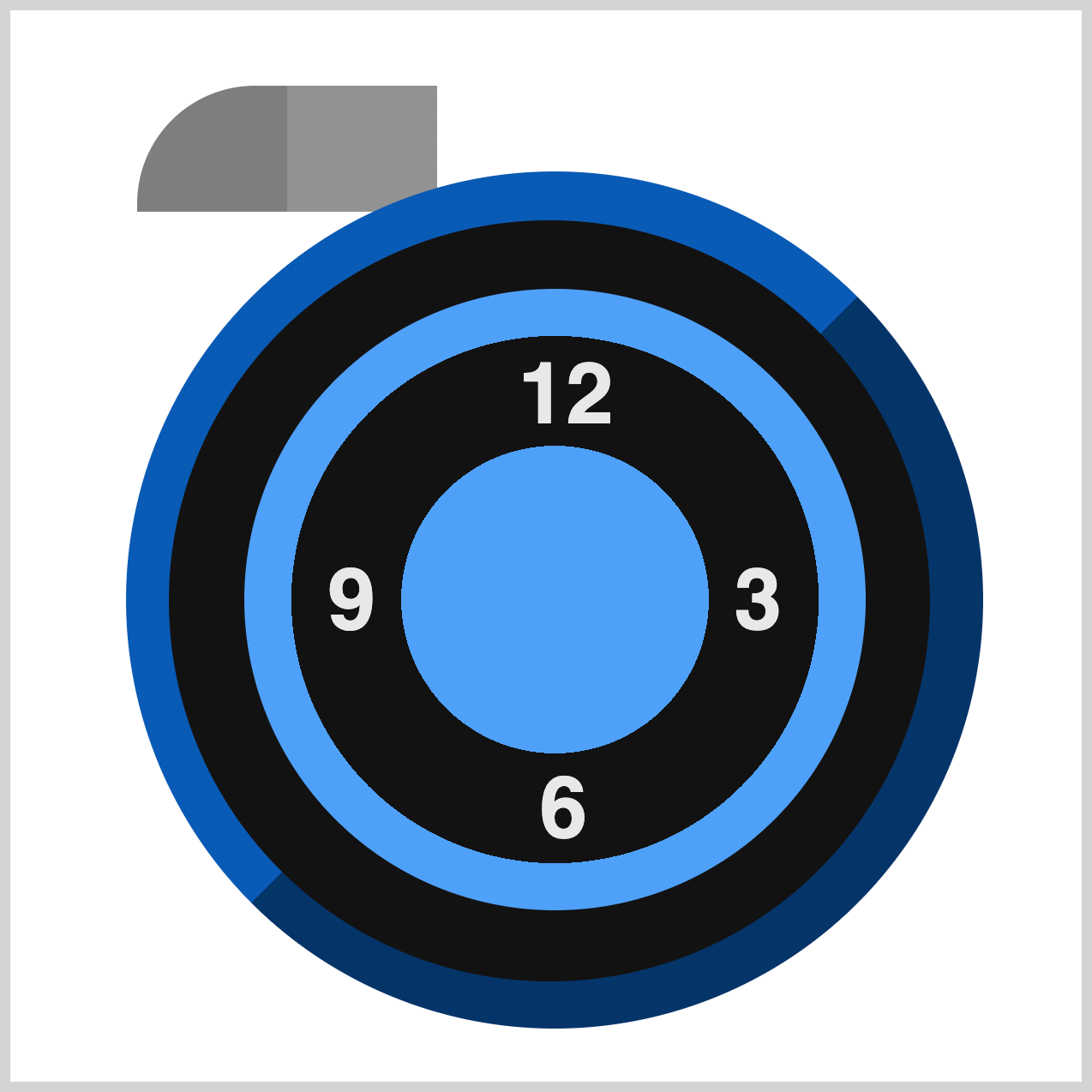
To create the curved edge of the Left Bell, you’ll use the CSS border-radius property.
In this case, border-top-left-radius: 55px; rounds the top-left corner, giving the bell a softer, more organic shape. This is especially useful when you want to combine straight edges with smooth curves for a polished design.

.left-bell {
  border-top-right-radius: 55px;
}
To round the opposite corner of the Left Bell, you’ll use border-top-right-radius: 55px;. This creates a smooth curve on the top-right edge, complementing the top-left curve you added earlier. Together, these rounded corners help transform the element from a plain rectangle into a bell-like shape.
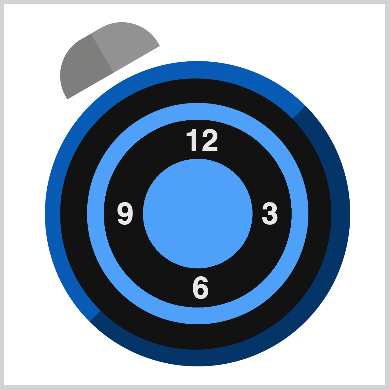
.left-bell {
  rotate: -30deg;
}
To tilt the Left Bell for a more dynamic look, you can use the CSS rotate property. Setting rotate: -30deg; rotates the element 30 degrees counterclockwise, giving it a stylish angled position.
Let’s work on the Bell Crown next.
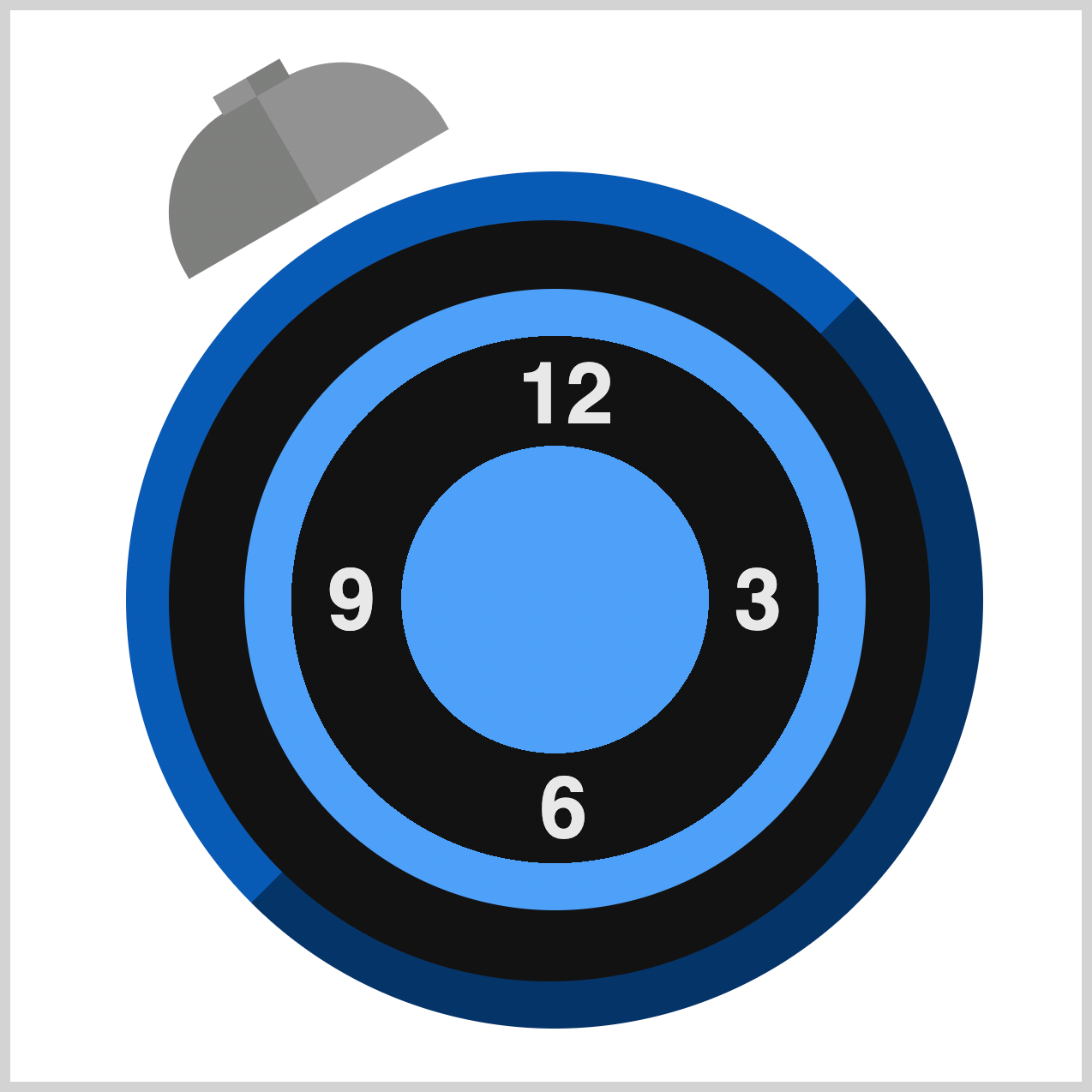
.left-bell::before {
  content: "";
  width: 36px;
  height: 10px;
  top: -9px;
  left: 52px;
  background: linear-gradient(
    90deg,
    var(--gray) 0 50%,
    var(--dark-gray) 50% 100%
  );
}
The Bell Crown starts as a simple rectangle, just like the main bell. It measures 36px wide and 10px high, and it’s positioned slightly above the bell—-9px from the top and 52px from the left edge.
To give it a contrasting two-tone look, we use the CSS linear-gradient() function:
90degmakes the gradient run horizontally, from left to right.var(--gray) 0% 50%fills the left half with gray.var(--dark-gray) 50% 100%fills the right half with dark gray.
This reversed gradient compared to the main bell creates a subtle visual contrast, making the crown stand out as a decorative detail.
Up next is the Bell Stem.
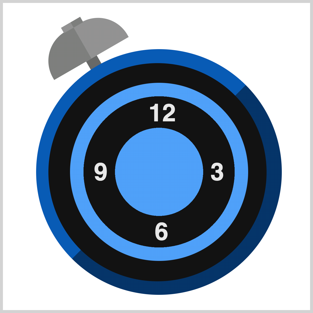
.left-bell::after {
  content: "";
  width: 20px;
  height: 20px;
  top: 59px;
  left: 60px;
  background: var(--metal-gray);
}
The Bell Stem is a small square element that connects the bell to the clock body. It’s:
- Size:
20pxby20px(a perfect square). - Position: Placed
59pxfrom the top and60pxfrom the left of its container. - Color: Styled with a metal gray shade using
background: var(--metal-gray);.
In the next section, we’ll work on the Right Bell.
Right Bell
The Right Bell is essentially a mirrored version of the Left Bell, so we won’t go into detailed explanations here.
For your convenience, the complete CSS code—right bell and its decorative elements—is provided below for reference.

/* Right Bell */
.right-bell {
  width: 140px;
  height: 59px;
  top: 33px;
  left: 311px;
  background: linear-gradient(
    90deg,
    var(--gray) 0 50%,
    var(--metal-gray) 50% 100%
  );
  border-top-left-radius: 55px;
  border-top-right-radius: 55px;
  rotate: 30deg;
}
.right-bell::before {
  content: "";
  width: 36px;
  height: 10px;
  top: -9px;
  left: 52px;
  background: linear-gradient(
    90deg,
    var(--metal-gray) 0 50%,
    var(--gray) 50% 100%
  );
}
.right-bell::after {
  content: "";
  width: 20px;
  height: 20px;
  top: 59px;
  left: 61px;
  background: var(--metal-gray);
}
Now that we’ve completed the bell bodies, crowns, and stems, it’s time to add the finishing touch—the Bell Tips. These small details will give your bells a more realistic and elegant look.
Bell Tips
The Bell Tips are small circular details that sit on top of the Bell Crowns. You’ll be using the CSS background and box-shadow properties to make them.

/* Bell Tip */
.bell-tip {
  width: 18px;
  height: 18px;
  top: 21px;
  left: 100px;
  background: var(--black);
}
First, let’s make the left bell tip shape. We’ll start with a simple square shape:
- Size:
18pxby18px - Position:
top: 21px;andleft: 100px;(relative to the bell container) - Color:
var(--black)for a bold, contrasting look

.bell-tip {
  box-shadow: 291px -1px var(--black);
}
Next, using the box-shadow property, we’ll create the right tip base shape. Set the box-shadow property values to 291px and -1px to position it precisely on top of the right bell crown. Then set the shadow color using var(--black).
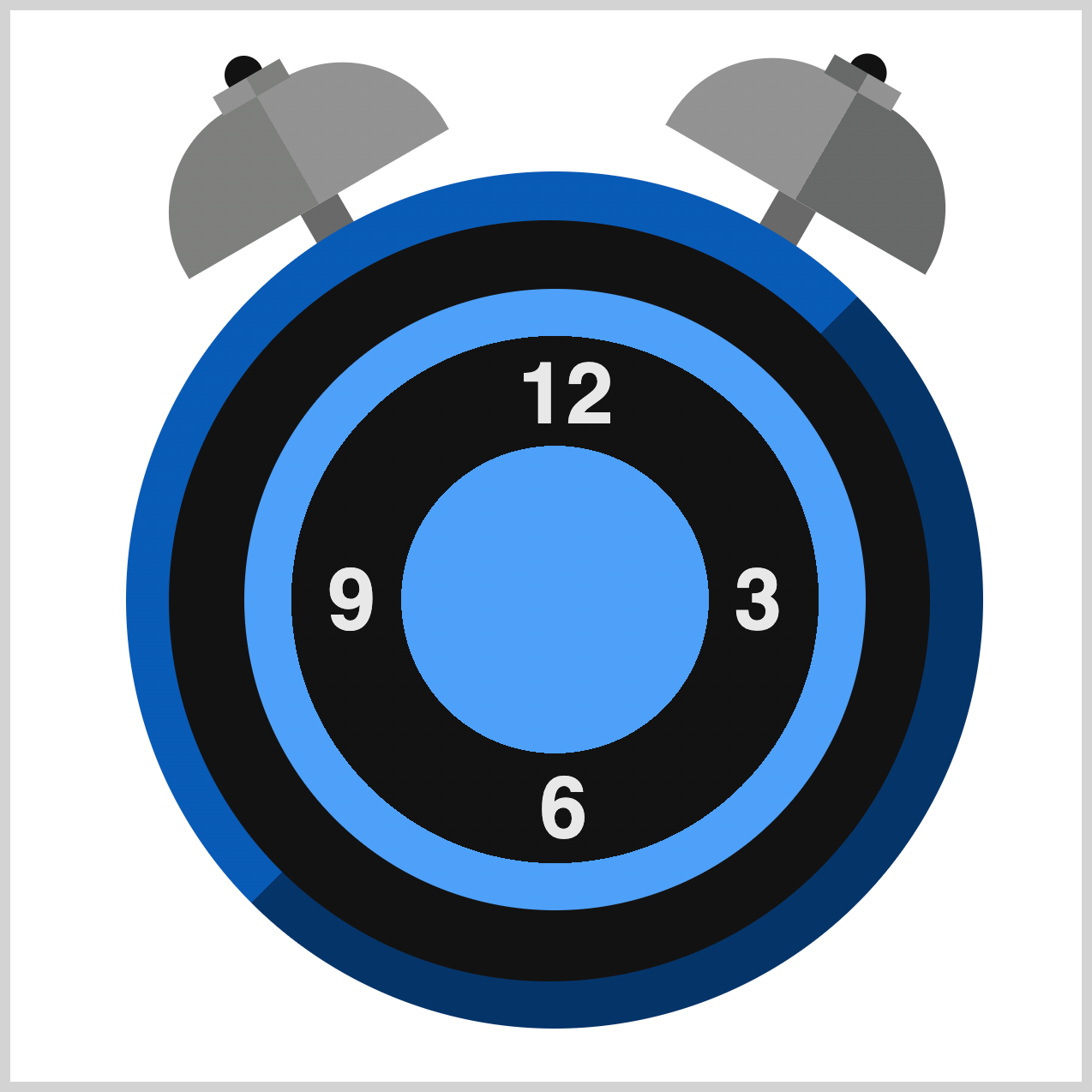
.bell-tip {
  border-radius: 50%;
}
Finally, use border-radius: 50%; to round the square borders to a perfect, smooth circle.
Up next is the Bell Hammer section.
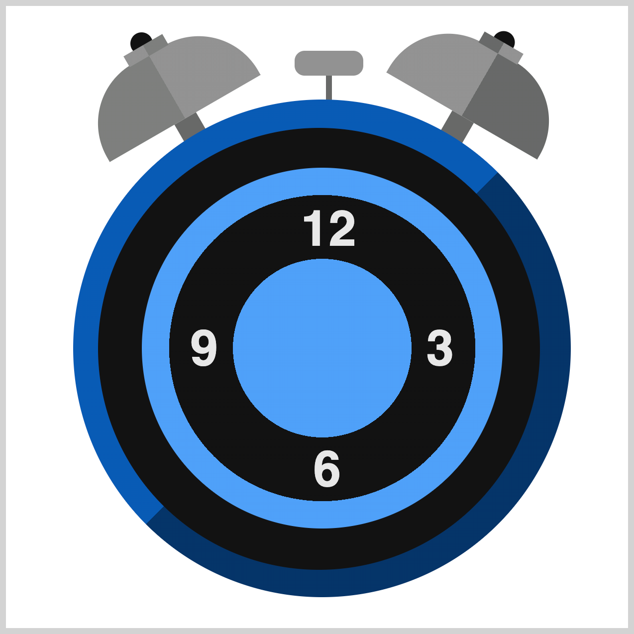
Bell Hammer
The Bell Hammer is the moving part that brings the bells to life. It swings left and right, striking each bell to produce a bright, ringing tone—perfect for waking us up.

/* Bell Hammer */
.bell-hammer {
  width: 55px;
  height: 20px;
  top: 36px;
  left: 232px;
  background: var(--gray);
}
To create the Bell Hammer base shape, set these CSS properties:
width: 55px;andheight: 20px;→ Creates a horizontal rectangle.top: 36px;andleft: 232px;→ Positions the hammer inside its container.background: var(--gray);→ Gives it a neutral gray color.

.bell-hammer {
  border-radius: 8px;
}
Slightly round the square borders using border-radius: 8px;.
.bell-hammer::after {
  content: "";
  width: 5px;
  height: 20px;
  top: 20px;
  left: 25px;
  background: var(--metal-gray);
}
To finish up the Bell Hammer, you’ll create the stem to connect the hammer to the clock body. The stem will be a 5px wide, 20px high rectangle. It’s positioned 20px from the top and 25px from the left. Set the background color using var(--metal-gray);.
In the next section, you’ll be working on the Clock Feet.
Clock Feet
Now that the bells and hammer are complete, it’s time to add the Clock Feet. These small details will give the clock a stable and grounded look.

/* Clock Feet */
.clock-feet {
  width: 48px;
  height: 50px;
  top: 422px;
  left: 98px;
  background: linear-gradient(
    90deg,
    var(--gray) 0 50%,
    var(--metal-gray) 50% 100%
  );
}
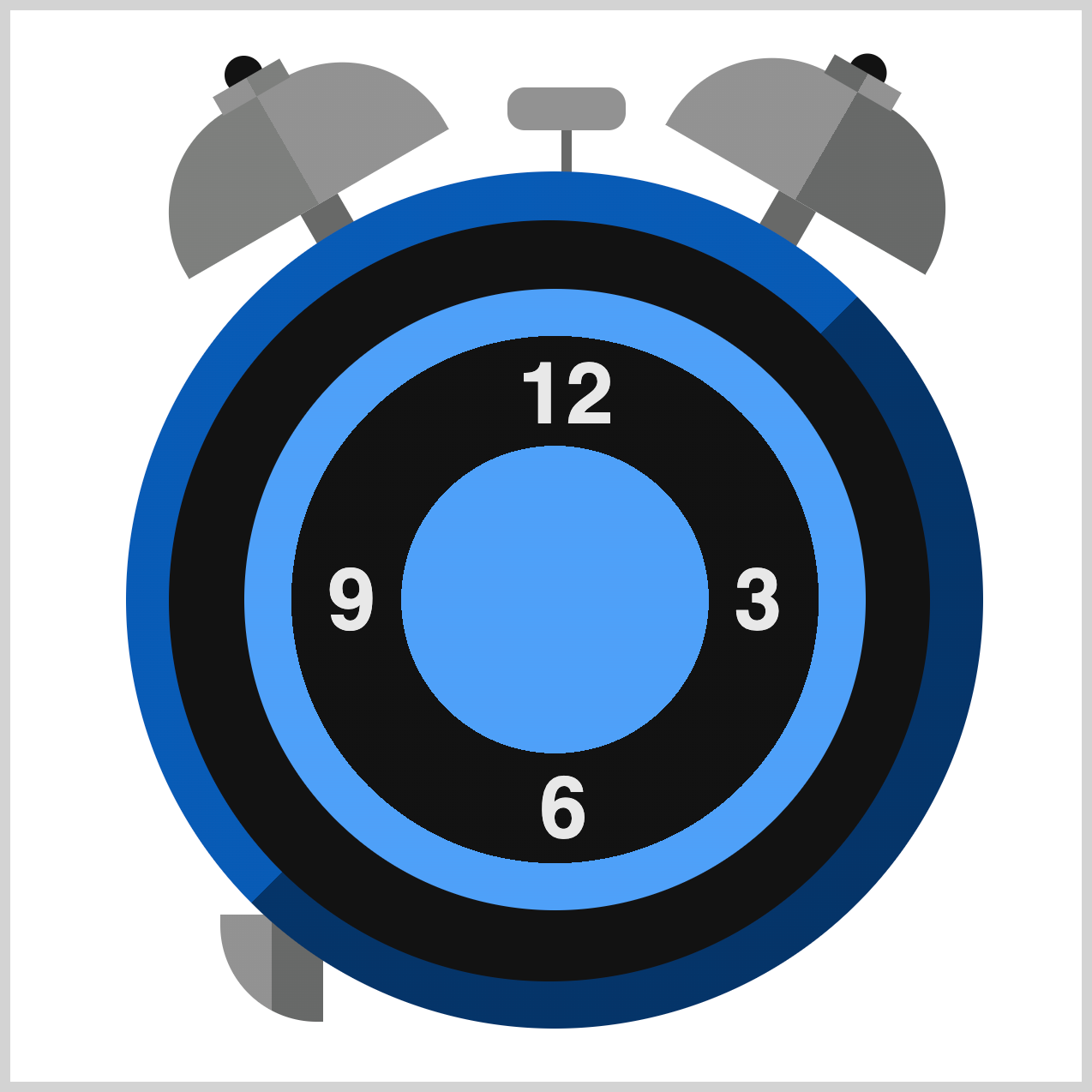
The Clock Feet give the clock a stable base and a polished look. Here’s what the current properties do:
width: 48px;andheight: 50px;→ Creates a tall rectangle for the foot.top: 422px;andleft: 98px;→ Positions the foot near the bottom of the clock.
The linear-gradient() background adds a two-tone metallic effect:
90degmakes the gradient run horizontally.var(--gray) 0 50%fills the left half.var(--metal-gray) 50% 100%fills the right half.
.clock-feet {
  border-bottom-left-radius: 45px;
}
Use border-bottom-left-radius: 45px; to round the bottom left border.

.clock-feet {
  border-bottom-right-radius: 45px;
}
To round the bottom right border, use border-bottom-right-radius: 45px;.
.clock-feet {
  rotate: 40deg;
}
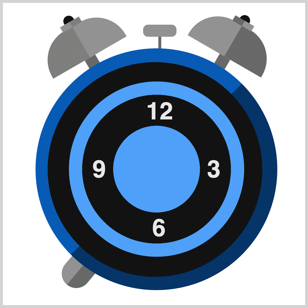
To finish the left clock feet, rotate it by 40deg or forty degrees.
.clock-feet::before {
  content: "";
  width: 48px;
  height: 50px;
  top: -173px;
  left: 206px;
  background: linear-gradient(
    90deg,
    var(--metal-gray) 0 50%,
    var(--gray) 50% 100%
  );
  border-bottom-left-radius: 45px;
  border-bottom-right-radius: 45px;
  rotate: -75deg;
}
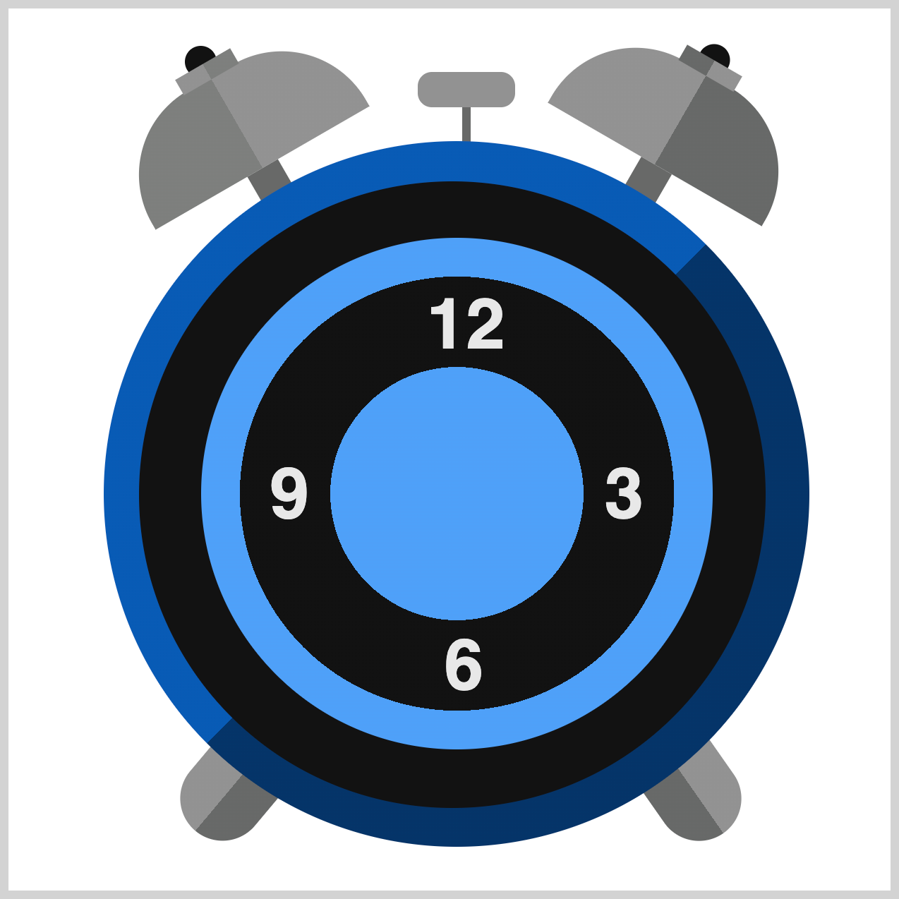
The right foot is a mirrored version of the left foot. For brevity, we won’t go into detailed explanations here.
Up next is the Hour Hand.
Hour Hand
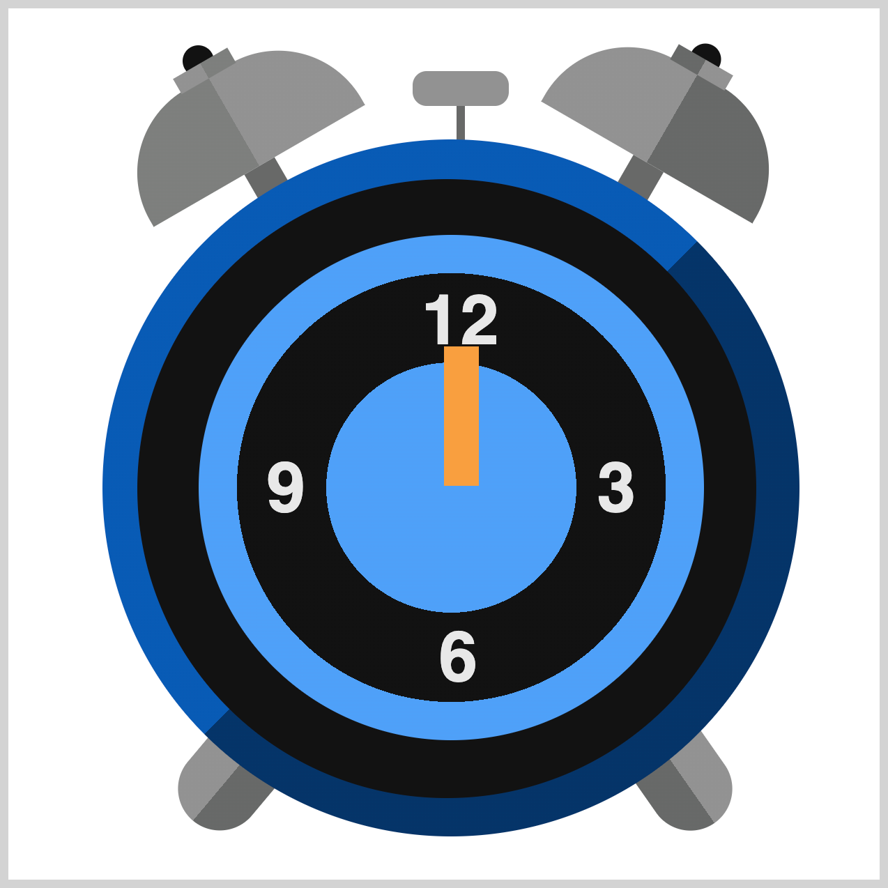
The Hour Hand is a bold orange rectangle with rounded top corners, giving it a sleek, modern look. Positioned at the center of the clock face, it serves as one of the main focal points of the design. Alongside the Minute Hand, it visually anchors the clock and makes time easy to read.
/* Hour Hand */
.hour-hand {
  width: 20px;
  height: 80px;
  top: 194px;
  left: 250px;
  background: var(--orange);
}
The CSS creates the hour hand for the clock face:
width: 20px;andheight: 80px;→ A slim vertical rectangle.top: 194px;andleft: 250px;→ Positions the hand inside the clock face.background: var(--orange);→ Gives it a bright orange color for visibility.

.hour-hand {
  border-top-left-radius: 45px;
}
The border-top-left-radius: 45px; CSS property rounds the top left corner for a smooth, tapered look.

.hour-hand {
  border-top-right-radius: 45px;
}
To round the top right corner, add border-top-right-radius: 45px; CSS property.
.hour-hand {
  transform-origin: bottom;
  rotate: -50deg;
}
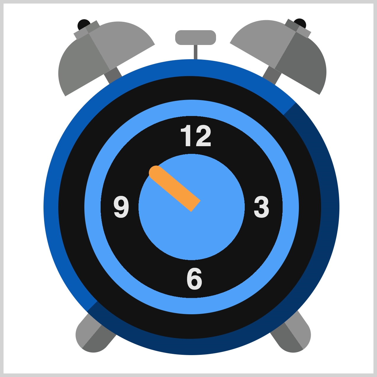
transform-origin: bottom; sets the rotation pivot at the bottom of the hand (so it swings like a real clock hand). rotate: -50deg; rotates the hand counterclockwise by 50° to indicate the hour.
In the next section, we’ll create the Minute Hand to complement the Hour Hand and complete the core of the clock face.
Minute Hand
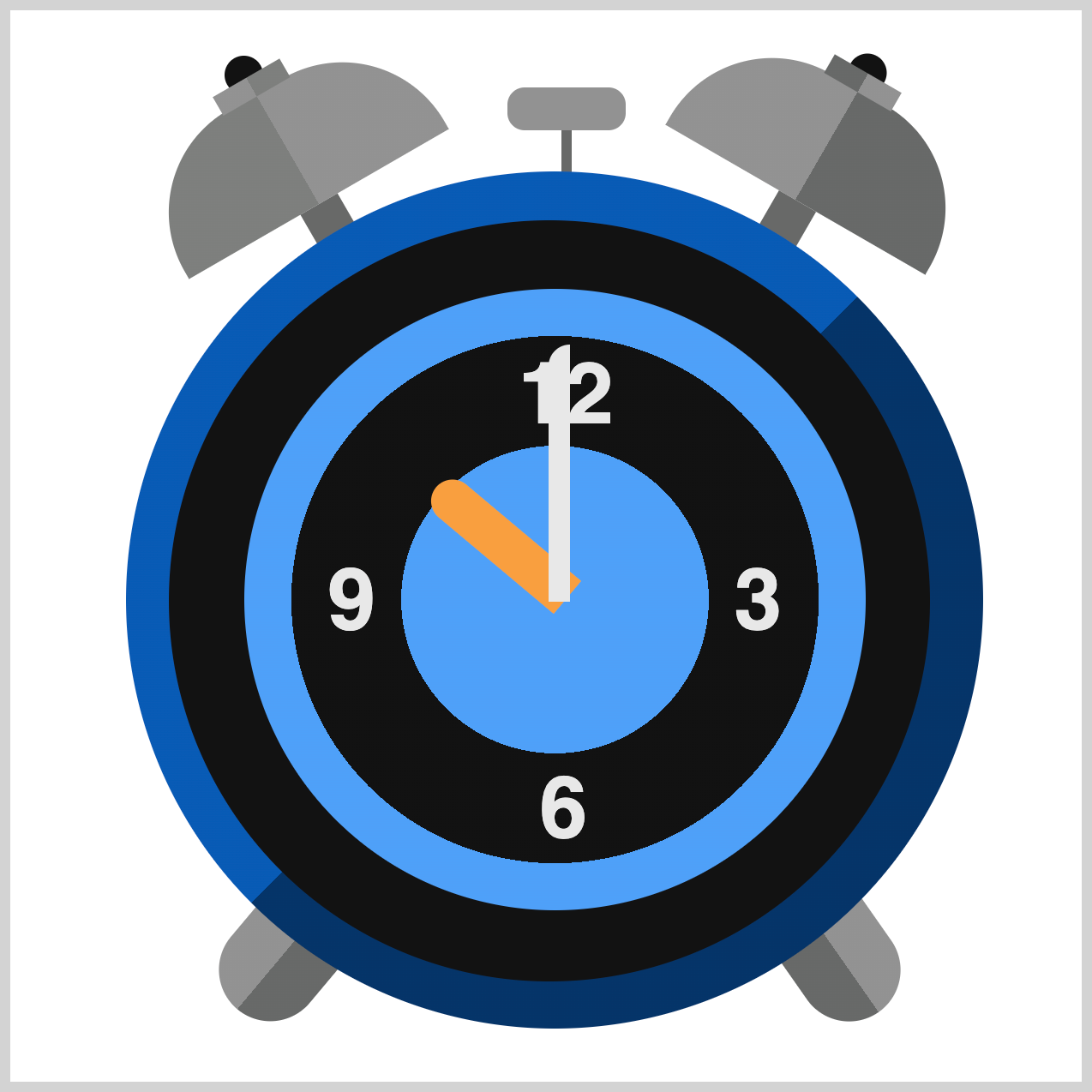
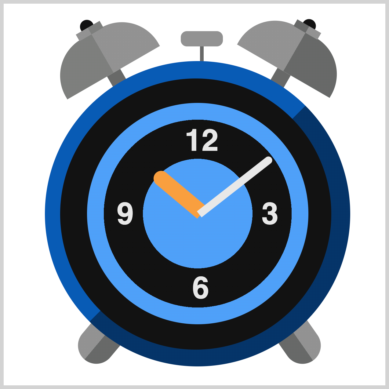
The Minute Hand is built similarly to the Hour Hand, with only minor differences in color, size, positioning, and rotation. Since the construction process is almost identical, we’ll skip the detailed explanation for brevity. You’ll find the complete CSS for both hands in the code block below.

/* Minute Hand */
.minute-hand {
  width: 10px;
  height: 120px;
  top: 156px;
  left: 251px;
  background: var(--white);
}
.minute-hand {
  border-top-left-radius: 45px;
}

.minute-hand {
  border-top-right-radius: 45px;
}
.minute-hand {
  transform-origin: bottom;
  rotate: 52deg;
}
In the final section, let’s make the Dial, completing the Clock Face.
Dial
The Dial completes the Clock Face by connecting the Hour and Minute Hands to the Clock Body.
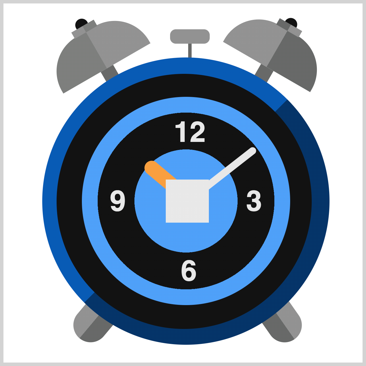
/* Dial */
.dial {
  width: 60px;
  height: 60px;
  top: 245px;
  left: 226px;
  background: radial-gradient(
    circle,
    var(--white) 0% 30%
  );
}
The Dial is the central hub of the clock face where the hands pivot. Its basic shape is a 60px square, positioned 245px from the top and 226px from the left edge of the clock container.
Using the CSS radial-gradient() function, you’ll create a white and light gray gradient.
circlesets the gradient shape to a perfect circle.var(--white) 0% 30%paints a white color between the0%and30%color stop area.
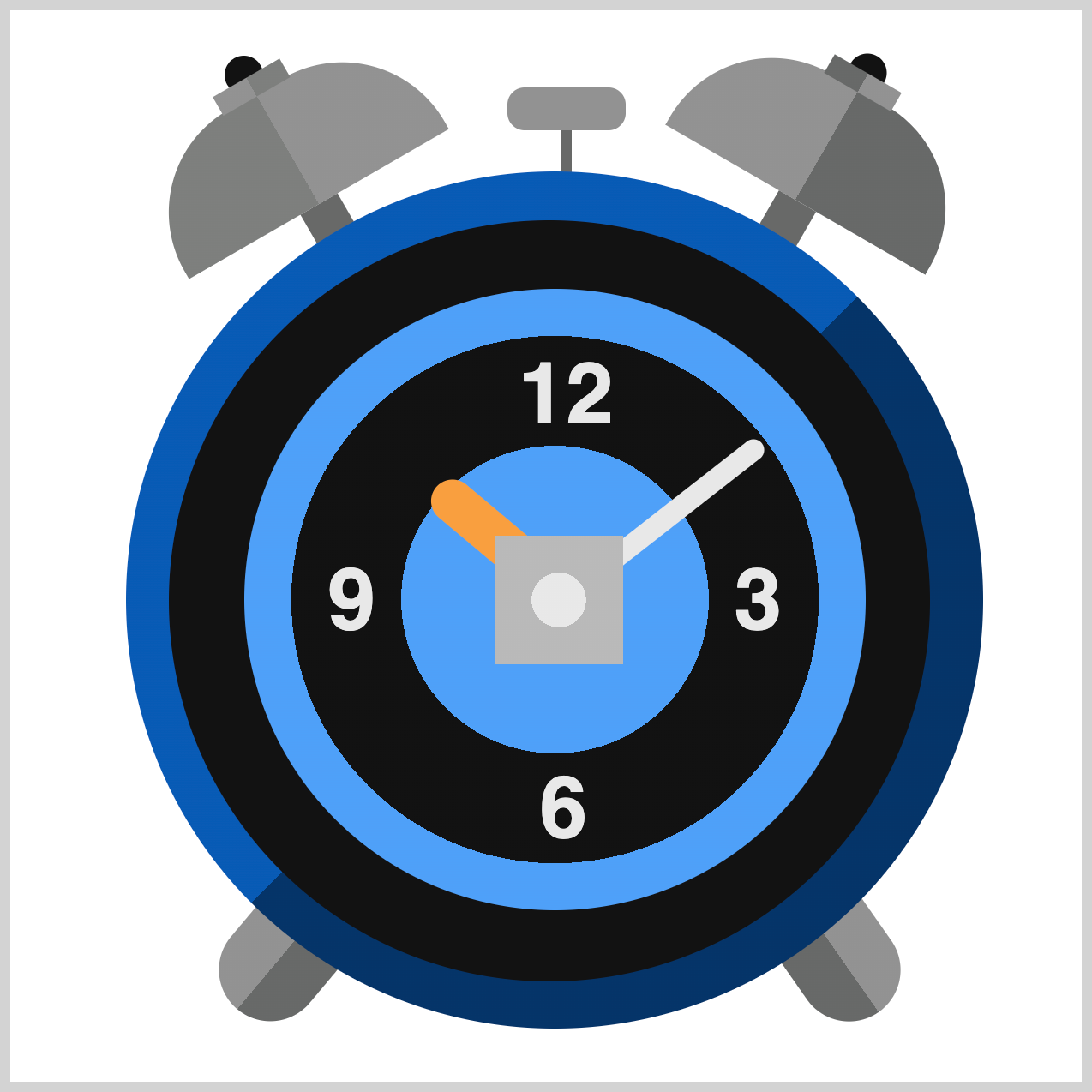
.dial {
  background: radial-gradient(
    circle,
    var(--white) 0% 30%,
    var(--light-gray) 30% 60%
  );
}
var(--light-gray) 30% 60% sets a light gray hue to occupy the 30% to 60% space.

.dial {
  border-radius: 50%;
}
Transform the Dial square to a circle shape with border-radius: 50%;.
You can see and play with the complete code on Pyxofy’s CodePen page.
See the Pen CSS Art - How to Build a Pure CSS Analog Clock with Gradients & Variables by Pyxofy (@pyxofy) on CodePen.
Conclusion
In Part 2 of this two-part article, you learned how to create the remaining components of an analog alarm clock—such as the bells, hammer, feet, hour and minute hands, and the dial—using only CSS.
You learned how to style individual corners of an element using these CSS properties:
border-top-left-radiusborder-top-right-radiusborder-bottom-left-radiusborder-bottom-right-radius
By combining these with other powerful CSS tools—like box-shadow, gradients (linear-gradient() and radial-gradient()), and creative use of ::before and ::after pseudo-elements—you transformed simple shapes into visually striking clock components. This is how small details can make a big impact on design!
What kind of CSS art will you create next with your new skills? Share your masterpiece with us on LinkedIn, Threads, Bluesky, Mastodon, X (Twitter) @pyxofy, or Facebook.
We hope you liked this article. Kindly share it with your network. We appreciate it.
Related Articles
