CSS Art - How to Build a Pure CSS Analog Clock with Gradients & Variables - Part 1
Level up your front-end skills by building an analog clock from scratch. Master CSS Variables (Custom Properties) and Gradients in this step-by-step guide.

Introduction
Analog alarm clocks are a fascinating piece of engineering—they kept time and woke us up reliably for decades.
In this two-part article, you’ll learn how to recreate that classic design using only CSS. Part 1 focuses on building the clock body, face, and numbers, while Part 2 will guide you through adding the remaining components, such as the alarm bells and their hammer, to complete the image design.
CSS properties and functions explored in this article:
- CSS Custom Properties (Variables)
linear-gradient()radial-gradient()border-radius::afterpseudo-elementtop,left, andright
Preview
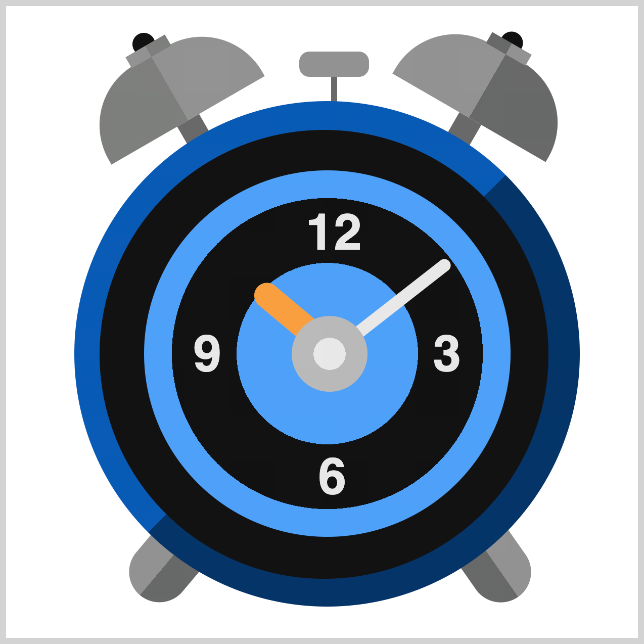
Alarm clock components you’ll be making in this article:
- Body
- Clock Face
- Numbers
Prerequisites
Essential CSS and HTML knowledge will help you understand the concepts and techniques introduced in this article. Jump over to this article if you require an HTML and CSS primer.
We assume you have configured tools to modify CSS. If not, this article will guide you through the setup process.
HTML Structure
<div class="container">
  <div class="bell-tip"></div>
  <div class="left-bell"></div>
  <div class="right-bell"></div>
  <div class="bell-hammer"></div>
  <div class="clock-feet"></div>
  <div class="clock-body"></div>
  <div class="clock-face">
    <div class="number twelve">12</div>
    <div class="number three">3</div>
    <div class="number six">6</div>
    <div class="number nine">9</div>
  </div>
  <div class="hour-hand"></div>
  <div class="minute-hand"></div>
  <div class="dial"></div>
</div>
container is the outermost enclosure. It enables the content to be centered and draws a light gray border. The rest of the <div>s represent each image component.
Keep the HTML structure as is for the image to display correctly.
Body and Container <div> CSS
CSS code for the body and container <div>.
/* Body and Container Settings */
/* Center shapes */
body {
  margin: 0;
  padding: 0;
  height: 100vh;
  display: flex;
  justify-content: center;
  align-items: center;
  flex-wrap: wrap;
}

/* Set background and border color */
.container {
  width: 500px;
  height: 500px;
  border: 5px solid lightgray;
  background: transparent;
  position: relative;
  margin: 5px;
  display: flex;
  justify-content: center;
  align-items: center;
}
Organizing Shared CSS Styles
To keep your code clean and maintainable, we’ll consolidate common CSS properties. This helps reduce repetition and makes it easier to manage your styles.
/* Common Properties */
.bell-hammer,
.bell-hammer::after,
.bell-tip,
.left-bell,
.left-bell::before,
.left-bell::after,
.right-bell,
.right-bell::before,
.right-bell::after,
.clock-body,
.clock-face,
.clock-body::after,
.clock-feet,
.clock-feet::before,
.number,
.hour-hand,
.minute-hand,
.dial {
  position: absolute;
}
position: absolute;lets you place each image element precisely within the container.
Custom Color Palette
Just like with the above common properties, defining a custom color palette using CSS Custom Properties (Variables) streamlines your workflow. This makes it easy to update colors without hunting through your code for every instance.
/* Color Palette */
:root {
  --white: #e8e8e8;
  --light-gray: #b9b9b9;
  --gray: #929292;
  --dark-gray: #7d7f7d;
  --metal-gray: #676968;
  --black: #121212;
  --orange: #f99f3e;
  --light-blue: #4fa0f8;
  --blue: #085bb5;
  --dark-blue: #043468;
}
The color names used in the palette are intuitive and can be easily customized to suit your design preferences. In this example, the palette features a blue and gray theme, but you're not limited to these colors. By simply updating the HEX codes, you can effortlessly switch to any color scheme that matches your project's style or branding.
Want to learn how to use CSS Custom Properties (Variables)?
Check out this helpful article that walks you through defining variables and applying them with the var() function.
 Pyxofy
Let’s start working on the clock body in the next section.
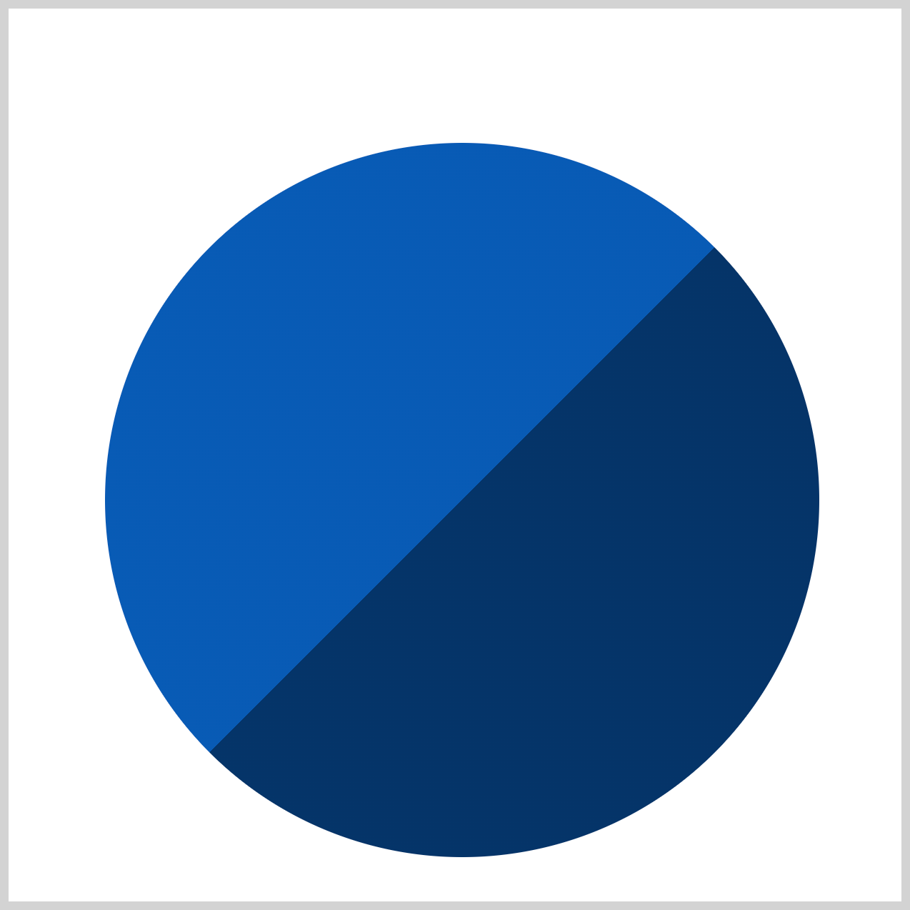
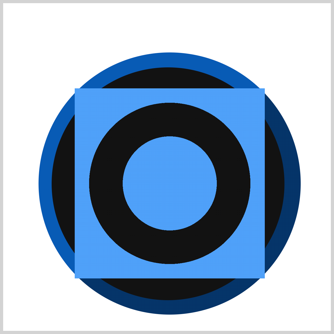
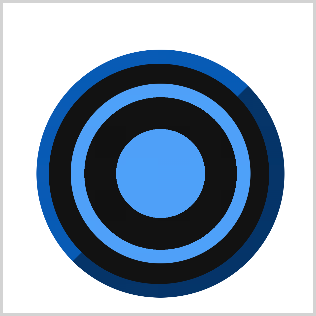
Clock Body
The base of the analog alarm clock is circular, with a clean two-tone color scheme for visual appeal. To add depth and contrast, a smaller black circle is layered on top of the base, creating a simple yet effective visual hierarchy.

/* Clock Body */
.clock-body {
  width: 400px;
  height: 400px;
  top: 75px;
  left: 54px;
  background: linear-gradient(
    var(--blue) 0 50%,
    var(--dark-blue) 50% 100%
  );
}
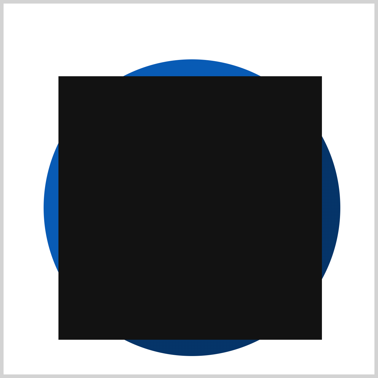
The clock body base starts as a square with dimensions of 400px by 400px. To position it on the container, it's placed 75px from the top and 54px from the left, ensuring it's neatly aligned and visually balanced within the layout.
The CSS linear-gradient() function is used to create the two-tone effect on the clock body base. In this example, the gradient starts with a navy blue color (#085bb5) from 0% to 50%, and transitions to a darker blue shade (#043468) from 50% to 100%. This technique adds depth and visual interest to the design while keeping the styling simple and customizable.

.clock-body {
  background: linear-gradient(
    135deg,
    var(--blue) 0 50%,
    var(--dark-blue) 50% 100%
  );
}
To adjust the direction of the gradient, you can add a specific angle value to the linear-gradient() function. For example, adding 135deg rotates the gradient by 135 degrees, creating a diagonal transition that adds a dynamic visual effect to the clock body.
.clock-body {
  border-radius: 50%;
}
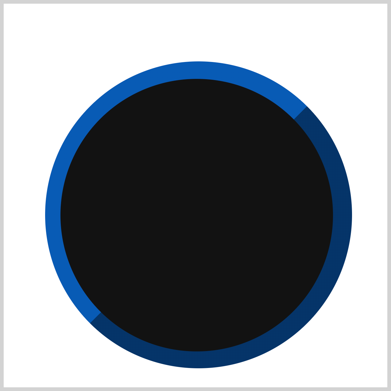
To transform the square clock body into a perfect circle, you use border-radius: 50%;. This rounds all four corners equally, giving the square a circular shape—ideal for creating smooth, clean circular designs.
The Clock Body Base is now complete!
Next, let’s enhance the design by adding another circle on top of the base. This smaller circle will sit at the center and serve as a layered detail.
.clock-body::after {
  content: "";
  width: 355px;
  height: 355px;
  top: 23px;
  left: 20px;
  background: var(--black);
}
The easiest way to add an extra shape without creating a new HTML element is by using the CSS ::after pseudo-element. The new shape starts as a 355px square and is positioned 23px from the top and 20px from the left edge. This approach keeps your HTML clean while allowing you to layer additional design elements with CSS.
.clock-body::after {
  border-radius: 50%;
}
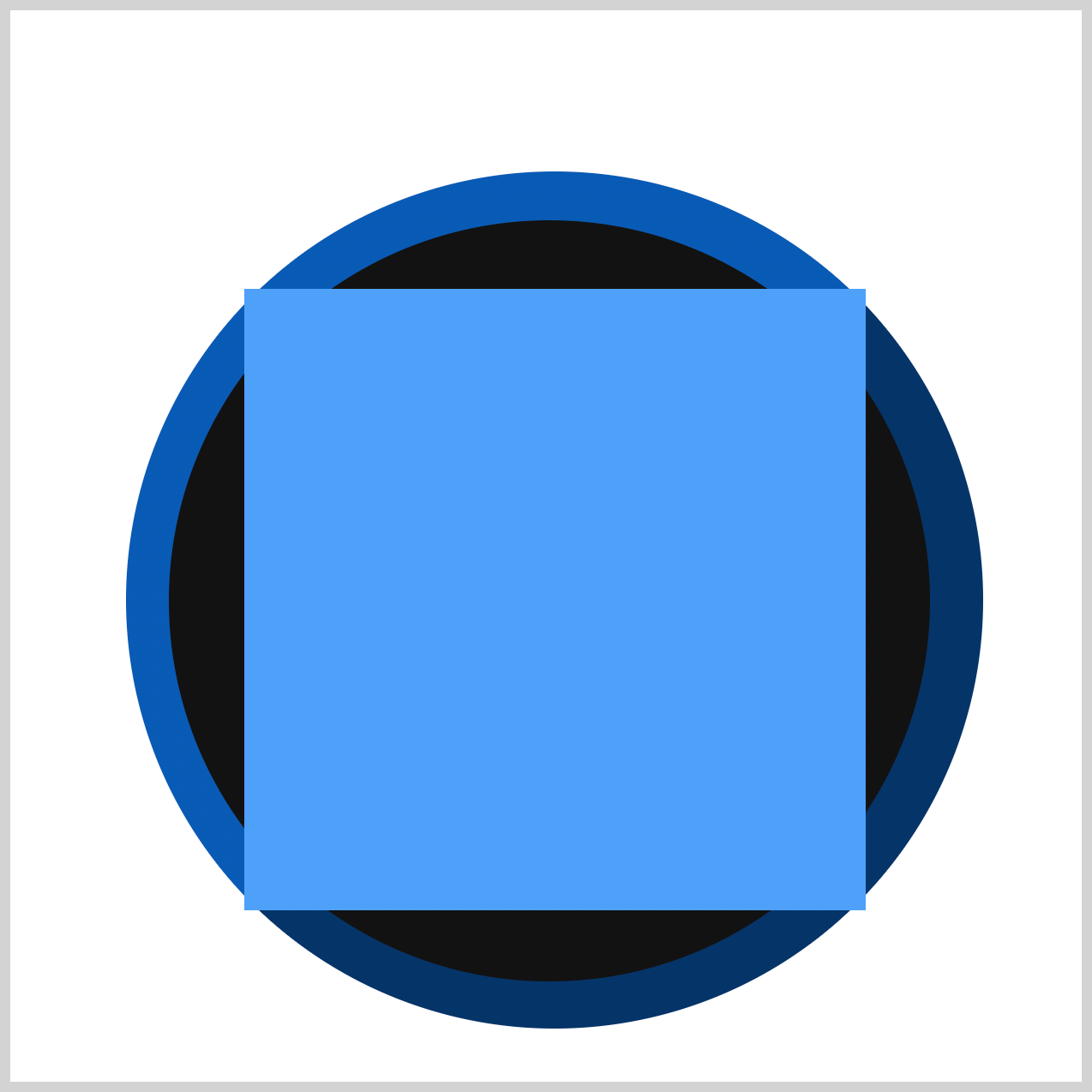
Just like the clock body base, you use border-radius: 50%; to transform the square into a perfect circle. This simple CSS property rounds all corners evenly, giving the shape a smooth, circular appearance.
Up next is the clock face.
Clock Face
The clock face is a circular element featuring an alternating light blue and black pattern for a stylish, modern look. This face will serve as the main display area, housing the clock numbers along with the hour and minute hands.
/* Clock Face */
.clock-face {
  width: 290px;
  height: 290px;
  top: 130px;
  left: 109px;
  background: radial-gradient(
    circle,
    var(--light-blue) 0% 35%
  );
}
The clock face begins as a 290px square and is positioned 130px from the top and 109px from the left of the canvas. To create the alternating light blue and black pattern, you’ll use the CSS radial-gradient() function.
To style the inner portion of the clock face, you’ll use the radial-gradient() function to define color stops. The area between 0% and 35% is set to a light blue color using: var(--light-blue) 0% 35%. This creates a smooth transition from the center outward, starting with light blue for the first 35% of the radius.
.clock-face {
  background: radial-gradient(
    circle,
    var(--light-blue) 0% 35%,
    var(--black) 35% 60%
  );
}
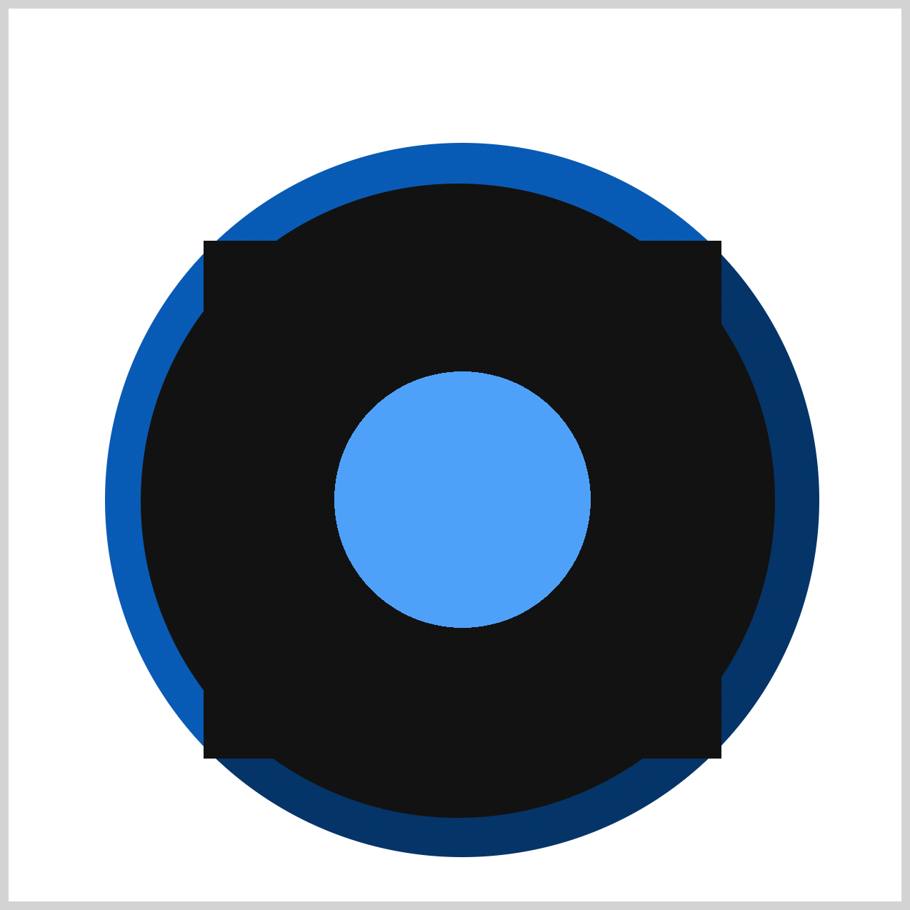
To add the black section to the gradient, use: var(--black) 35% 60%.
This sets the black color between the 35% and 60% color stops, creating a clear alternating pattern on the clock face.
.clock-face {
  background: radial-gradient(
    circle,
    var(--light-blue) 0% 35%,
    var(--black) 35% 60%,
    var(--light-blue) 60% 100%
  );
}
Finally, to complete the alternating radial pattern, add the last light blue section: var(--light-blue) 60% 100%. This applies the light blue color from 60% to 100% of the gradient, creating a smooth finish for the clock face design.
.clock-face {
  border-radius: 50%;
}
Use border-radius: 50%; to transform the square into a perfect circle.
Let’s work on the clock numbers in the following section.
Clock Numbers
The clock numbers are an essential feature of the clock face, as they indicate the time and provide clear visual reference points. By styling and positioning these numbers correctly, you ensure the clock is both functional and easy to read.
/* Numbers */
.number {
  color: var(--white);
  font-size: 40px;
  font-weight: bold;
  font-family: sans-serif;
}
- Font color: Set to
var(--white)for high contrast against the dark clock face. - Font size:
40pxfor clear visibility. - Font weight:
boldto make the numbers stand out. - Font family:
sans-seriffor a modern, minimal look.
Next, let’s position the numbers on the clock face using the CSS top and left properties. These properties allow you to place each number precisely within the container, ensuring they align correctly around the clock face.
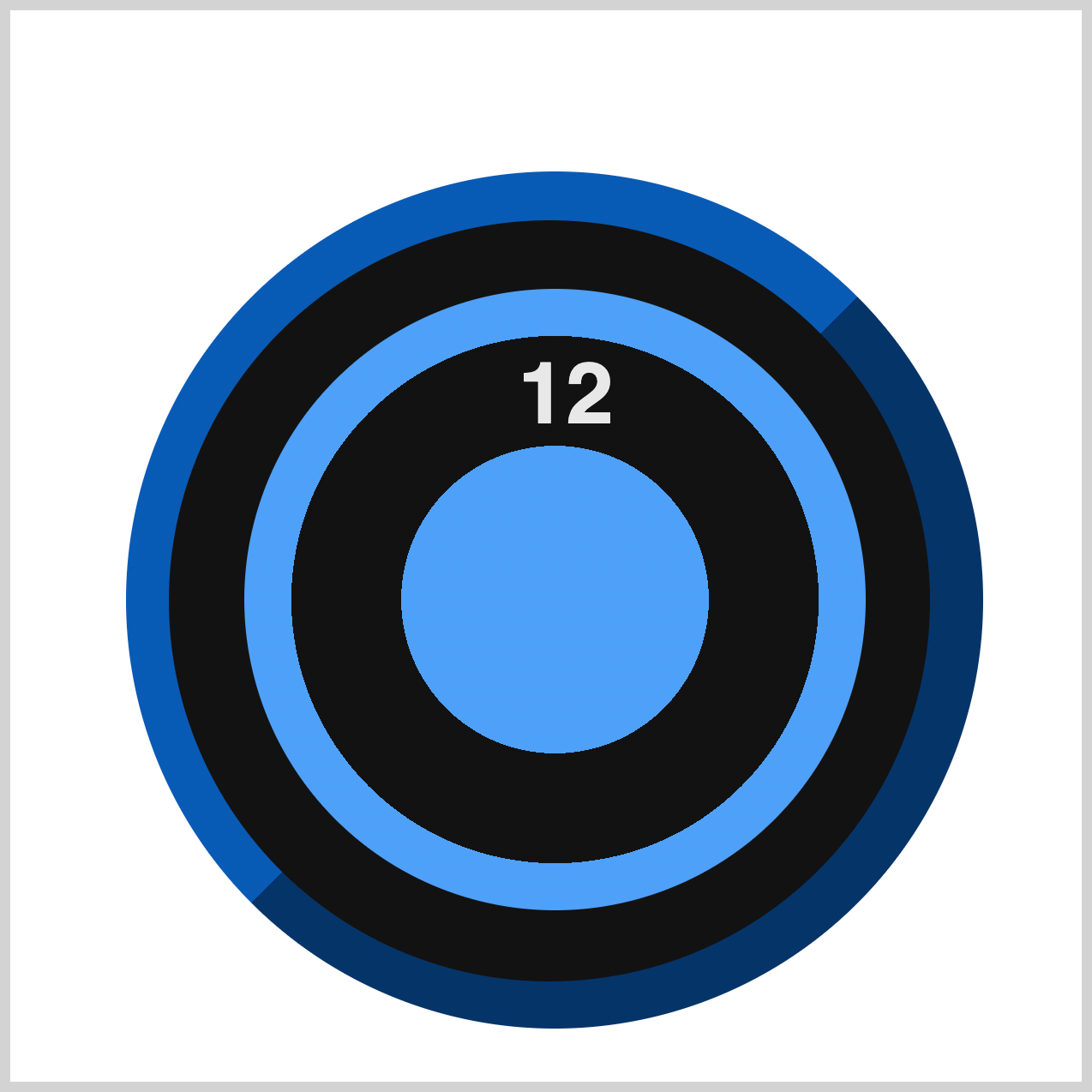
.number.twelve {
  top: 26px;
  left: 128px;
}
The number twelve is positioned at the top of the clock face using the following CSS:
top: 26px;left: 128px;
These values ensure the number sits neatly at the top center of the clock, aligned for a balanced layout.
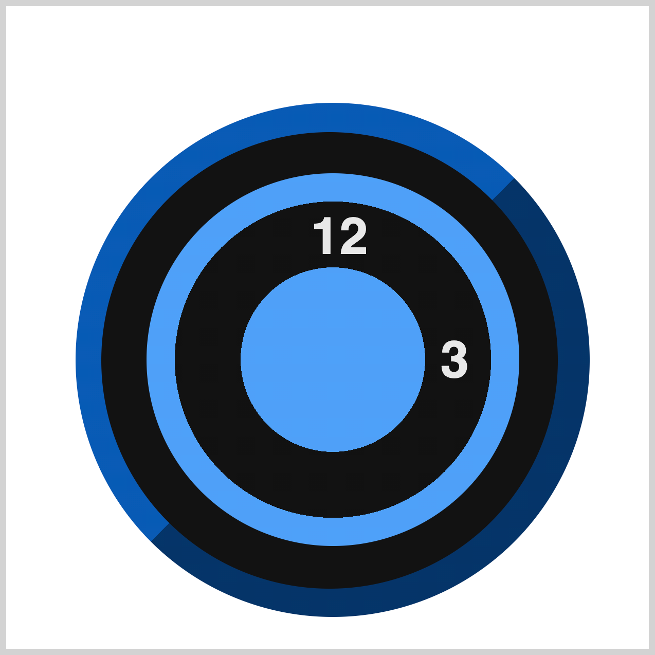
.number.three {
  top: 42%;
  right: 39px;
}
The number three is positioned on the right side of the clock face using these CSS properties:
top: 42%;places the number slightly below the vertical center.right: 39px;moves it inward from the right edge of the clock face.
This ensures the number sits neatly in its correct position without overlapping other elements.
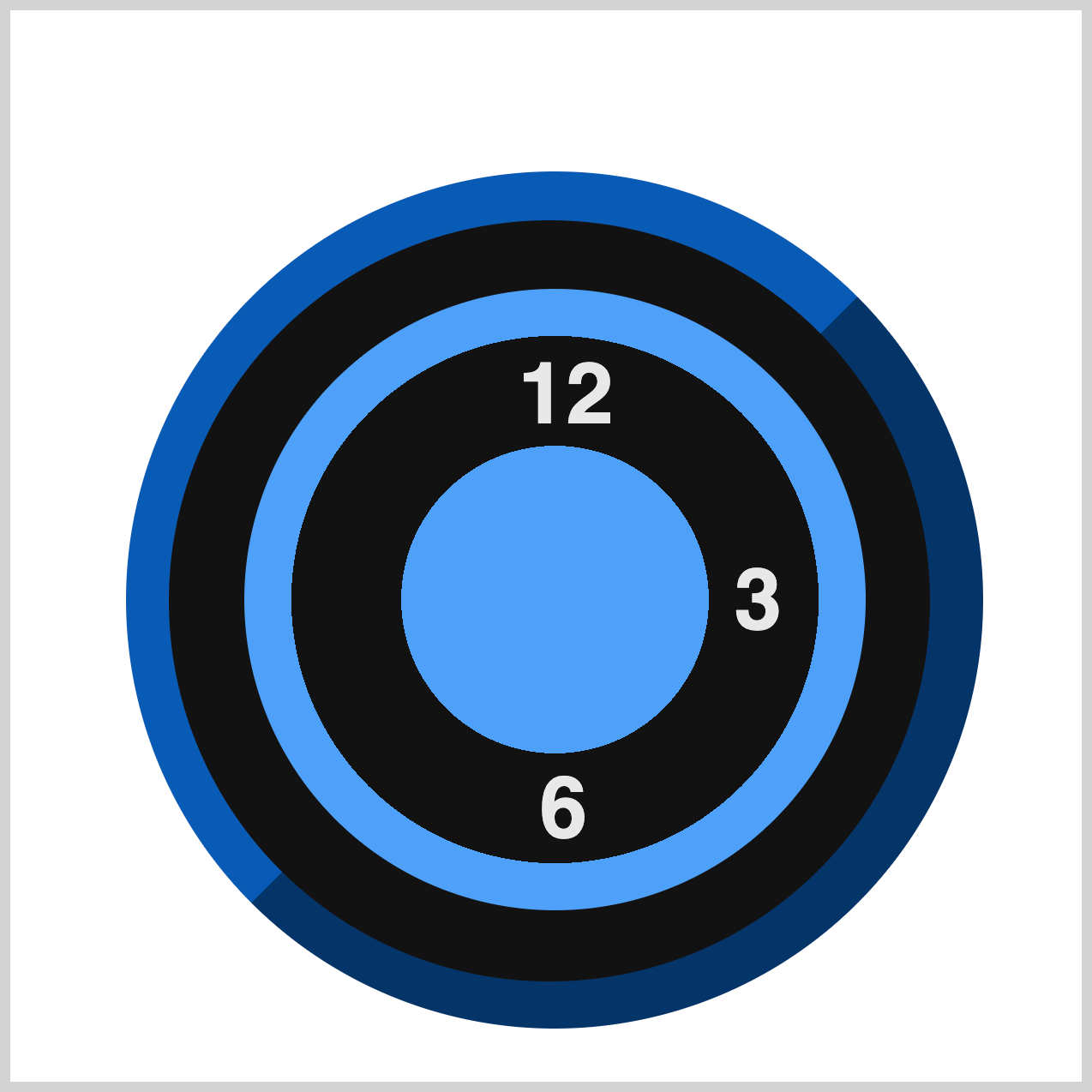
.number.six {
  bottom: 25px;
  left: 138px;
}
The number six is positioned at the bottom of the clock face using these CSS properties:
bottom: 25px;places the number slightly above the bottom edge.left: 138px;moves it inward from the left edge for proper alignment.
This ensures the number sits neatly at the bottom center of the clock face.
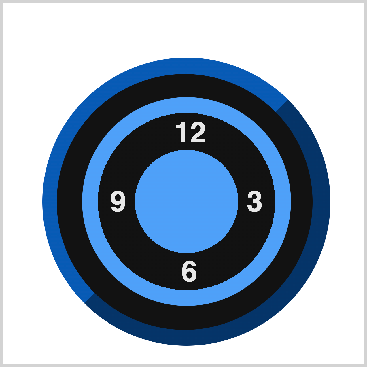
.number.nine {
  top: 42%;
  left: 39px;
}
The number nine is positioned on the left side of the clock face using these CSS properties:
top: 42%;places the number slightly below the vertical center.left: 39px;moves it inward from the left edge for proper alignment.
This ensures the number sits neatly at the 9 o’clock position.
You can see and play with the complete code on Pyxofy’s CodePen page.
See the Pen CSS Art - How to Build a Pure CSS Analog Clock with Gradients & Variables by Pyxofy (@pyxofy) on CodePen.
Conclusion
In Part 1 of this two-part article, you learned how to build the analog alarm clock’s body, clock face, and numbers using only CSS.
Along the way, you explored how to create a custom color palette with CSS variables and combined different gradient techniques—such as linear-gradient() and radial-gradient()—to style the clock body and its components.
In Part 2, we’ll continue by adding the remaining clock elements to complete the design. Until then, here’s a question for you: What creative designs will you make using CSS gradients and variables? The possibilities are endless—experiment and have fun!
Share your masterpiece with us on LinkedIn, Threads, Bluesky, Mastodon, X (Twitter) @pyxofy, or Facebook.
We hope you liked this article. Kindly share it with your network. We appreciate it.
Related Articles
 Pyxofy
 Pyxofy
 Pyxofy