CSS Art - CSS shape() & Gradients: Create an Isometric Hot Air Balloon - Part 2
You'll learn how to combine the CSS shape() function with gradients to create stunning, 3D-like isometric visuals in this step-by-step article.

Introduction
Color gradients are a powerful tool for creating three-dimensional, isometric-style visuals with CSS. Mastering the use and control of the CSS linear-gradient() and radial-gradient() functions can significantly expand your CSS skill set and design capabilities.
- In Part 1, you created the structural components of the hot air balloon.
- In Part 2—this article—you’ll develop a custom color palette and apply it using CSS gradients to style each balloon component.
CSS functions and properties introduced in this article include:
- CSS Custom Properties (Variables)
linear-gradient()radial-gradient()border-radiusrotate()background-size
Preview
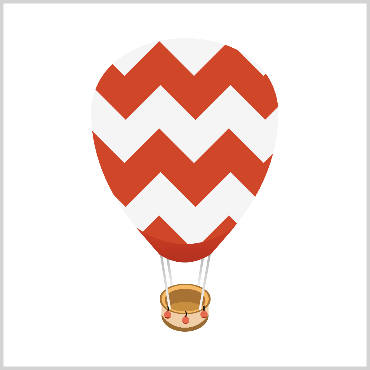
Using CSS custom properties (variables), each hot air balloon component is assigned a unique color palette.

The balloon's sandbags are constructed using the CSS border-radius property in combination with the rotate() function, contributing to the overall isometric design.
Prerequisites
Essential CSS and HTML knowledge will help you understand the concepts and techniques introduced in this article. Jump over to this article if you require an HTML and CSS primer.
We assume you have configured tools to modify CSS. If not, this article will guide you through the setup process.
HTML Structure
<div class="container">
  <div class="envelope"></div>
  <div class="basket-base"></div>
  <div class="rigging-back"></div>
  <div class="basket-rim"></div>
  <div class="basket-body"></div>
  <div class="rigging-front"></div>
  <div class="skirt"></div>
  <div class="sand-bags">
    <div class="sand-bag-1 sand-bag"></div>
    <div class="sand-bag-2 sand-bag"></div>
    <div class="sand-bag-3 sand-bag"></div>
  </div>
</div>
container is the outermost enclosure. It enables the content to be centered and draws a light gray border. The rest of the <div>s represent each image component.
Keep the HTML structure as is for the image to display correctly.
Body and Container <div> CSS
CSS code for the body and container <div>.
/* Body and Container Settings */
/* Center shapes */
body {
  margin: 0;
  padding: 0;
  height: 100vh;
  display: flex;
  justify-content: center;
  align-items: center;
  flex-wrap: wrap;
}

/* Set background and border color */
.container {
  min-width: 500px;
  height: 500px;
  border: 5px solid lightgray;
  background: white;
  position: relative;
  margin: 5px;
  display: flex;
  justify-content: center;
  align-items: center;
  overflow: hidden;
}
Common Properties
To improve code efficiency and maintainability, shared properties among the hot air balloon components are consolidated.
/* Common Properties */
.sand-bag,
.sand-bag::before,
.sand-bag-1,
.sand-bag-2,
.sand-bag-3 {
  position: absolute;
}
Color Palette
Each hot air balloon component will be assigned a color palette using CSS custom properties (variables). Custom properties (variables) are easier to maintain than hard-coding colors into each component.
/* Color Palette */
:root {
  /* Envelope */
  --envelope-1: #d04629; /* Red */
  --envelope-2: #f5f5f5; /* Light Gray */

  /* Skirt */
  --skirt-1: #cc3f24; /* Skirt Top */
  --skirt-2: #b32f1f; /* Skirt Bottom */

  /* Rigging */
  --rigging-1: #f9faf6; /* Base Color */
  --rigging-2: #b2b2b2; /* Gray Color */

  /* Basket */
  --basket-1: #f0cea8; /* Base Color */
  --basket-2: #996a32; /* Base Bottom Color */
  --basket-3: #f6b864; /* Top Ring Color */
  --basket-4: #c78d40; /* Body Inside Bottom Color */
  --basket-5: #a67233; /* Body Inside Color */

  /* Sandbag */
  --sand-bag-1: #e66b51; /* Sandbag Base Color */
  --sand-bag-2: #9a2d07; /* Sandbag Bottom Color */
  --sand-bag-3: #000000; /* Sandbag Rope */
}
Check this article for more details on how to make a custom color palette.
Hot Air Balloon Envelope
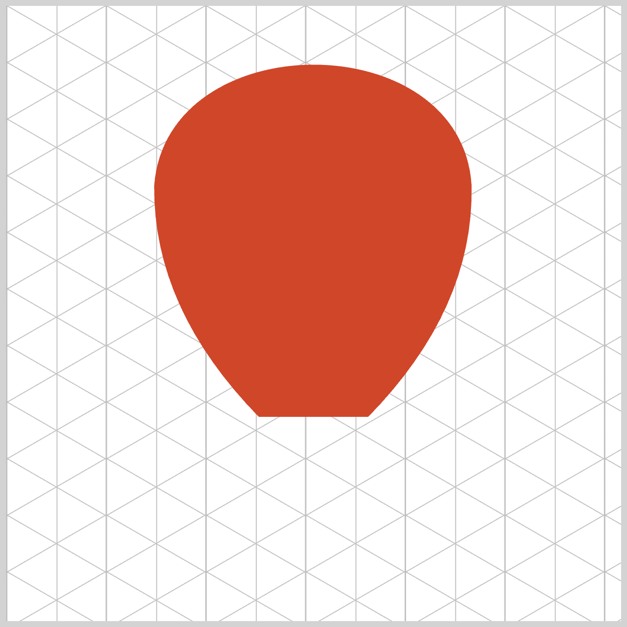
The envelope component is the most prominent part of the hot air balloon. It will be styled using the CSS linear-gradient() function to apply color and the stripe pattern.
/* Envelope */
.envelope {
  width: 259px;
  height: 288px;
  top: 46px;
  left: 120.5px;
  background-color: var(--envelope-1);
  clip-path: shape(
    from 0px 100px,
    curve to 258px 100px with 10px -31px / 250px -31px,
    curve to 174px 288px with 260px 200px,
    line to 85px 288px,
    curve to 0px 100px with -1px 200px,
    close
  );
}
The base color for the envelope, defined by the variable --envelope-1, is set to a tomato shade with the hexadecimal value #d04629.
.envelope {
  background:
	linear-gradient(135deg, var(--envelope-2) 25%, transparent 25%) -50px 0,
    linear-gradient(225deg, var(--envelope-2) 25%, transparent 25%) -50px 0,
    linear-gradient(315deg, var(--envelope-2) 25%, transparent 25%),
    linear-gradient(45deg, var(--envelope-2) 25%, transparent 25%);
	background-size: 96px 120px;
}
The variable --envelope-2 is assigned the hexadecimal value #f5f5f5, representing a light gray hue.
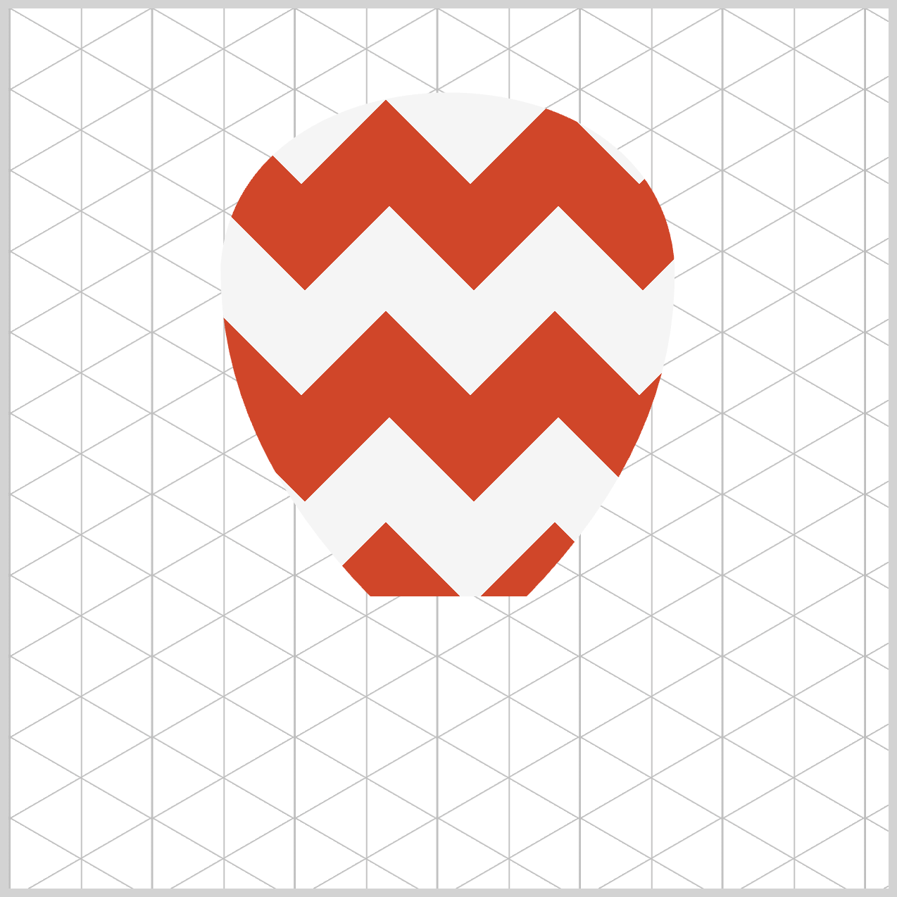
Four linear gradients are applied at angles of 135°, 225°, 315°, and 45°. Each gradient alternates between a transparent color and the value of --envelope-2, a light gray (#f5f5f5). The transparent sections reveal the underlying tomato red (--envelope-1), producing a visually engaging zigzag pattern.
The property background-size: 96px 120px defines the width and height of the repeating zigzag pattern, ensuring consistent spacing and alignment across the design.
Let’s work on the balloon skirt in the following section.
Hot Air Balloon Skirt
The skirt uses two red shades, forming a gradient from top to bottom.

/* Skirt */
.skirt {
  background: linear-gradient(to bottom, var(--skirt-1), var(--skirt-2));
}
The first color, a dark pastel red (#cc3f24), is assigned to --skirt-1. The second color, a Chinese brown (#b32f1f), is assigned to --skirt-2. The gradient begins at the top with --skirt-1 and gradually fades to --skirt-2 toward the bottom.
Next up is the balloon rigging.
Hot Air Balloon Riggings
The hot air balloon has a total of four riggings, two at the front and two at the back.

/* Riggings */
.rigging-front {
  background: linear-gradient(180deg, var(--rigging-2), var(--rigging-1));
}
The gradient angle is set to 180 degrees, indicating that the gradient will flow downwards. The primary color --rigging-2 is set to hexadecimal value #b2b2b2, representing a light gray hue. The secondary color, #f9faf6, corresponding to an off white color, is set to --rigging-1.
.rigging-front::before {
  background: inherit;
}
The .rigging-front::before inherits the linear gradient color from .rigging-front.

The back riggings follow the same color scheme as the front side riggings.
.rigging-back {
  background: linear-gradient(180deg, var(--rigging-2), var(--rigging-1));
}
.rigging-back::before {
  background: inherit;
}
Let’s work on the basket rim in the next section.
Hot Air Balloon Basket Rim
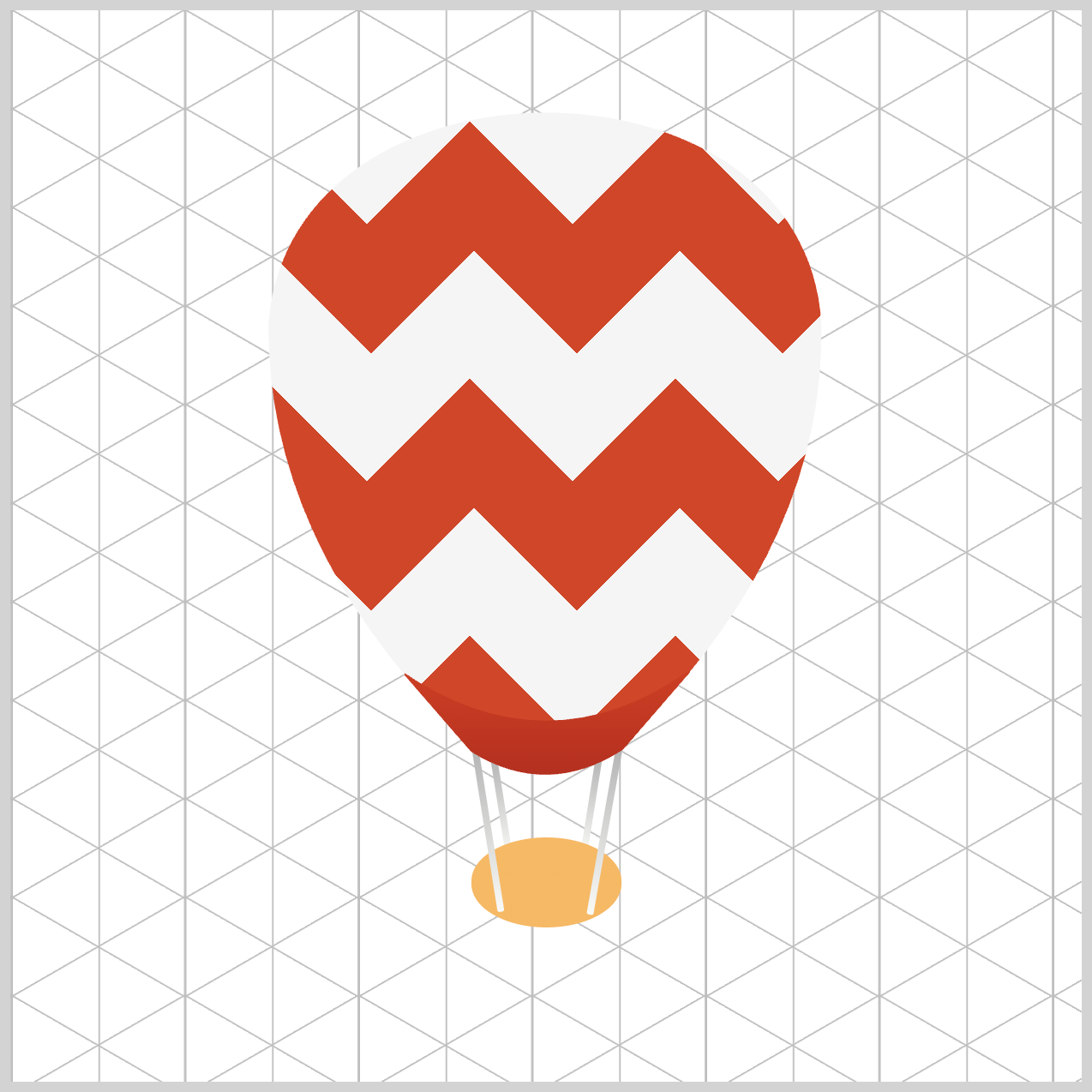
The basket rim is divided into two color areas, the main area and the edge area.
/* Basket Rim */
.basket-rim {
  background: radial-gradient(
    at 50% 50%,
    var(--basket-3) 65%
  );
}
The main area’s color is set to a sandy brown color, #f6b864, set to --basket-3 and ends at sixty-five percent of the component, 65%. The at 50% 50% value positions the radial gradient at 50% of both horizontal and vertical axes.

.basket-rim {
  background: radial-gradient(
    at 50% 50%,
    var(--basket-3) 65%,
    var(--basket-5) 66%
  );
}
To create the basket rim ring, the CSS variable --basket-5 is assigned a dark gold shade (#a67233) and applied to the outer portion of the basket, starting from 66% and above.
The basket body is next.
Hot Air Balloon Basket Body
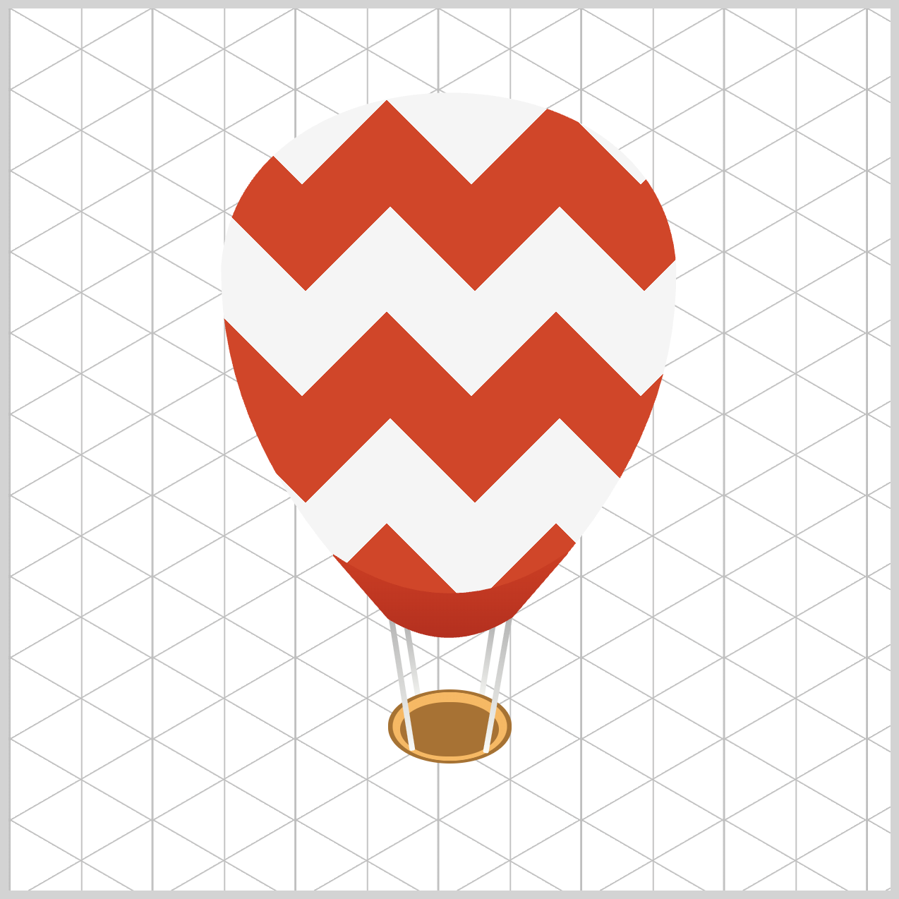
The basket's body design creates the illusion that you're looking directly into its interior.
/* Basket Body */
.basket-body {
  background: var(--basket-5);
}
The base color is similar to the previous rim ring component, dark gold shade, #a67233, set to --basket-5.

.basket-body::before {
  background: var(--basket-4);
}
To simulate the basket body bottom, an amber tone, #c78d40, is configured for --basket-4.
In the next section, you’ll be working on the balloon basket base.
Hot Air Balloon Basket Base
The basket base uses the CSS radial-gradient() function to simulate an isometric effect.

/* Basket Base */
.basket-base {
  background: radial-gradient(
    circle at 50% 28%,
    var(--basket-1) 70%
  );
}
The gradient shape is configured as a circle, positioned at 50% along the horizontal axis and 28% along the vertical axis. A desert sand hue (#f0cea8) is assigned to the --basket-1 variable, covering the area from 0% to 70% of the gradient.

.basket-base {
  background: radial-gradient(
    circle at 50% 28%,
    var(--basket-1) 70%,
    var(--basket-2) 70%
  );
}
To define the bottom portion of the gradient, the --basket-2 variable is assigned a dark gold shade (#996a32), which occupies the area from 70% onward.
Hot Air Balloon Sandbags
Three sandbags will be created and positioned along the side of the basket body to enhance its visual structure.
Before implementing the CSS styling, let's first review the HTML structure to ensure all elements are properly defined and organized.
<div class="sand-bags">
  <div class="sand-bag-1 sand-bag"></div>
  <div class="sand-bag-2 sand-bag"></div>
  <div class="sand-bag-3 sand-bag"></div>
</div>
<sand-bags>serves as a container element, serving as a wrapper for the sandbag components.<sand-bag>represents the template image for each sandbag.- These elements are combined with classes such as
sand-bag-1,sand-bag-2, and so on to control their positioning along the side of the basket body.
/* Sandbag Template */
.sand-bag {
  height: 10px;
  width: 10px;
  background: radial-gradient(
    circle at 0% 0%,
    var(--sand-bag-1) 75%
  );
}
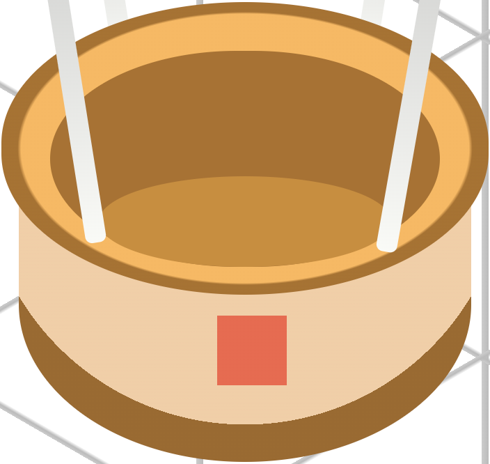
The sandbag template is defined as a 10px by 10px square. Its radial gradient is set to circle, positioned at 0% on both the horizontal and vertical axes. The base color for the sandbag, defined by the --sand-bag-1 variable, is set to #e66b51, a warm salmon hue. This color occupies the gradient space from 0% to 75%, forming the primary visual layer of the sandbag.
/* Sandbag Position */
.sand-bag-1 {
  top: 431px;
  left: 246px;
}
sand-bag-1 is centrally positioned, located 431px from the top and 246px from the left edge of the container.
.sand-bag {
  background: radial-gradient(
    circle at 0% 0%,
    var(--sand-bag-1) 75%,
    var(--sand-bag-2) 75%
  );
}
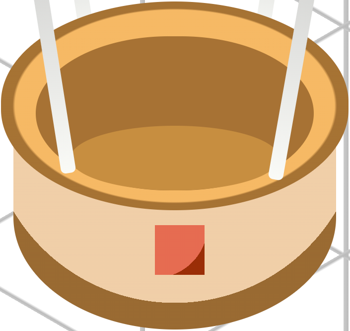
The bottom color of the sandbag is defined by the --sand-bag-2 variable and set to #9a2d07, a deep, dark red shade that adds contrast and depth to the design.
The following steps will apply corner rounding to the sandbags, giving them a more circular and refined appearance
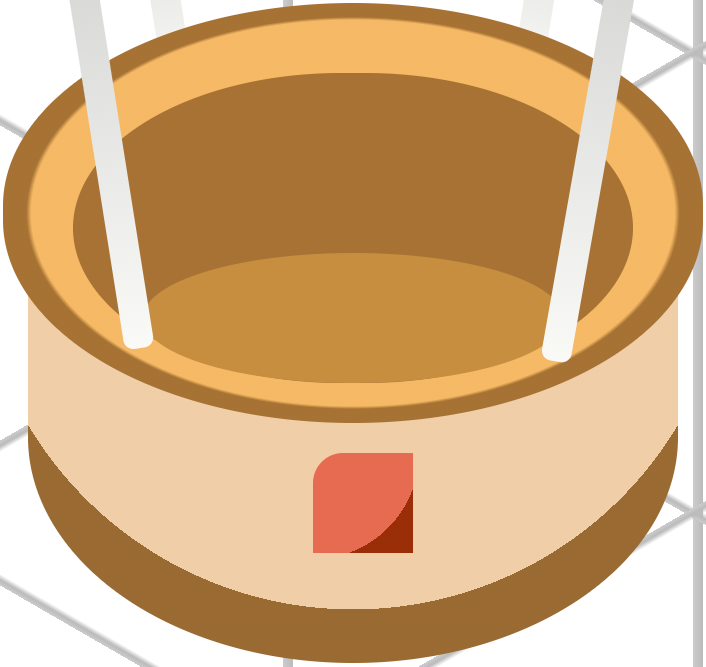
.sand-bag {
  border-top-left-radius: 30%;
}
The top-left corner of the sandbag is rounded using a border-radius of 30%.
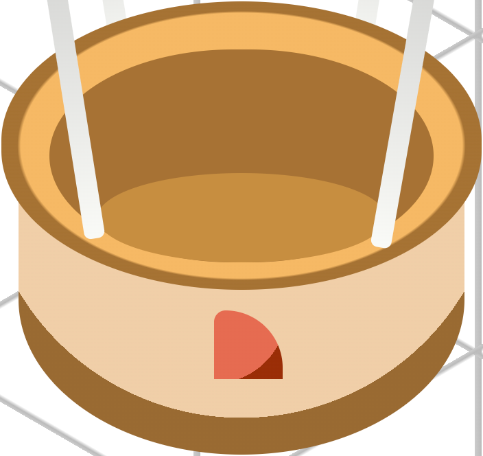
.sand-bag {
  border-top-left-radius: 30%;
  border-top-right-radius: 150%;
}
Next, the top-right corner of the sandbag is rounded using a border-radius of 150%, enhancing its circular appearance and adding visual softness to the shape.
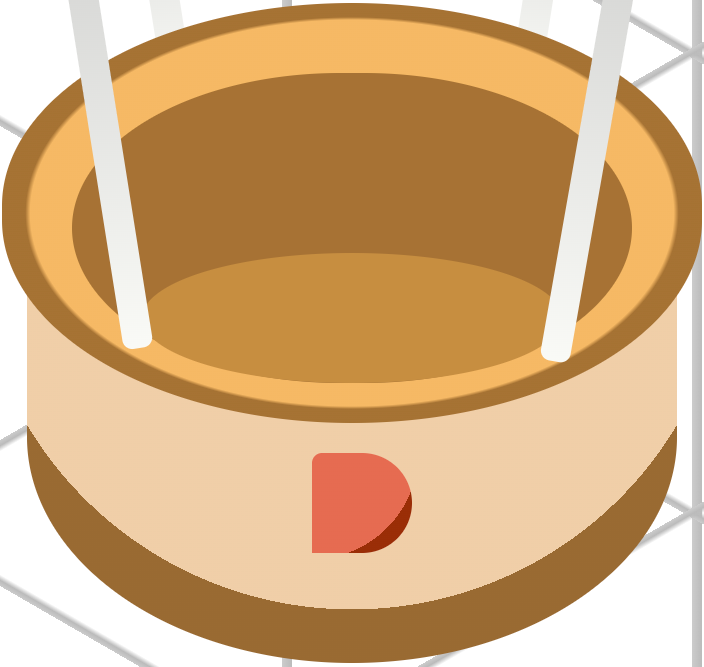
.sand-bag {
  border-top-left-radius: 30%;
  border-top-right-radius: 150%;
  border-bottom-right-radius: 150%;
}
A border-radius of 150% is applied to the bottom-right corner of the sandbag, further enhancing its rounded and organic appearance.
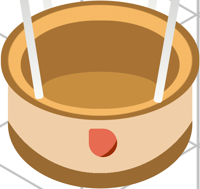
.sand-bag {
  border-top-left-radius: 30%;
  border-top-right-radius: 150%;
  border-bottom-right-radius: 150%;
  border-bottom-left-radius: 150%;
}
Finally, a border-radius of 150% is applied to the bottom-left corner of the sandbag, completing the rounded styling and contributing to its smooth, circular form.
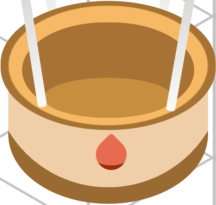
.sand-bag {
  border-top-left-radius: 30%;
  border-top-right-radius: 150%;
  border-bottom-right-radius: 150%;
  border-bottom-left-radius: 150%;
  transform: rotate(45deg);
}
The sandbag image will be rotated by 45 degrees (45deg) to ensure that the bottom color aligns visually with the lower portion of the sandbag, enhancing its isometric appearance.
In the next section, we’ll be making the sandbag rope component.
Hot Air Balloon Sandbag Rope
In this final section, you'll learn how to create the sandbag rope using the CSS ::before pseudo-element, along with the border property and rotate() function to achieve the desired visual effect.

.sand-bag::before {
  content: "";
  height: 6px;
  width: 1px;
  top: -5px;
  left: -2.5px;
  background: transparent;
  border: 1px solid var(--sand-bag-3);
}
The rope component is positioned -5px from the top edge and -2.5px from the left. Its background color is set to transparent, while the border is styled as a 1px solid line. The color #000000 (black) is assigned to the -sand-bag-3 variable to define the rope's appearance.

.sand-bag::before {
  border-radius: 50%;
}
A border-radius of 50% is applied to the rope component to round its corners, giving it a smoother appearance.
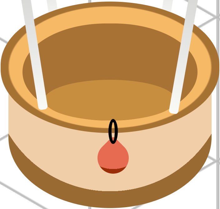
.sand-bag::before {
  transform: rotate(-45deg);
}
The rope component is rotated by -45 degrees using the rotate(-45deg) transformation, positioning the rope diagonally to align with the sandbag's orientation.
In the following steps, we’ll position the remaining sandbags to complete the layout.
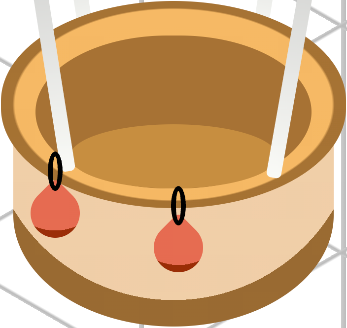
.sand-bag-2 {
  top: 424px;
  left: 221px;
}
sand-bag-2 is positioned 424px from the top and 221px from the left edge of the container, aligning it precisely within the layout.
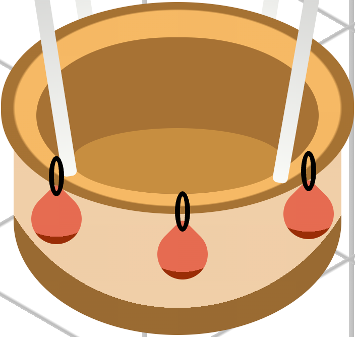
.sand-bag-3 {
  top: 423px;
  left: 271px;
}
Finally, sand-bag-3 is positioned 423px from the top and 271px from the left edge of the container, completing the arrangement of the sandbags along the basket body.
You can see and play with the complete code on Pyxofy’s CodePen page.
See the Pen CSS Art - CSS shape() & Gradients: Create an Isometric Hot Air Balloon by Pyxofy (@pyxofy) on CodePen.
Conclusion
In Part 2 of this two-part article series, you explored how to apply color to hot air balloon components using CSS custom properties (variables). You learned to create zigzag patterns and isometric shapes using the linear-gradient() and radial-gradient() functions and the background-size property.
To complete the isometric hot air balloon image, you combined multiple border-radius property values with the rotate() function to construct the sandbag and its string.
Did the CSS techniques you discovered in this article inspire you to experiment further or apply them to your own projects? Share your masterpiece with us on LinkedIn, Threads, Bluesky, Mastodon, X (Twitter) @pyxofy, or Facebook.
We hope you liked this article. Kindly share it with your network. We appreciate it.
Related Articles
