CSS Animation – Animate Along a Curved Path
Squares are so last century. What do rounded corners, smooth curves and roller coasters have in common. Find out in this step-by-step article.
Introduction
Round, circular animation are definitely fun to look at. Combining curved paths with animation can produce interesting movement sequences.
In this article, we’ll explore how to use the CSS offset-path and offset-distance properties. Let’s find out what animation sequences we can produce by combining them with Scalable Vector Graphics (SVG).
Preview
Roller Coaster

U Shape

Round Motion

Along a Circle

Prerequisites
Basic CSS and HTML knowledge will help you understand the concepts and techniques introduced in this article. Jump over to this article if you require an HTML and CSS primer.
We assume that you have set up tools to create CSS animation. If you haven’t, this article will show you how to set them up.
If you’re unfamiliar with CSS animation and the@keyframes at-rule property, please read this article.
path() function will be used extensively in this article. Please read this article to get acquainted with both technologies.HTML Structure
<div class="container">
	<div class="roller-coaster-box">
		<svg viewBox="0 0 360 360">
			<path
				d="M 0 39 Q 136 553 185 160 Q 229 -110 313 172"
				fill="none"
				stroke="lightgrey"
				stroke-dasharray="4"
				/>
		</svg>
		<div class="circle roller-coaster"></div>
	</div>
</div>

<div class="container">
	<div class="u-shape-box">
		<svg viewBox="0 0 240 200">
			<path
				d="M0,0 C40,240 200,240 240,0"
				fill="none"
				stroke="lightgrey"
				stroke-dasharray="4"
				/>
		</svg>
		<div class="circle u-shape"></div>
	</div>
</div>

<div class="container">
	<div class="circle round-motion"></div>
</div>

<div class="container">
	<div class="along-a-circle-box">
		<div class="circle along-a-circle"></div>
	</div>
</div>
container is our outermost enclosure. This enables us to center the content and draw a light gray border. The rest of the divs represent each animation sequence.
It’s important to keep the HTML structure as is for each animation to display properly.
Body and Container Div CSS
CSS code for the body, container div and svg position.
/**************************************/
/* Color, Body and Container Settings */
/**************************************/
/* Center shapes */
body {
  margin: 0;
  padding: 0;
  height: 100vh;
  display: flex;
  justify-content: center;
  align-items: center;
  flex-wrap: wrap;
}

/* Set light gray border */
.container {
  width: 500px;
  height: 500px;
  border: 5px solid lightgray;
  background: royalblue;
  position: relative;
  display: flex;
  justify-content: center;
  align-items: center;
  border-radius: 1px;
  margin: 5px;
}

/* SVG position */
svg {
  position: absolute;
}
CSS Shape
The circle shape we’ll animate in this article.
/****** Shape ******/
.circle {
  position: absolute;
  width: 50px;
  height: 50px;
  background-color: burlywood;
  border-radius: 50%;
}
Round Motion
Our first example will be a circle shape moving in a round motion. Below is a static image of our first example.

CSS Code
/* Round Motion */
.round-motion {
	offset-path: path("M -80,-70 A 1,1 0 0 0 114,76 A 1,1 0 0 0 -80,-70");
  animation: round-motion 5s linear infinite;
}

@keyframes round-motion {
  100% {
    offset-distance: 100%;
  }
}
Two CSS properties are used to animate an element a long an SVG path.
offset-path
This CSS property defines a motion or movement path for an element to follow. You cannot animate this property.offset-distance
This CSS property specifies a position along anoffset-path. This is an animatable property associated withoffset-path.
We define our SVG with this code. You can use this tool to visualize the SVG path.
path("M -80,-70 A 1,1 0 0 0 114,76 A 1,1 0 0 0 -80,-70");
Now that the motion path is defined, we use this shorthand CSS code to animate our circle shape.
animation: round-motion 5s linear infinite;
The CSS shorthand code above equates to this longhand or verbose code.
animation-name: round-motion;
animation-duration: 5s;
animation-timing-function: linear;
animation-iteration-count: infinite;
We set offset-distance property value to 100%.
@keyframes round-motion {
  100% {
    offset-distance: 100%;
  }
}
In the next section, let’s see how we can make the circle shape move along a round shape.
Along a Circle
In this section, we’ll make a circle outline, then animate the circle shape along that outline.
CSS Code
/* Along a Circle */
.along-a-circle-box {
  width: 200px;
  height: 200px;
  border: 1px dashed lightgrey;
  border-radius: 50%;
}

.along-a-circle {
  offset-path: path("M 100,0 A 100,100 0 1 1 100,200 A 100,100 0 1 1 100,0");
  animation: along-a-circle 3s linear infinite;
}

@keyframes along-a-circle {
  100% {
    offset-distance: 100%;
  }
}
First, the circle dashed outline.

.along-a-circle-box {
  width: 200px;
  height: 200px;
  border: 1px dashed lightgrey;
  border-radius: 50%;
}
- We set the shape’s
widthandheightto200px. - We used this code,
border: 1px dashed lightgrey;to create the light grey dashed border. border-radius: 50%;will make the box into a circle by rounding its borders.
Next, the circle shape animation.

.along-a-circle {
  offset-path: path("M 100,0 A 100,100 0 1 1 100,200 A 100,100 0 1 1 100,0");
  animation: along-a-circle 3s linear infinite;
}

@keyframes along-a-circle {
  100% {
    offset-distance: 100%;
  }
}
For the circle shape to move along the dashed outline, we set the offset-path to path("M 100,0 A 100,100 0 1 1 100,200 A 100,100 0 1 1 100,0"), which replicates the dashed outline shape.
Now that we’re familiar with how circular animation works, let’s move to another curved example in the next section.
U Shape
In this example, we’ll simulate a U shape movement. We use an underlying SVG image to visualize the motion path.
SVG Image

HTML / SVG Code
<div class="container">
	<div class="u-shape-box">
		<svg viewBox="0 0 240 200">
			<path
				d="M0,0 C40,240 200,240 240,0"
				fill="none"
				stroke="lightgrey"
				stroke-dasharray="4"
				/>
		</svg>
		<div class="circle u-shape"></div>
	</div>
</div>
Let’s break down the SVG image element in detail.
<path
	d="M0,0 C40,240 200,240 240,0"
	fill="none"
	stroke="lightgrey"
	stroke-dasharray="4"
	/>
d="M0,0 C40,240 200,240 240,0"is our SVG path to create the image.fillwe set tonone.strokeis set tolightgrey.- We use
stroke-dasharray="4"to draw the dashes.
Next, we overlay the CSS circle shape on top of the SVG image.
<div class="circle u-shape"></div>

CSS Code
/* U Shape */
.u-shape-box {
  width: 244px;
  height: 200px;
  position: relative;
}

.u-shape {
  offset-path: path("M 0,0 C 40,240 200,240 240,0");
  animation: u-shape 4s infinite ease-in-out;
}

@keyframes u-shape {
  100% {
    offset-distance: 100%;
  }
}
To control the SVG image dimension, we use this CSS code.
.u-shape-box {
  width: 244px;
  height: 200px;
  position: relative;
}
The offset-path path value is M 0,0 C 40,240 200,240 240,0 which is the same value we have for the SVG path. By setting the same path value, we enabled our CSS circle shape to precisely animate along the SVG dashed image.
The technique of combining SVG image and CSS animation is useful when making sophisticated animations. Working only with offset-path: path() is challenging, as you can’t visualize the motion path. It’s always recommended to visualize the motion path when animating.
For our next section, we’ll build on the SVG image + CSS animation technique.
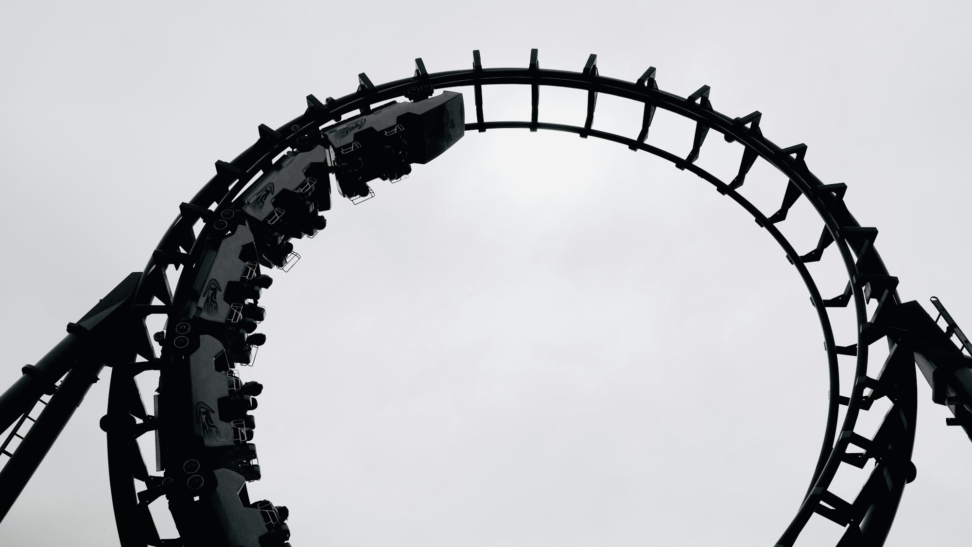
Roller Coaster
For this last section, we’ll simulate a roller coaster or up and down animation. Similar to the previous U Shape section, we combine an SVG image and CSS animation for this example.

HTML / SVG Code
<div class="container">
	<div class="roller-coaster-box">
		<svg viewBox="0 0 360 360">
			<path
				d="M 0 39 Q 136 553 185 160 Q 229 -110 313 172"
				fill="none"
				stroke="lightgrey"
				stroke-dasharray="4"
				/>
		</svg>
		<div class="circle roller-coaster"></div>
	</div>
</div>
We use a dashed stroke for the SVG image to help visualize the animation motion path. We use SVG commands to make the image. Please read this article on how to use SVG commands.
You can use this app to visualize the SVG code.

CSS Code
/* Roller Coaster */
.roller-coaster-box {
  width: 350px;
  height: 350px;
  position: relative;
}

.roller-coaster {
  offset-path: path("M 0,39 Q 136,553 185,160 Q 229,-110 313,172");
  animation: roller-coaster 5s alternate infinite ease-in-out;
}

@keyframes roller-coaster {
  100% {
    offset-distance: 100%;
  }
}
Let’s expand the animation shorthand.
animation-name: roller-coaster;
animation-duration: 5s;
animation-direction: alternate;
animation-iteration-count: infinite
animation-timing-function: ease-in-out;
We introduced a new CSS animation property for this section. This code, animation-direction: alternate;, enables us to play the animation alternating between forward and backward motion sequence.
Besides alternate, animation-direction can be set as follows:
normal: Animation plays forward each cycle. Default setting.reverse: Animation plays from the end state or backward for each cycle.alternate-reverse: The animation reverses direction each cycle, with the first cycle played backwards.
This concludes all the examples we have for this article. You can see and play with the code at Pyxofy’s CodePen page.
See the Pen CSS Animation – Animate Along a Curved Path by Pyxofy (@pyxofy) on CodePen.
Conclusion
We combined Scalable Vector Graphics (SVG) and CSS animation to create simple round motion animation to more sophisticated roller coaster type sequences.
Creating SVG images with SVG commands maybe daunting at first, but with practice and thanks to SVG visualizing apps, you can get better at it in no time.
To save time and code volume, we used CSS shorthand. CSS shorthands are handy. The more you use it, the easier you’ll remember them.
Did you get inspired? What CSS animations will you create with the knowledge you gained in this article? Share your masterpiece with us on Twitter @pyxofy, on LinkedIn, Mastodon or Facebook.
We hope you liked this article. Kindly share it with your network. We really appreciate it.
Related Articles
 Pyxofy
 Pyxofy
 Pyxofy