CSS Art - CSS shape() & Gradients: Create an Isometric Hot Air Balloon - Part 1
Colorful hot air balloons against a sky blue background are majestic! Learn, step by step, how to create one using the CSS shape() function.

Introduction
Hot air balloons are vibrant and come in various shapes and sizes. They create an incredible spectacle against a bright blue sky. In this two-part article series, you’ll learn how to make an isometric, 3D-like hot air balloon using the CSS shape() function.
- In Part 1, this article, you’ll create the hot air balloon components.
- In Part 2, you will create a custom color palette and utilize it with CSS gradients to color all the balloon components.
CSS functions and properties introduced in this article:
shape()Function::beforepseudo-elementborder-radius
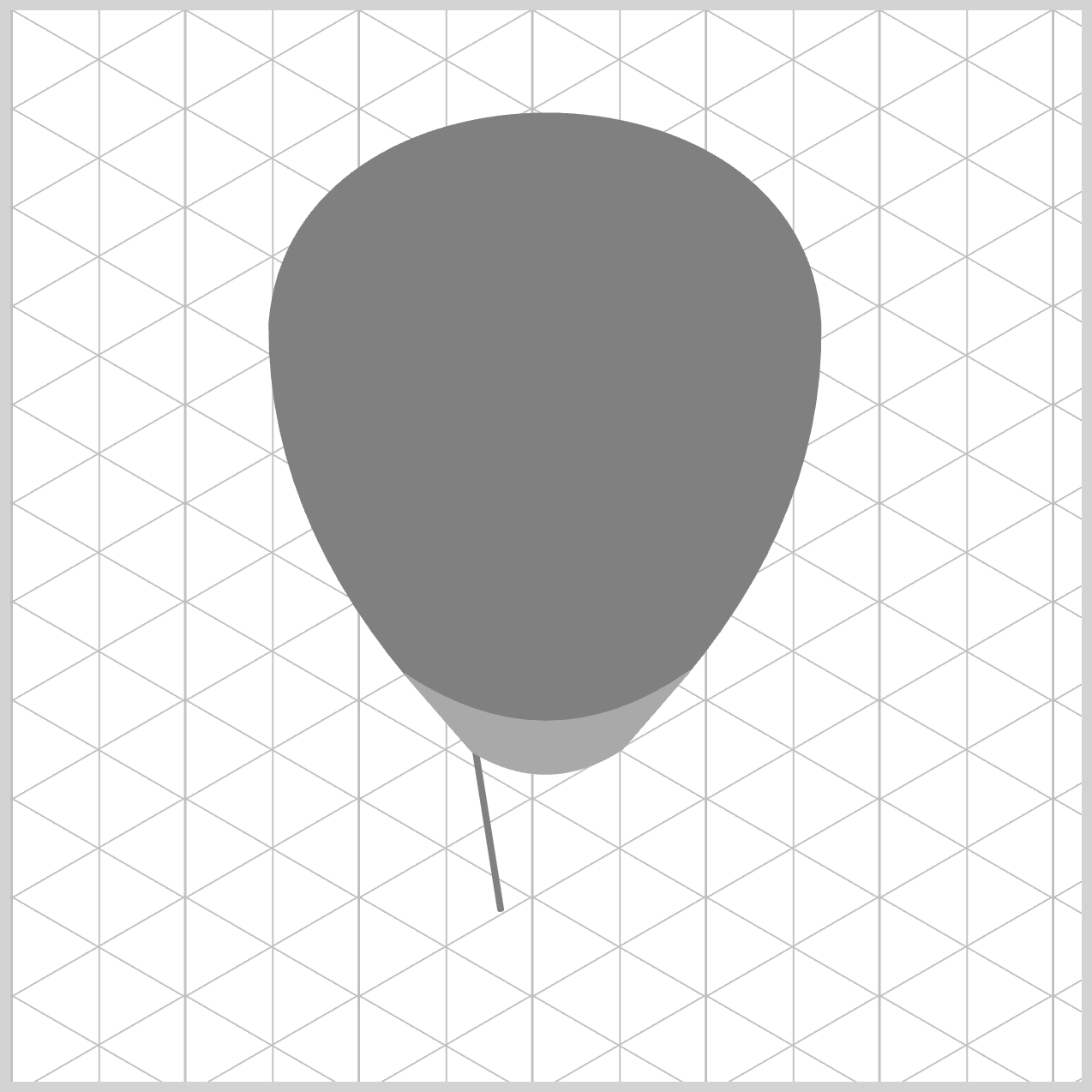
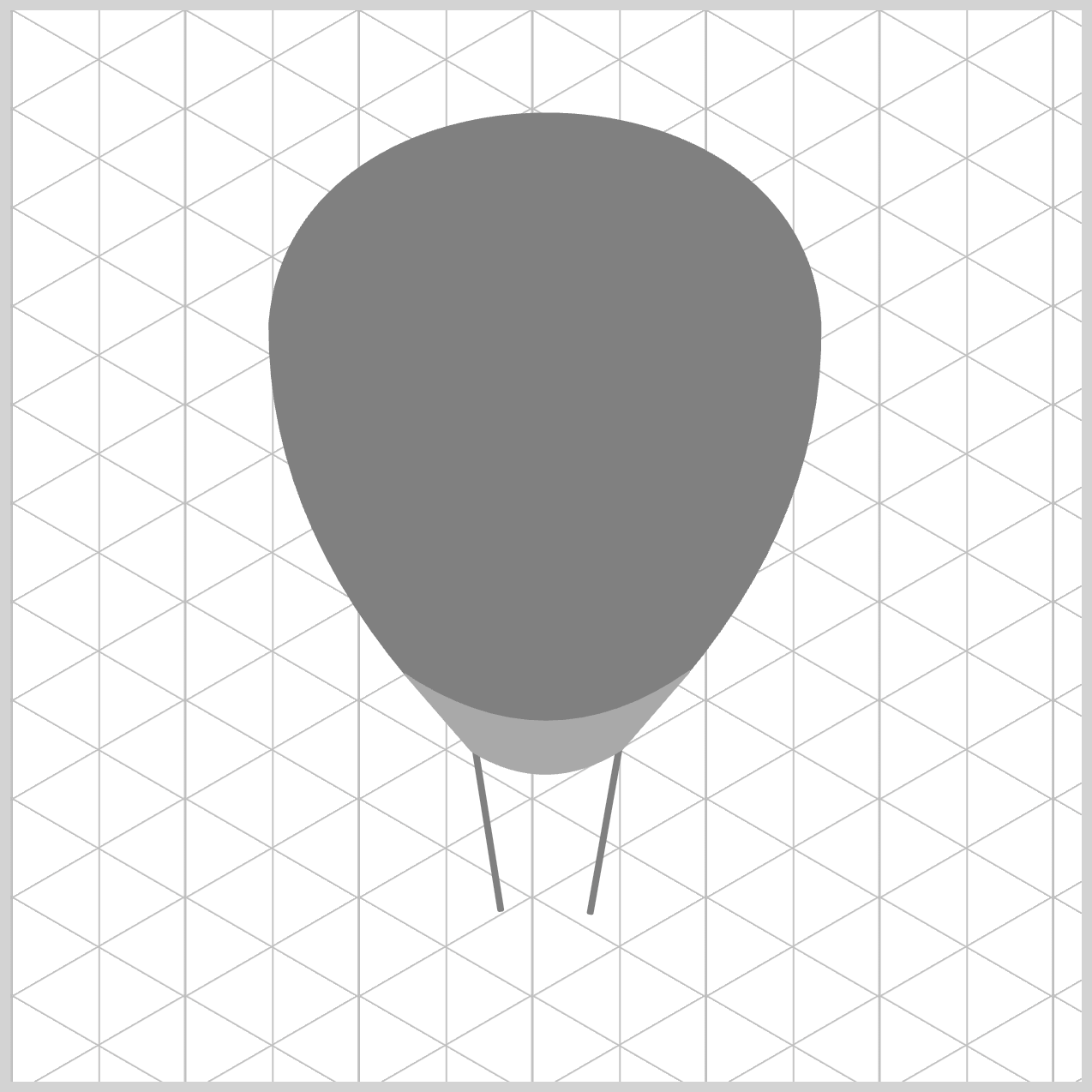
Preview

Hot air balloon components:
- Envelope
- Skirt
- Riggings
- Basket (Rim, Body, and Base)
Prerequisites
Essential CSS and HTML knowledge will help you understand the concepts and techniques introduced in this article. Jump over to this article if you require an HTML and CSS primer.
We assume you have configured tools to modify CSS. If not, this article will guide you through the setup process.
HTML Structure
<div class="container">
  <div class="envelope"></div>
  <div class="basket-base"></div>
  <div class="rigging-back"></div>
  <div class="basket-rim"></div>
  <div class="basket-body"></div>
  <div class="rigging-front"></div>
  <div class="skirt"></div>
</div>
container is the outermost enclosure. It enables the content to be centered and draws a light gray border. The rest of the <div>s represent each image component.
Keep the HTML structure as is for the image to display correctly.
Body and Container <div> CSS
CSS code for the body and container <div>.
/* Body and Container Settings */
/* Center shapes */
body {
  margin: 0;
  padding: 0;
  height: 100vh;
  display: flex;
  justify-content: center;
  align-items: center;
  flex-wrap: wrap;
}

/* Set background and border color */
.container {
  min-width: 500px;
  height: 500px;
  border: 5px solid lightgray;
  background: white;
  position: relative;
  margin: 5px;
  display: flex;
  justify-content: center;
  align-items: center;
  overflow: hidden;

  /* Isometric Grid Guide */
  background: repeating-linear-gradient(
      150deg,
      #ccc,
      #bbb 0.5px,
      transparent 1px,
      transparent 40px
    ),
    repeating-linear-gradient(
      30deg,
      #ccc,
      #bbb 0.5px,
      transparent 1px,
      transparent 40px
    ),
    repeating-linear-gradient(
      90deg,
      #ccc,
      #bbb 1px,
      transparent 1px,
      transparent 41px
    );
  background-size: 81px 46px;
}
Common Properties, CSS shape() Function, and Isometric Grid Guide
Common properties are combined for code brevity.
/* Common Properties */
.envelope,
.skirt,
.rigging-front,
.rigging-front::before,
.rigging-back,
.rigging-back::before,
.basket-body,
.basket-body::before,
.basket-base,
.basket-rim {
  position: absolute;
}
Read this article for an introduction to the CSS shape() function.
 Pyxofy
shape() commands and parameters guide.
 Pyxofy
This article details how to create an isometric grid guide.
 Pyxofy
Let’s start on the hot air balloon envelope component in the next section.
Hot Air Balloon Envelope
The hot air balloon envelope is the biggest component you will create using the CSS shape() function. You will combine several shape() commands and parameters to make it.

/* Envelope */
.envelope {
  width: 259px;
  height: 288px;
  top: 46px;
  left: 120.5px;
  background: gray;
}
The envelope starts as a vertically elongated rectangle, 259px wide and 288px tall. It’s positioned 46px from the top and 120.5px from the left edge. The background color is set to gray.

.envelope {
  clip-path: shape(
    from 0px 100px,
    curve to 258px 100px with 10px -31px / 250px -31px,
  );
}
- The
from <coordinate-pair>sets the starting position of the shape at0pxon the horizontal or x-axis and100pxon the vertical or y-axis. - The
<curve-command>indicated ascurve to 258px 100pxadds a Bézier curve, ending at258pxon the x-axis and100pxon the y-axis. with 10px -31px / 250px -31pxcreates a cubic Bézier curve by adding two control points. The first control point coordinates are set to10px -31px, and the second control point is set to250px -31px.

.envelope {
  clip-path: shape(
    from 0px 100px,
    curve to 258px 100px with 10px -31px / 250px -31px,
    curve to 174px 288px with 260px 200px,
  );
}
curve to 174px 288px with 260px 200px creates a quadratic Bézier curve starting from the previous 258px 100px coordinate pair and ending at 174px on the x-axis and 288px on the y-axis. The single control point, with 260px 200px, sets the control point coordinates to 260px on the horizontal axis and 200px on the vertical axis.

.envelope {
  clip-path: shape(
    from 0px 100px,
    curve to 258px 100px with 10px -31px / 250px -31px,
    curve to 174px 288px with 260px 200px,
    line to 85px 288px,
  );
}
A straight line is drawn from the lower right corner to the left, using line to 85px 288px. The horizontal endpoint is 85px, while the vertical coordinate 288px stays similar to the previous curve command.

.envelope {
  clip-path: shape(
    from 0px 100px,
    curve to 258px 100px with 10px -31px / 250px -31px,
    curve to 174px 288px with 260px 200px,
    line to 85px 288px,
    curve to 0px 100px with -1px 200px,
    close
  );
}
To complete the envelope component, a curve is drawn from the lower left corner using curve to 0px 100px with -1px 200px.
- The curve destination is set to
0px 100px, which is the starting point of the envelope. - A control point is positioned at
-1px 200pto adjust the curvature. - The
closecommand effectively closes the envelope shape.
Hot Air Balloon Skirt
The hot air balloon skirt is at the base of the envelope component and connects it to the rest of the hot air balloon parts.

/* Skirt */
.skirt {
  width: 133px;
  height: 50px;
  top: 308px;
  left: 184px;
  background: darkgray;
}
The skirt begins as a rectangle measuring 133px in width and 50px in height. It is placed 308px from the top and 184px from the left edge. The background color is darkgray.

.skirt {
  clip-path: shape(
    from 134px 0px,
    line to 102px 37px,
    curve to 31px 38px with 66.5px 60px,
    line to -2px 0px,
    curve to 133px 0px with 66.5px 47px
  );
}
- The starting point is defined using
from 134px 0px, which is located in the upper right corner. line to 102px 37pxdraws a diagonal line from the starting point to the lower right corner.- The bottom curving section is made using
curve to 31px 38px with 66.5px 60px. The curve destination is set to31pxon the x-axis and38pxon the y-axis. The control point utilizes thewith 66.5px 60pxcoordinate pair to manage the curvature. - Another diagonal line is created with
line to -2px 0px, extending from the bottom left corner to the top left. curve to 133px 0px with 66.5px 47pxcreates the upper curved section and completes the skirt component shape.
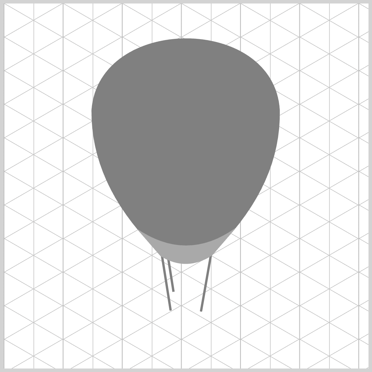
Hot Air Balloon Riggings
The riggings attach the skirt to the hot air balloon basket. You will create four in total—two at the front and two at the back.
/* Riggings */
.rigging-front {
  width: 3px;
  height: 79px;
  top: 342px;
  left: 221px;
  rotate: -9deg;
  background: gray;
  border-radius: 1px;
}
All the riggings are thin, slightly round rectangles. The first rigging, placed on the left side, is 3px wide and 79px high. It’s placed 342px from the top and 221px from the left. You rotate the rigging using rotate: -9deg. The background color is set to gray and has a 1px border radius.
.rigging-front::before {
  content: "";
  width: 3px;
  height: 81px;
  top: 8px;
  left: 54px;
  rotate: 19deg;
  background: inherit;
  border-radius: inherit;
}
The second front rigging, located on the left side, is rotated by 19 degrees. The rest of the settings are similar to the previous rigging.
.rigging-back {
  width: 3px;
  height: 47px;
  top: 348px;
  left: 227.5px;
  rotate: -9deg;
  background: gray;
}
The first back rigging, placed on the left side, has a width of 3px and 47px high. Similar to the first rigging, it’s rotated by -9 degrees.
.rigging-back::before {
  content: "";
  width: 3px;
  height: 47px;
  top: 6px;
  left: 41.5px;
  rotate: 18deg;
  background: inherit;
}
The last back rigging, located on the right side, is rotated by 18 degrees.
Let’s work on the air balloon basket rim in the next section.
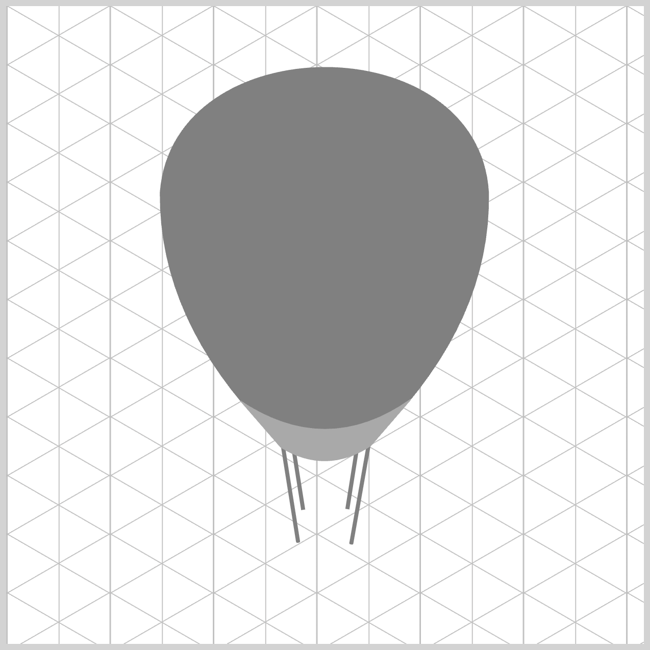
Hot Air Balloon Basket Rim
In this hot air balloon example, the rigging attaches to the elliptical basket rim, which is the first part of the basket component.

/* Basket Rim */
.basket-rim {
  width: 70px;
  height: 42px;
  top: 386px;
  left: 215px;
  background: lightgray;
}
The width is set to 70px, and the height property value is set to 42px. The basket rim is positioned 386px from the top and 215px from the left. The background color is set to lightgray.

/* Basket Rim */
.basket-rim {
  border-radius: 95px/55px;
}
Setting the border radius property to 95px/55px gives the horizontal curve a 95px radius and the vertical curve a 55px radius.
Up next is the basket body.
Hot Air Balloon Basket Body
The basket body is made up of two ellipses, mimicking an isometric view that reveals the interior of the basket.

/* Basket Body */
.basket-body {
  width: 56px;
  height: 31px;
  top: 393px;
  left: 222px;
  background: gray;
}
The basket body begins as a rectangle measuring 56px in width and 31px in height. It is positioned 393px from the top and 222px from the left, with gray set as the background color.

.basket-body {
  border-radius: 95px/55px;
}
To transform the rectangle to an ellipse, you set the border radius property value to 95px/55px.

.basket-body::before {
  content: "";
  width: 42px;
  height: 13px;
  top: 18px;
  left: 7px;
  background: darkgray;
}
The second ellipse, which simulates the bottom of the basket body, is 42px wide and 13px high and has a darkgray background.

.basket-body::before {
  border-radius: 50%;
}
To round out the rectangle borders, set its border radius to 50%.
Let’s work on the basket base in the next section.
Hot Air Balloon Basket Base
The basket base features rounded bottom corners and is the largest part of the basket.

/* Basket Base */
.basket-base {
  width: 65px;
  height: 60px;
  top: 392px;
  left: 217.5px;
  background: gray;
}
- The width property value is set to
65pxand the height is60px. - The basket base is placed
392pxfrom the top and217.5pxfrom the left edge. grayis set as the background color.

.basket-base {
  border-radius: 95px/66px;
}
Both the horizontal and vertical border radii are set to 95px and 66px, respectively.
You can see and play with the complete code on Pyxofy’s CodePen page.
See the Pen CSS Art - CSS shape() & Gradients: Create an Isometric Hot Air Balloon by Pyxofy (@pyxofy) on CodePen.
Conclusion
In part 1 of this two-part article series, you learned to make the hot air balloon’s components using the CSS shape() function. By combining the shape() with other CSS properties such as border-radius and the ::before pseudo-element, you were able to create isometric, 3D-like shapes.
In part 2 of this article series, you’ll create a custom color palette and learn how to use CSS custom properties (variables) to apply colors to the hot air balloon components.
What fascinating, 3D-like images will you create using shape()? Share your masterpiece with us on LinkedIn, Threads, Bluesky, Mastodon, X (Twitter) @pyxofy, or Facebook.
We hope you liked this article. Kindly share it with your network. We appreciate it.
Related Articles
 Pyxofy
 Pyxofy
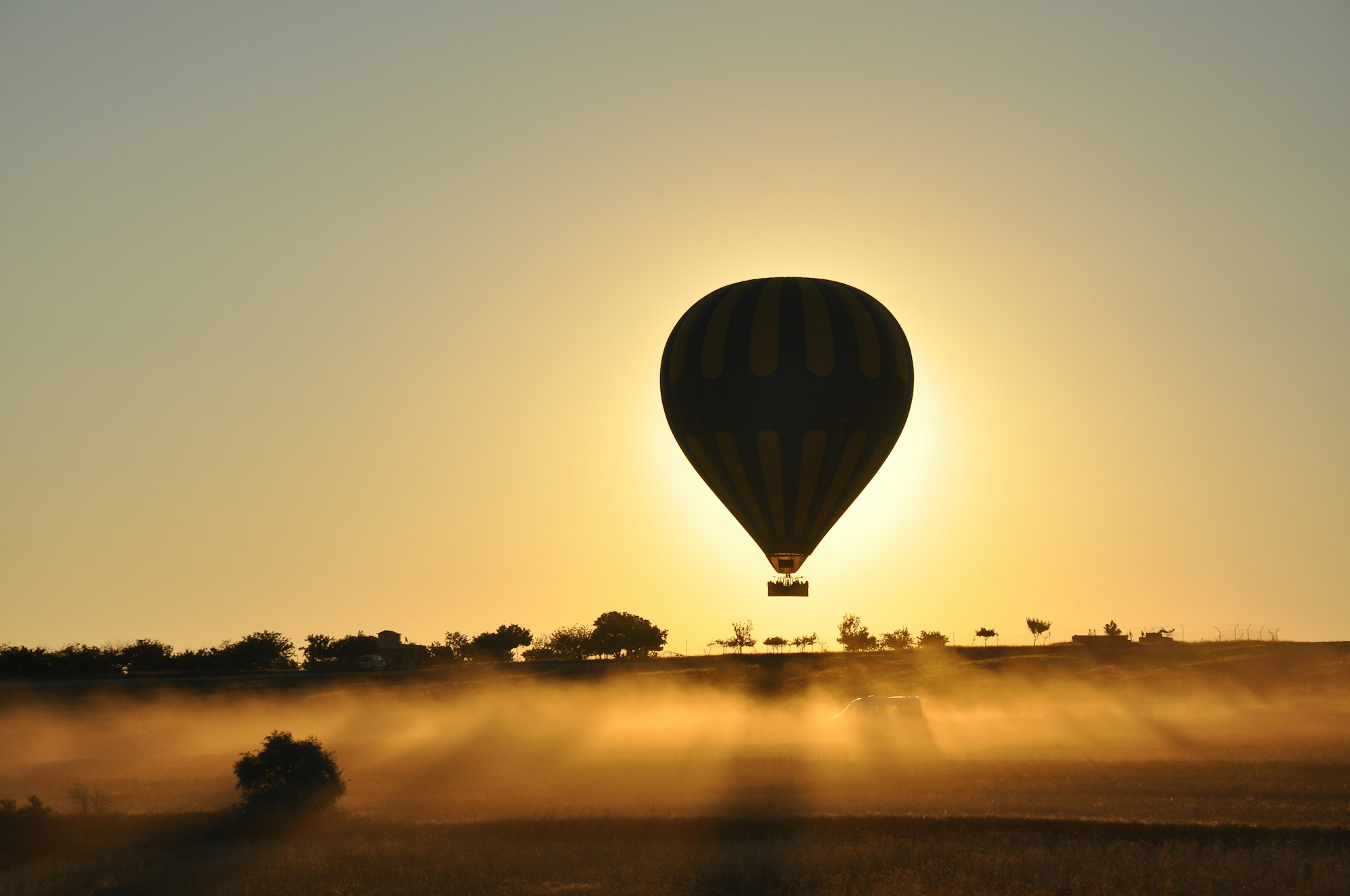
 Pyxofy
 Pyxofy