CSS Animation – Text Background Animation
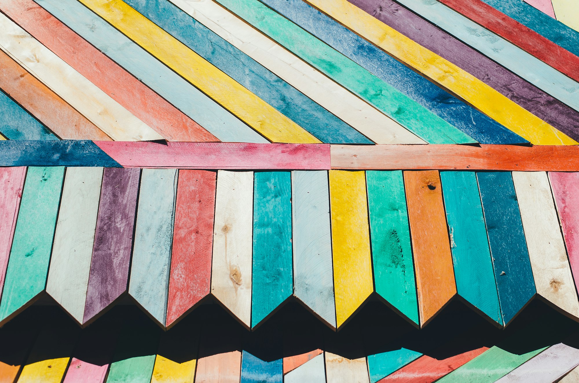
Do you love lava lamps, swirling colors, and flashy stripes? In this step-by-step article, we’ll learn how to make animated gradients in CSS.
Introduction
Color gradients combined with text mask produces stunning background animation effects. You can use this technique to make eye-catching headlines, making your content pop from the rest.
You’ll learn to create two animations in this article.
- Gradient text background
- Stripe text background
If you’re new to CSS gradients, read this article to get familiar with how they work.
 Pyxofy
Preview
Gradient Text Background Animation

Stripe Text Background Animation

Prerequisites
Basic CSS and HTML knowledge will help you understand the concepts and techniques introduced in this article. Jump over to this article if you require an HTML and CSS primer.
We assume that you have set up tools to create CSS animation. If you haven’t, this article will show you how to set them up.
If you’re unfamiliar with CSS animation and the @keyframes at-rule property, please read this article.
HTML Structure
<!-- Gradient Text Background -->
<div class="container">
  <div class="gradient-container">
    <p class="gradient-background">CSS Text Animation!</p>
  </div>
</div>

<!-- Stripe Text Background -->
<div class="container">
  <div class="stripe-container">
    <p class="stripe-background">Stripe Text Animation!</p>
  </div>
</div>
container is the outermost enclosure. It enables the content to be centered and draws a light gray border. The rest of the divs represent each animation sequence.
Keep the HTML structure as is for each animation to display properly.
Body and Container Div CSS
CSS code for the body and container div.
/* Body and Container Settings */
/* Center shapes */
body {
  margin: 0;
  padding: 0;
  height: 100vh;
  display: flex;
  justify-content: center;
  align-items: center;
  flex-wrap: wrap;
}

/* Set background and light gray border */
.container {
  width: 500px;
  height: 500px;
  border: 5px solid lightgray;
  background: transparent;
  position: relative;
  margin: 5px;
  display: flex;
  justify-content: center;
  align-items: center;
}
Gradient Text Background Animation

The gradient text animation and the stripe animation consist of three components.
- Gradient background
- Text mask
- Animation
Gradient text animation CSS code.
/* Gradient Container */
.gradient-container {
  width: 500px;
  height: 500px;
  font: 900 5.5em sans-serif;
  text-align: center;
  display: flex;
  justify-content: center;
  align-items: center;
  background: black;
}

/* Background Gradient */
.gradient-background {
  background: linear-gradient(
    90deg,
    #4169e1,
    #5768df,
    #8164d7,
    #aa60c8,
    #cc60b3,
    #e3689c,
    #ed7889,
    #ee8c7e,
    #e99e7c,
    #e4ac7f,
    #e0b585,
    #deb887,
    orange
  );
  background-size: 200%;
  /* Background Text Clip */
  /* webkit vendor prefix start */
  -webkit-background-clip: text;
  -webkit-text-fill-color: transparent;
  /* webkit vendor prefix end */
  background-clip: text;
  animation: gradient-text-animation 3s alternate infinite;
}

/* Gradient Text Animation */
@keyframes gradient-text-animation {
  from {
    background-position: 0 50%;
  }
  50% {
    background-position: 100% 50%;
  }
  to {
    background-position: 0 50%;
  }
}
Let’s deep dive on each component.
First, the gradient background.

CSS code producing the gradient background.
/* Background Gradient */
.gradient-background {
  background: linear-gradient(
    90deg,
    #4169e1,
    #5768df,
    #8164d7,
    #aa60c8,
    #cc60b3,
    #e3689c,
    #ed7889,
    #ee8c7e,
    #e99e7c,
    #e4ac7f,
    #e0b585,
    #deb887,
    orange
  );
  background-size: 200%;
}
The CSS linear-gradient() function is used to produce the gradient.
#4169e1, #5768df, #8164d7are RGB hexadecimal string notation values commonly referred to as Hex colors. You can use gradient generator apps such as this to generate unique color combinations.- The
background-sizeis set to200%. Setting the background size to double its container size enables a smooth transition between the start and end hex color gradient. - The gradient angle is set to
90deg, but you can change this to any angle that suits your taste.
Second, the static text and text mask.

/* Gradient Container */
.gradient-container {
  width: 500px;
  height: 500px;
  font: 900 5.5em sans-serif;
  text-align: center;
  display: flex;
  justify-content: center;
  align-items: center;
  background: black;
}
The static text properties are set to:
- Font weight:
900
You can change the font weight value to400for a non bold, normal font weight. - Font size:
5.5em
By adjusting the font size from5.5emto another value, you can increase or decrease its size. - Font family:
sans-serif
Besidessans-serif, you can change the font family tocursive,seriforGeorgia. Check this guide for more details about font family property values.
Take note, for the sample image, the background is set to a light color for the text to be visible.
Let’s explore the text mask.

/* Background Gradient */
.gradient-background {
  /* Background Text Clip */
  /* webkit vendor prefix start */
  -webkit-background-clip: text;
  -webkit-text-fill-color: transparent;
  /* webkit vendor prefix end */
  background-clip: text;
}
background-clip: text and vendor prefix version -webkit-background-clip: text CSS property sets whether an element's background extends underneath its border box, padding box, or content box. Combined with -webkit-text-fill-color: transparent, it allows the background gradient to shine through the text, simulating a text mask effect.
At the time of this writing, Chromium-based browsers required the vendor prefix for the text mask effect to work.
Third, the animation.
/* Background Gradient */
.gradient-background {
  animation: gradient-text-animation 3s alternate infinite;
}
Animation is set inside the .gradient-background class.
- The animation name is set to
gradient-text-animation. - The animation duration is three seconds,
3s. alternateis set for the animation direction property.infiniteis set for animation iteration. The animation will loop.
/* Gradient Text Animation */
@keyframes gradient-text-animation {
  from {
    background-position: 0 50%;
  }
  50% {
    background-position: 100% 50%;
  }
  to {
    background-position: 0 50%;
  }
}
The background animates sideways. It moves from left to right and then back.
background-position: 0 50%;sets the background to start from its left edge.background-position: 100% 50%;moves the background so that its right edge is visible.
This wraps up our first example.
In the next section, you’ll use the CSS repeating-linear-gradient to produce a stripe background animation.
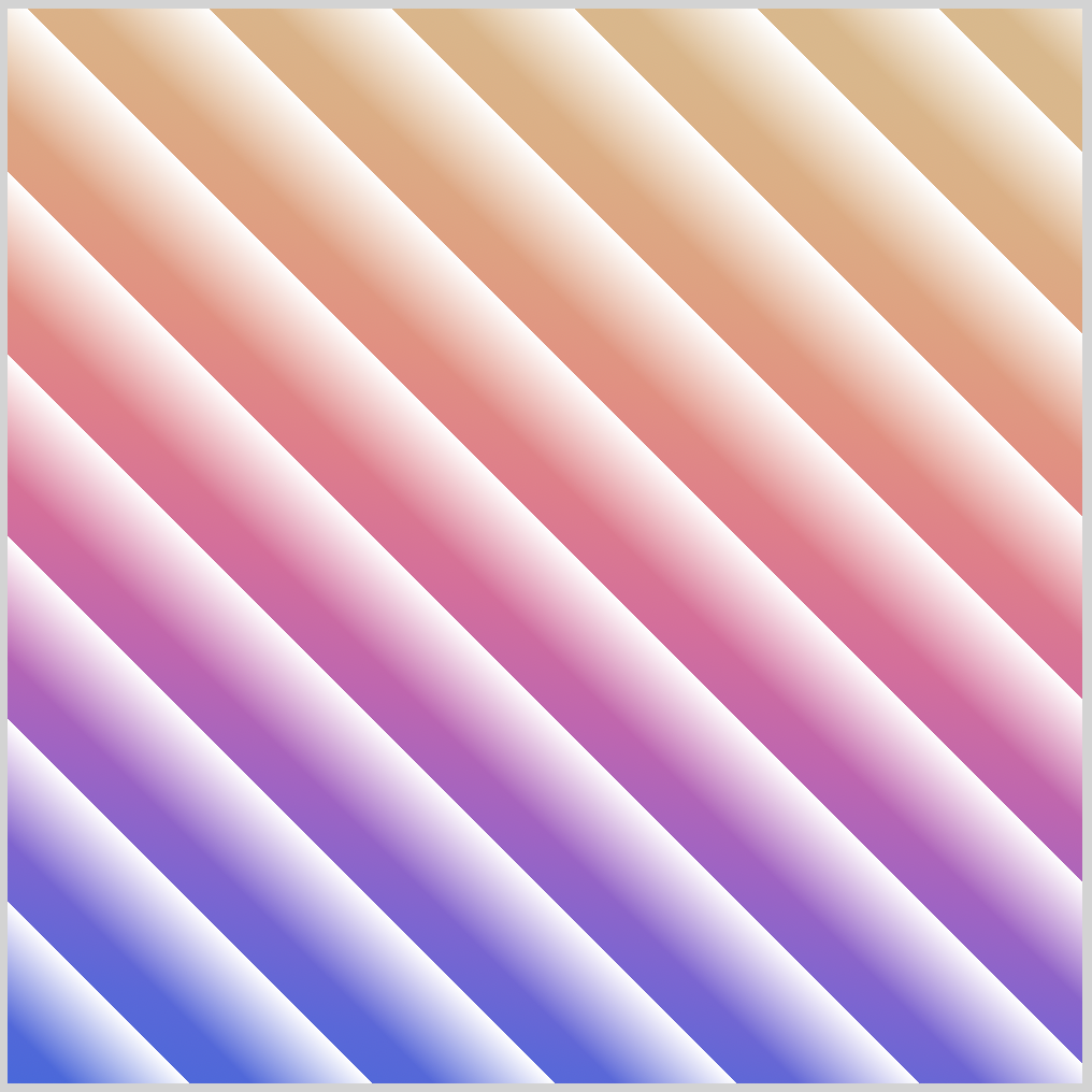
Stripe Text Background Animation

In this section, the CSS repeating-linear-gradient function is used to generate a stripe gradient background.
For brevity, only CSS code that differs from the previous Gradient Text Background Animation section is explained.
/* Stripe Background Gradient */
.stripe-background {
  background: repeating-linear-gradient(
      45deg,
      transparent,
      transparent 20px,
      white 60px
    ),
    linear-gradient(
      10deg,
      royalblue,
      #5768df,
      #8164d7,
      #aa60c8,
      #cc60b3,
      #e3689c,
      #ed7889,
      #ee8c7e,
      #e99e7c,
      #e4ac7f,
      #e0b585,
      burlywood
    );
}
The stripe background gradient combines repeating-linear-gradient and linear-gradient CSS functions.
The code within the repeating-linear-gradient function produces the white stripes. You can change the angle of the stripe by changing 45deg to another value. Try changing it to 90deg or 240deg.
You can adjust transparent 20px and white 60px to a different value to increase or decrease the stripe width.

The hex colors in the linear-gradient function produces the color gradient. Don’t hesitate to change the hex color values or the angle, 10deg, to your liking.
/* Stripe Text Animation */
@keyframes stripe-text-animation {
  from {
    background-position: 0px 100px;
  }

  to {
    background-position: 300px 300px;
  }
}
The background animates diagonally,
- from the top-left corner,
background-position: 0px 100px; - to the bottom-right corner,
background-position: 300px 300px;.
You can change the animation direction by adjusting the background-position property values. Increase or decrease the pixel values, see how it changes the background animation.
Full stripe text animation CSS code for your reference.
/* Stripe Container */
.stripe-container {
  width: 500px;
  height: 500px;
  font: 900 5.5rem sans-serif;
  text-align: center;
  display: flex;
  justify-content: center;
  align-items: center;
  background: black;
}

/* Stripe Background Gradient */
.stripe-background {
  background: repeating-linear-gradient(
      45deg,
      transparent,
      transparent 20px,
      white 60px
    ),
    linear-gradient(
      10deg,
      royalblue,
      #5768df,
      #8164d7,
      #aa60c8,
      #cc60b3,
      #e3689c,
      #ed7889,
      #ee8c7e,
      #e99e7c,
      #e4ac7f,
      #e0b585,
      burlywood
    );
  /* Background Text Clip */
  /* webkit vendor prefix start */
  -webkit-background-clip: text;
  -webkit-text-fill-color: transparent;
  /* webkit vendor prefix end */
  background-clip: text;
  animation: stripe-text-animation 3s alternate infinite;
}

/* Stripe Text Animation */
@keyframes stripe-text-animation {
  from {
    background-position: 0px 100px;
  }

  to {
    background-position: 300px 300px;
  }
}
Hop over to Pyxofy’s CodePen page to play with the full CSS and HTML code.
See the Pen CSS Animation – Text Background Animation by Pyxofy (@pyxofy) on CodePen.
Conclusion
You learned to combine repeating-linear-gradient and linear-gradient CSS function to create striped gradients.
By making the background bigger than its container, you animated the background gradient in diverse direction, from left to right, diagonally, from top-left to bottom-right.
You learned how to combine background-clip: text and -webkit-text-fill-color: transparent to simulate text masks.
Play around with the examples, change the CSS property values to your hearts content. Then share your masterpiece with us on Twitter @pyxofy, on LinkedIn, Mastodon or Facebook.
We hope you liked this article. Kindly share it with your network. We really appreciate it.
Related Articles
Pyxofy
 Pyxofy
 Pyxofy