CSS Animation – Mastering Split Animations using CSS Translate and Keyframes
Create stunning CSS animations that group and split like magic! Follow our step-by-step article and bring your designs to life.

Introduction
Group and split animations are a visually captivating way to bring your web pages to life—and they’re also a fantastic opportunity to sharpen your CSS and HTML skills.
In this article, you’ll discover how to group multiple HTML elements and animate them using pure CSS—no JavaScript required. Whether you're just starting out or looking to level up your front-end development game, this article will walk you through the process step by step.
CSS functions and properties introduced in this article include:
cubic-beziertranslate- CSS Custom Properties (Variables)
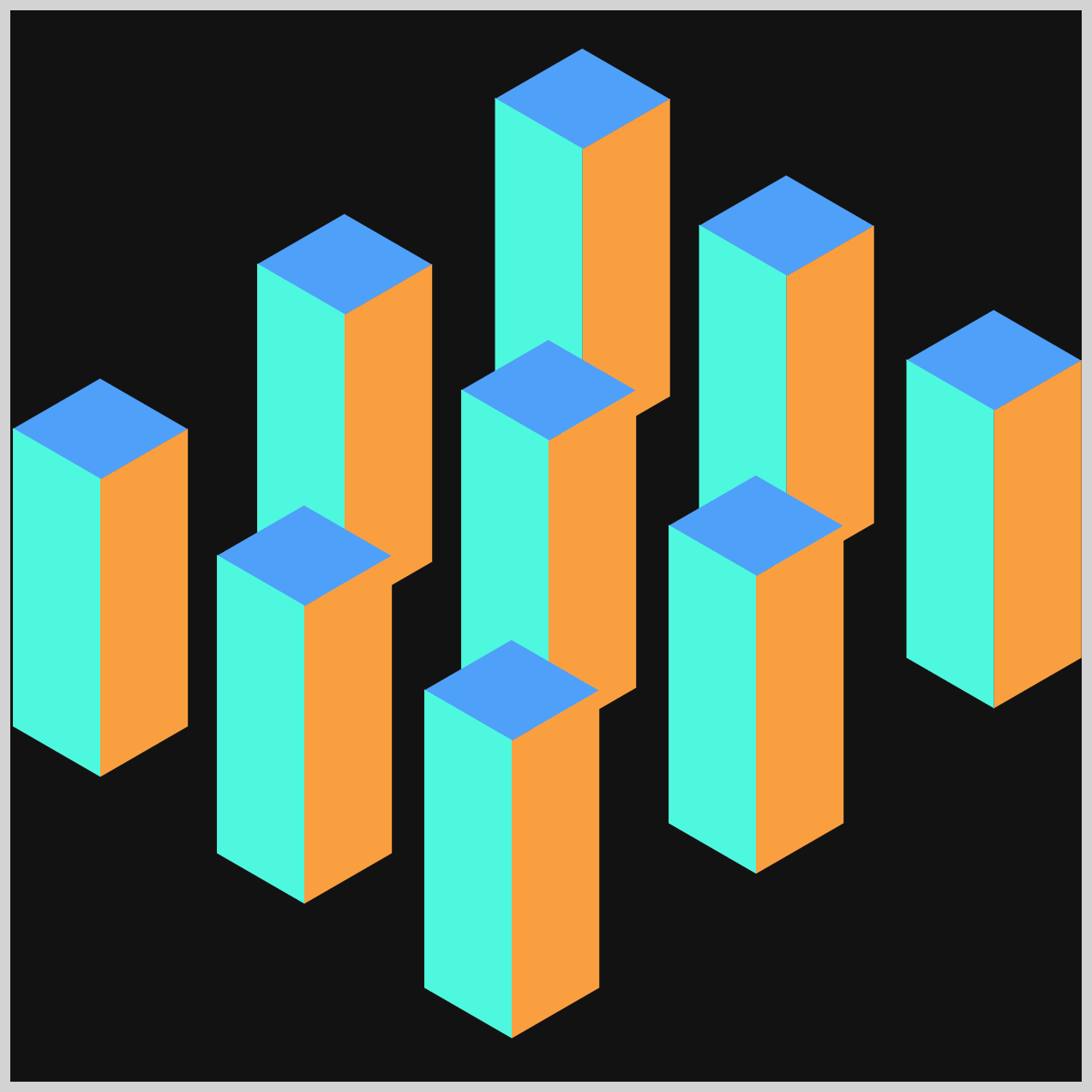
Preview

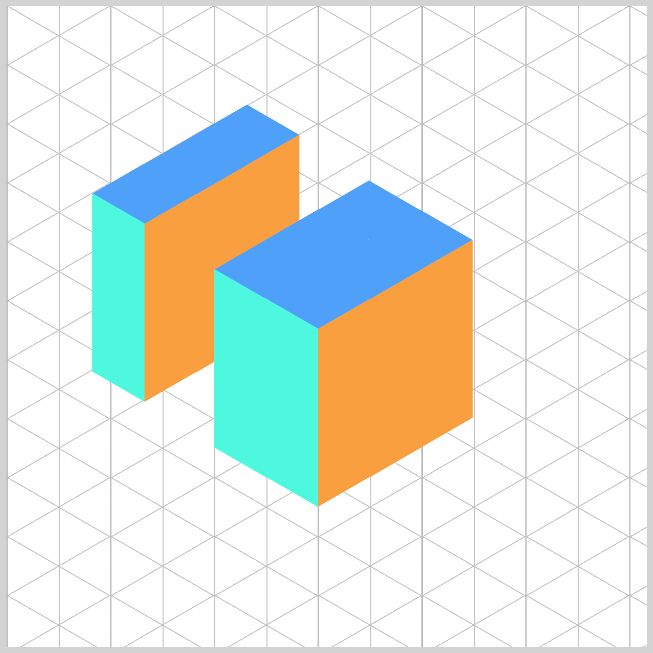
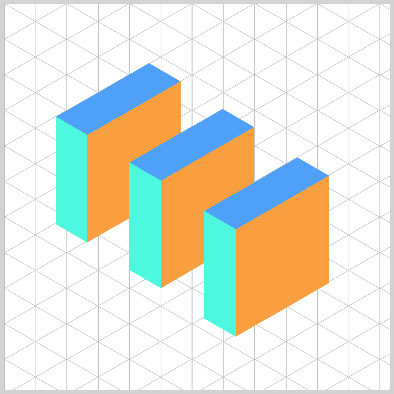
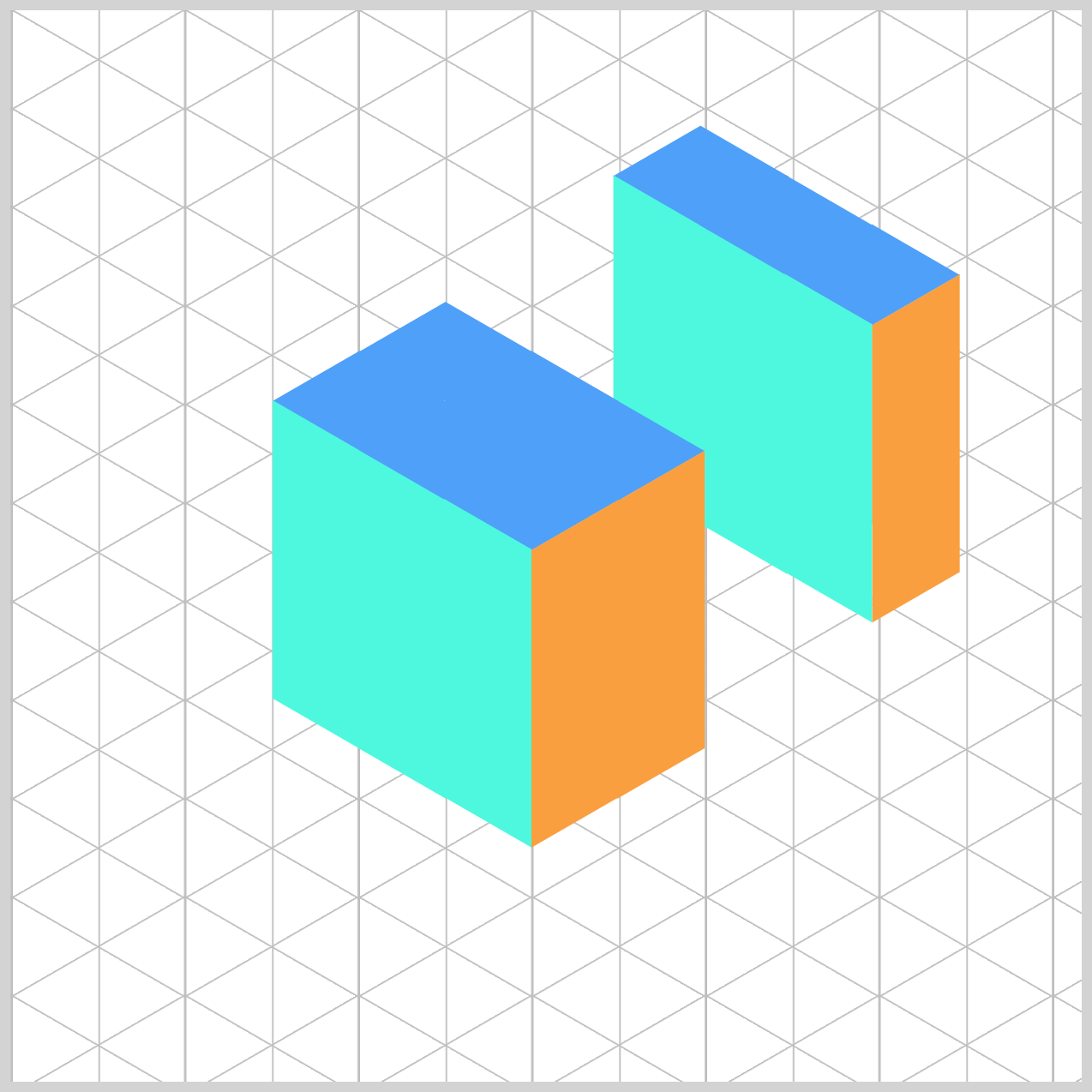
You will learn to animate the isometric towers created in this article.
By building on the original design, we’ll explore how to bring these 3D-like structures to life using pure CSS animations
 Pyxofy
Prerequisites
Essential CSS and HTML knowledge will help you understand the concepts and techniques introduced in this article. Jump over to this article if you require an HTML and CSS primer.
We assume you have configured tools to modify CSS. If not, this article will guide you through the setup process.
Please read this article if you’re unfamiliar with CSS animation and the @keyframes at-rule property.
HTML Structure
<div class="container">
  <div class="group-1">
    <div class="tower-1 split-right">
      <div class="isometric-tower-top"></div>
      <div class="isometric-tower-right"></div>
      <div class="isometric-tower-left"></div>
    </div>
    <div class="tower-2 split-middle">
      <div class="isometric-tower-top"></div>
      <div class="isometric-tower-right"></div>
      <div class="isometric-tower-left"></div>
    </div>
    <div class="tower-3 split-left">
      <div class="isometric-tower-top"></div>
      <div class="isometric-tower-right"></div>
      <div class="isometric-tower-left"></div>
    </div>
  </div>
  <div class="group-2">
    <div class="tower-4 split-right">
      <div class="isometric-tower-top"></div>
      <div class="isometric-tower-right"></div>
      <div class="isometric-tower-left"></div>
    </div>
    <div class="tower-5 split-middle">
      <div class="isometric-tower-top"></div>
      <div class="isometric-tower-right"></div>
      <div class="isometric-tower-left"></div>
    </div>
    <div class="tower-6 split-left">
      <div class="isometric-tower-top"></div>
      <div class="isometric-tower-right"></div>
      <div class="isometric-tower-left"></div>
    </div>
  </div>
  <div class="group-3">
    <div class="tower-7 split-right">
      <div class="isometric-tower-top"></div>
      <div class="isometric-tower-right"></div>
      <div class="isometric-tower-left"></div>
    </div>
    <div class="tower-8 split-middle">
      <div class="isometric-tower-top"></div>
      <div class="isometric-tower-right"></div>
      <div class="isometric-tower-left"></div>
    </div>
    <div class="tower-9 split-left">
      <div class="isometric-tower-top"></div>
      <div class="isometric-tower-right"></div>
      <div class="isometric-tower-left"></div>
    </div>
  </div>
</div>
container is the outermost enclosure. It enables the content to be centered and draws a light gray border. The rest of the <div>s represent each animation sequence.
Keep the HTML structure as is for the animation to display correctly.
Body and Container <div> CSS
CSS code for the body and container <div>.
/* Body and Container Settings */
/* Center shapes */
body {
  margin: 0;
  padding: 0;
  height: 100vh;
  display: flex;
  justify-content: center;
  align-items: center;
  flex-wrap: wrap;
}

/* Set background and border color */
.container {
  width: 500px;
  height: 500px;
  border: 5px solid lightgray;
  background: #121212;
  position: relative;
  margin: 5px;
  display: flex;
  justify-content: center;
  align-items: center;
  overflow: hidden;
}
Animation Custom Properties
Using CSS Custom Properties—also known as CSS Variables—to define animation settings can greatly simplify your workflow. Instead of manually updating each instance of an animation value throughout your code, you can make changes in one place. This not only saves time but also keeps your styles clean, consistent, and easy to maintain.
/* Custom Properties */
:root {
  /* Tower Animation Properties */
  --animation-length: 5s;
  --animation-easing: cubic-bezier(0.68, -0.41, 0.265, 1);
  --animation-iteration: infinite;
}
Tower animation properties:
- Five seconds or
5sis set as the animation length. - The animation easing function is set to
cubic-bezier(0.68, -0.41, 0.265, 1). - The animation loops infinitely with
infiniteset as the animation iteration value.
Tower Group Animation
We’ll begin with an isometric cube as the foundation. From there, we’ll build three distinct groups of towers—each group containing three towers stacked vertically. These groups will be named group-1, group-2, and group-3. Once the structure is in place, we’ll animate the groups to create a dynamic split effect using only CSS.
This approach not only adds visual interest but also helps reinforce key concepts like grouping elements, using CSS variables, and applying animations in a modular way.

Group 1
Group 1 represents the left face of the isometric cube. In this animation, the entire group will smoothly separate from the cube and move toward the left edge of the container. This creates a dynamic “split” effect, giving the illusion that the cube is breaking apart into distinct sections.
By isolating and animating this group, you’ll learn how to control movement using CSS, while keeping your layout structured and modular.
/* Tower Groups */
.group-1 {
  animation: group-1 var(--animation-length) var(--animation-easing)
    var(--animation-iteration);
}
Group 1’s animation is defined using the animation name group-1. The rest of the animation settings—such as duration, timing function, and transform values—are managed using CSS custom properties. These variables are outlined in detail in the Animation Custom Properties section, making it easy to maintain and update your animation logic.
Group 3 will use the same set of custom properties, with the only difference being its animation name (group-3). This approach keeps your code clean, consistent, and scalable—especially when working with multiple animated elements.
/* Animation */
@keyframes group-1 {
  0%,
  100% {
    top: 206px;
    left: 163px;
  }
  50%,
  80% {
    top: 170px;
    left: 108px;
  }
}
Between the 0% and 100% keyframes of the animation, Group 1 maintains its original position with top: 206px and left: 163px. This ensures the group starts and ends in the same place, creating a smooth loop.
During the middle phase of the animation—specifically between the 50% and 80% keyframes—Group 1 shifts to a new position: top: 170px and left: 108px. This movement creates the visual effect of the group sliding toward the left edge of the container before returning to its original spot.
By defining these keyframes, you control the timing and direction of the animation, making it easy to adjust or reuse for other groups.
Group 3
Group 3 represents the right face of the isometric cube. In this animation, the group will split away from the cube and move toward the right edge of the container, creating a balanced visual effect alongside Group 1’s leftward movement.
It’s important to note that Group 2—the middle section of the cube—remains static and unanimated. This contrast helps emphasize the motion of the outer groups and reinforces the cube’s structure during the animation sequence.
.group-3 {
  animation: group-3 var(--animation-length) var(--animation-easing)
    var(--animation-iteration);
}
Group 3’s animation is assigned the name group-3. Aside from the animation name, all other property values—such as duration, easing, and keyframe positions—are identical to those used for Group 1.
@keyframes group-3 {
  0%,
  100% {
    top: 252px;
    left: 243px;
  }
  50%,
  80% {
    top: 292px;
    left: 300px;
  }
}
- At both the
0%and100%keyframes, Group 3 is positioned attop: 252pxandleft: 243px, ensuring it starts and ends in the same location. - Between the
50%and80%keyframes, the group shifts totop: 292pxandleft: 300px, creating a smooth rightward motion before returning to its original position.
In the next section, let’s start working on the split group animation.
Split Group Animation
The split group animation breaks the isometric cube into three distinct parts—Split Right, Split Middle, and Split Left. To create the illusion of movement, we use the CSS translate property, which allows us to shift each group’s position smoothly within the container.
By applying translate transformations within keyframes, we can animate each group independently while maintaining a cohesive overall effect.

Split Right
The Split Right animation targets the top-right portion of the isometric cube. This group will gently shift to the right using the CSS translate property, then return to its original position. The movement adds a subtle but dynamic effect, enhancing the illusion of the cube breaking apart and reassembling.
/* Split Groups */
.split-right {
  animation: split-right var(--animation-length) var(--animation-easing)
    var(--animation-iteration);
}
The Split Right animation is assigned the name split-right. All other animation properties—such as duration, easing, and transform values—are managed using CSS custom properties, which are detailed in the Animation Custom Properties section.
This setup allows you to reuse the same animation structure across multiple groups, simply by changing the animation name.
This modular approach keeps your code clean and makes it easy to maintain or update animations for other split groups, like split-left or split-middle, without duplicating styles.
/* Animation */
@keyframes split-right {
  0%,
  40%,
  100% {
    translate: 0px 0px;
  }
  50%,
  80% {
    translate: 79px -59px;
  }
}
- At the
0%,40%, and100%keyframes, the element remains in its original position usingtranslate(0px, 0px). This ensures the animation starts and ends smoothly without abrupt movement. - Between the
50%and80%keyframes, the element shifts totranslate(79px, -59px), creating a subtle rightward and upward motion. This movement gives the impression that the top-right portion of the cube is temporarily separating before returning to its original place.
Split Middle
The Split Middle animation adds a subtle “pop” effect to split-middle—the center portion of the isometric cube. Unlike the side groups that move outward, this animation gently shifts the middle group toward the top-right, creating a soft bounce that adds balance and rhythm to the overall sequence.
This movement is minimal but effective, helping to break the symmetry just enough to make the animation feel more dynamic and engaging.

.split-middle {
  animation: split-middle var(--animation-length) var(--animation-easing)
    var(--animation-iteration);
}
The animation for the middle group is named split-middle. Like the other split animations, it uses the same set of CSS custom properties for timing, easing, and transform values.
@keyframes split-middle {
  0%,
  40%,
  100% {
    translate: 0px 0px;
  }
  50%,
  80% {
    translate: 8px -5px;
  }
}
At the 0%, 40%, and 100% keyframes, the middle group remains in its original position using translate(0px, 0px). This ensures the animation starts and ends smoothly without any abrupt movement.
Between the 50% and 80% keyframes, the group gently shifts to translate(8px, -5px), creating a subtle upward and rightward bounce. This small motion adds a touch of liveliness to the center of the cube, complementing the more dramatic movements of the side groups.
Split Left
The Split Left animation targets the bottom-left portion of the isometric cube—specifically split-left. This group moves diagonally downward using the CSS translate property, then smoothly returns to its original position. The motion adds depth and contrast to the overall animation sequence, balancing the upward movement of the other groups.

.split-left {
  animation: split-left var(--animation-length) var(--animation-easing)
    var(--animation-iteration);
}
The animation for the bottom-left portion of the cube is named split-left. Like the other split animations (split-right and split-middle), it uses the same set of CSS custom properties for timing, easing, and transform values.
@keyframes split-left {
  0%,
  40%,
  100% {
    translate: 0px 0px;
  }
  50%,
  80% {
    translate: -66px 49px;
  }
}
Split Left is at its original position: translate(0px, 0px) between the 0%, 40%, and 100% keyframes.
At the 50% and 80% keyframes, the split left group moves 66px to the left (negative x) and 49px down (positive y) using translate(-66px, 49px).
This shift creates a dynamic downward-left motion, contrasting nicely with the upward and rightward movements of the other groups.
This completes the animation code for all three split animations—each with its own direction and style, yet unified by shared animation properties
You can see and play with the complete code on Pyxofy’s CodePen page.
See the Pen CSS Animation - Mastering Split Animations using CSS Translate and Keyframes by Pyxofy (@pyxofy) on CodePen.
Conclusion
In this article, you explored how to group multiple HTML elements and animate them using CSS to create a visually engaging split animation sequence. Grouping elements not only helps organize your layout—it also opens the door to creative, dynamic animations that bring your designs to life.
By leveraging CSS Custom Properties, the cubic-bezier() timing function, and the translate transform, you created a spring-like effect that adds energy and flow to your group and split animations. These techniques are powerful tools for building interactive, modern web experiences—all without needing JavaScript.
Now it’s your turn: What kind of group or split animations will you create next? Try experimenting with different directions, timing curves, or even combining multiple effects to see what unique animations you can come up with! Share your masterpiece with us on LinkedIn, Threads, Bluesky, Mastodon, X (Twitter) @pyxofy, or Facebook.
We hope you liked this article. Kindly share it with your network. We appreciate it.
Related Articles
 Pyxofy
 Pyxofy
 Pyxofy