CSS Animation – Unique Rotate Effect Using clip-path and Animation Delays
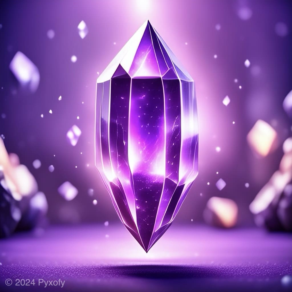
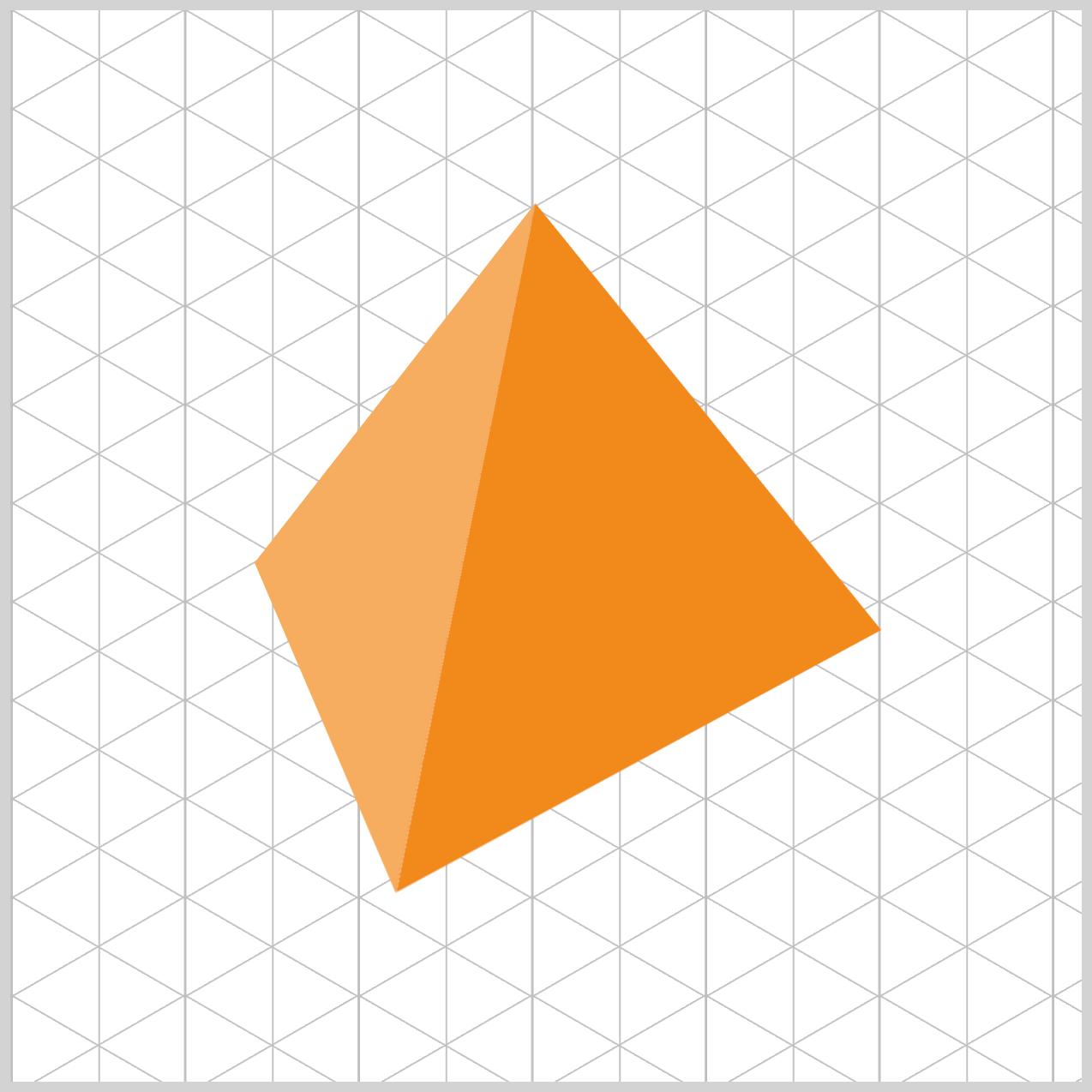
Build a spinning pyramid with only CSS! This easy step-by-step guide helps beginners master isometric shapes and professional animations today.

Introduction
Ready to bring your code to life and make web elements spin? In this article, we’ll build a beautiful isometric (3D‑style) rotating pyramid using only HTML and CSS. You’ll learn how to “cut” shapes with CSS and animate them in 3D space—step by step, with no complicated math.
CSS properties and functions you’ll learn to use in this article:
clip-pathpolygon()animation-delaytransformrotateopacity- CSS Custom Properties (Variables)
Preview
Here’s a quick preview of the isometric pyramid rotation animation sequence you’ll be building in this article.
Prerequisites
Essential CSS and HTML knowledge will help you understand the concepts and techniques introduced in this article. Jump over to this article if you require an HTML and CSS primer.
We assume you have configured tools to modify CSS. If not, this article will guide you through the setup process.
Please read this article if you’re unfamiliar with CSS animation and the @keyframes at-rule property.
HTML Structure
<div class="container">
  <div class="side front"></div>
  <div class="side right"></div>
  <div class="side back"></div>
  <div class="side left"></div>
</div>
container is the outermost enclosure. It enables the content to be centered and draws a light gray border. The rest of the <div>s represent each animation sequence.
Keep the HTML structure as is for the animation to display correctly.
Body and Container <div> CSS
CSS code for the body and container <div>.
/* Body and Container Settings */
/* Center shapes */
body {
  margin: 0;
  padding: 0;
  height: 100vh;
  display: flex;
  justify-content: center;
  align-items: center;
  flex-wrap: wrap;
}

/* Set background and border color */
.container {
  width: 500px;
  height: 500px;
  border: 5px solid lightgray;
  background: transparent;
  background: #0a0a0a;
  margin: 5px;
  display: flex;
  justify-content: center;
  align-items: center;

  /* Set perspective and perspective origin */
  perspective: 300px;
  perspective-origin: 50% 25%;
}
CSS perspective and perspective-origin
/* Set perspective and perspective origin */
.container {
  perspective: 300px;
  perspective-origin: 50% 25%;
}
- The
perspective: 300px;property controls how close the viewer feels to the 3D scene. You can think of it as the distance between your eyes and the screen. When we set perspective, we’re telling the browser, “Imagine the viewer is standing 300 pixels away from this object.”
Smaller values, like300px, create a strong and dramatic 3D effect, making the pyramid feel like it’s popping out toward you. Larger values, such as2000px, flatten the scene and reduce the depth. By choosing300px, we give the pyramid a sharp, bold, and impressive 3D-style look. - The Viewpoint with Perspective Origin
Ifperspectivecontrols the distance, thenperspective-origincontrols where you’re looking from. You can think of it as the position of your head when viewing the pyramid. This property sets the viewing angle using two values: horizontal (X) and vertical (Y).
With50%on the horizontal axis, your view is perfectly centered left to right. The real magic happens with the vertical value. Instead of the usual50%, we use25%, which moves the viewpoint higher. It’s like standing on a chair and looking down at the pyramid. This top‑down angle makes the rotation easier to see and gives the animation a stronger, more dynamic 3D-style feel.
Custom Properties
CSS Custom Properties—often called “variables”—are a powerful way to streamline your styling workflow. By creating your own reusable color palette and animation settings, you can update values in one place instead of hunting through your entire stylesheet. It’s a simple change that makes your code easier to maintain, faster to update, and much more enjoyable to work with.
/* Custom Properties */
:root {
  /* Isometric Pyramid Colors */
  --base-color: #ed7e07;
  --left-color: #fcc891;
  --right-color: #f99f3e;

  /* Isometric Pyramid Animation Properties */
  --animation-length: 5s;
  --animation-easing: linear;
  --animation-iteration: infinite;
}
Pyramid Color Palette
--base-color: #ed7e07— a rich, dark orange that grounds the entire shape.--left-color: #fcc891— a soft, very light orange that brightens the left face.--right-color: #f99f3e— a medium orange that adds balance and contrast on the right side.
These custom colors make it easy to adjust the look of your pyramid later without digging through your whole CSS file.
Pyramid Animation Variables
--animation-length: 5s;: The animation will take exactly 5 seconds (5s) to complete one full spin.--animation-easing: linear;: This controls the speed.linearmeans the speed stays exactly the same the whole time. It does not start slow and speed up; it is smooth and constant.--animation-iteration: infinite;: This tells the animation how many times to play.infinitemeans it will loop forever; it loops endlessly for a smooth, continuous effect.
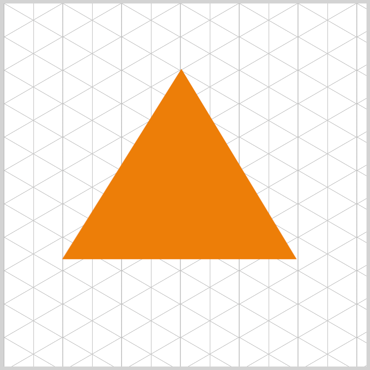
Now that our color palette and animation variables are ready, we can start shaping the first side of the isometric pyramid. In this step, we’ll focus on creating a single triangular face using the CSS clip-path: polygon() function.
By building one side at a time, the overall structure becomes much easier to understand—and you’ll get a clear sense of how each piece snaps together to form the final isometric pyramid.
Isometric Pyramid Side
Now we’re ready to dive into the core styling of each pyramid face. This is where the .side class comes in—think of it as the blueprint for all four walls of our pyramid. Every face starts as a simple square, and through a series of transforms, it becomes a crisp, isometric‑looking triangle.
First let’s look at the HTML code before diving into the CSS code.
<div class="container">
  <div class="side front"></div>
  <div class="side right"></div>
  <div class="side back"></div>
  <div class="side left"></div>
</div>
Think of the container as the stage where all of our 3D magic takes place. We need this parent element because, in CSS, 3D-style effects require a “world” to hold the perspective. The container provides that world, giving our pyramid a place to exist and a viewpoint to rotate from.
To visualize this, imagine placing four paper triangles directly on top of each other on a table. The front triangle is the one facing you, the right triangle is the one that will eventually rotate outward to your right, the back triangle will move to the far side, and the left triangle will open toward the left.
Right now they’re stacked, flat and still—but once we apply transforms, each one moves into its rightful place to form a complete isometric pyramid.
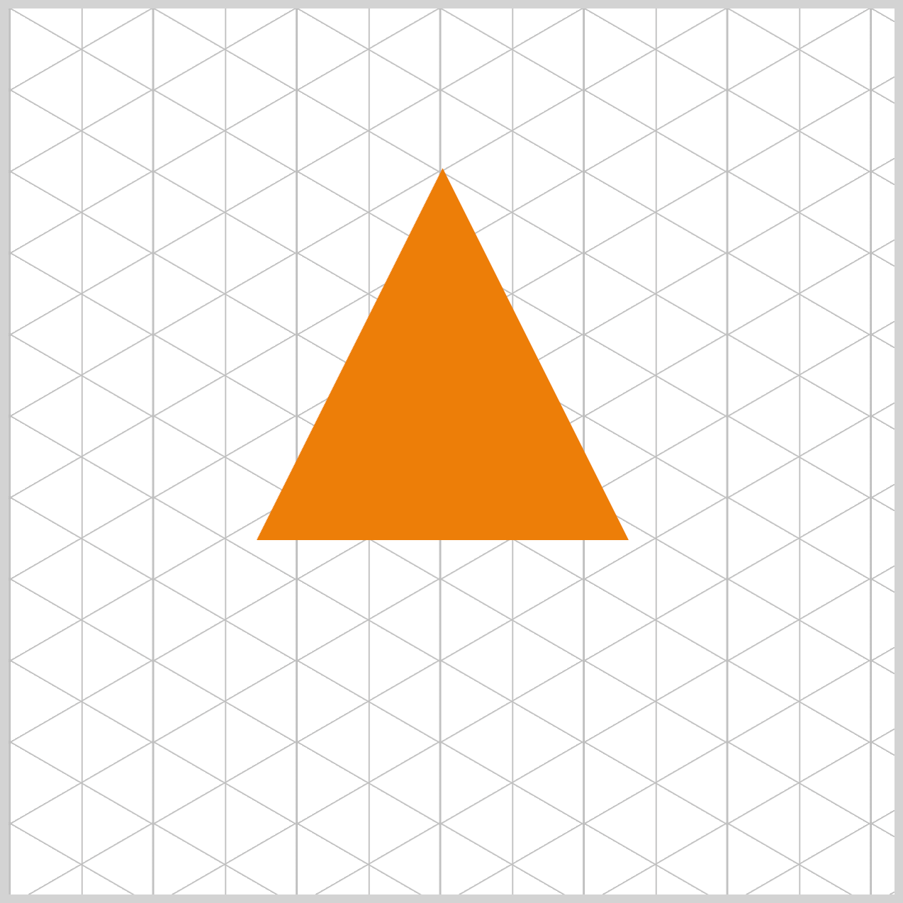
/* Isometric Pyramid Side */
.side {
  position: absolute;
  left: 140px;
  top: 90px;
  width: 210px;
  height: 210px;
  background-color: var(--base-color);
  clip-path: polygon(50% 0%, 0% 100%, 100% 100%);
  transform-origin: 50% 0%;
}
- Inside
.side, the first thing we do is setposition: absolute;. This is crucial because it pulls each face out of the page’s normal flow and lets us freely position them on top of one another inside thecontainer. - With
left: 140pxandtop: 90px, we nudge eachsideto the exact spot we want within our500pxcontainer space. - Finally, we begin with a perfect 210×210 pixel square—this clean foundation makes it much easier to rotate, skew, and shape the square into a triangle later.
- Next, we add the color and shape that turn our square into a proper pyramid face. The line
background: var(--base-color);simply fills the shape with the base color we defined earlier.
The real magic happens with clip-path.
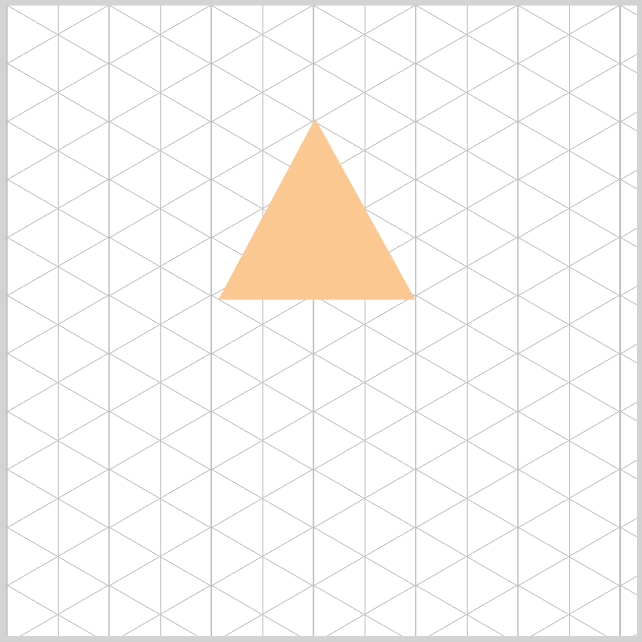
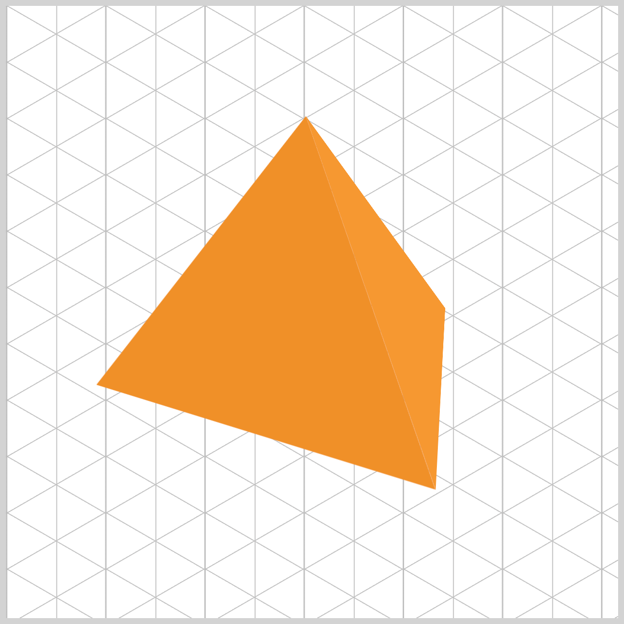
clip-pathis like using scissors on your square. With thepolygon()function, we give the browser three coordinate points—(50% 0%), (0% 100%), and (100% 100%). These points outline the peak of the triangle and its two bottom corners. Once those three dots are connected, everything outside that outline gets trimmed away, leaving us with a clean, perfect triangle.
We then set transform-origin: 50% 0%;, which defines the “hinge point” for all rotations. By placing this origin at the very tip of the triangle, we ensure each face rotates around the pyramid’s top. Without this, each triangle would spin around its own center like a propeller—and the illusion of a solid, unified pyramid would fall apart.
Now that our pyramid’s structure is in place, it’s time to bring it to life. In the next section, we’ll start building the animation sequence that makes the entire shape rotate smoothly in 3D space. This is where all those custom animation variables we defined earlier come into play. With just a few lines of CSS, our once‑static pyramid will begin to spin, shift, and feel like a real object moving inside its little world.
Animation Sequence
At a high level, the animation sequence is made up of eight distinct animation stops. During these moments, we use the CSS transform property to rotate the pyramid faces along both the X and Y axes, giving the illusion of real 3D movement. At the same time, the opacity property helps us control which sides are visible and which fade away as the pyramid turns. By carefully combining rotation and visibility, we create a smooth, believable animation that feels intentional rather than chaotic.
/* Isometric Pyramid Side */
.side {
  animation: rotate var(--animation-length) var(--animation-easing)
    var(--animation-iteration);
}
- The animation itself is named
rotate, making its purpose easy to understand at a glance. - Its duration is set to five seconds (
5s) usingvar(--animation-length), so one full rotation feels smooth and unhurried. - We keep the motion steady by applying a
lineareasing withvar(--animation-easing), which means the speed never changes as the pyramid spins. - Finally,
var(--animation-iteration)is set toinfinite, allowing the animation to loop endlessly and keep the pyramid rotating without stopping.
/* Pyramid Animation */
@keyframes rotate {
  0% {
    transform: rotateY(0deg) rotateX(30deg);
    background-color: var(--base-color);
  }
}
The animation begins by rotating the pyramid face 30 degrees along the X‑axis, rotateX(30deg). This slight tilt immediately gives the shape a sense of depth and helps establish the 3D illusion. At this starting point, the background color is set to a rich, dark orange using var(--base-color), clearly defining the active face and anchoring the viewer’s eye as the rotation sequence begins.
@keyframes rotate {
  25% {
    transform: rotateY(90deg) rotateX(30deg);
    background-color: var(--right-color);
    opacity: 1;
  }
}
At the 25% point of the animation—about 1.25 seconds in—the pyramid face begins a more dramatic turn. It rotates 90 degrees along the Y‑axis using rotateY(90deg) while maintaining a 30‑degree tilt on the X‑axis with rotateX(30deg). At this moment, the background color switches to var(--right-color), a medium orange shade that helps distinguish this face from the others. The opacity is set to 1, ensuring the side is fully visible and clearly in focus as the rotation continues.
Immediately after the 25% mark, we make the pyramid face disappear. This is done by quickly adjusting its visibility using the CSS properties shown in the next snippet.
@keyframes rotate {
  25.1% {
    opacity: 0;
  }
}
By hiding the side at just the right moment, at 25.1% using opacity: 0, we prevent visual overlap and keep the animation clean and intentional. This small step plays a big role in maintaining the illusion of a solid, rotating 3D pyramid.
@keyframes rotate {
  49.9% {
    background-color: var(--left-color);
  }
}
At the 49.9% point of the animation, we prepare the next transition.
@keyframes rotate {
  50% {
    transform: rotateY(180deg) rotateX(30deg);
  }
}
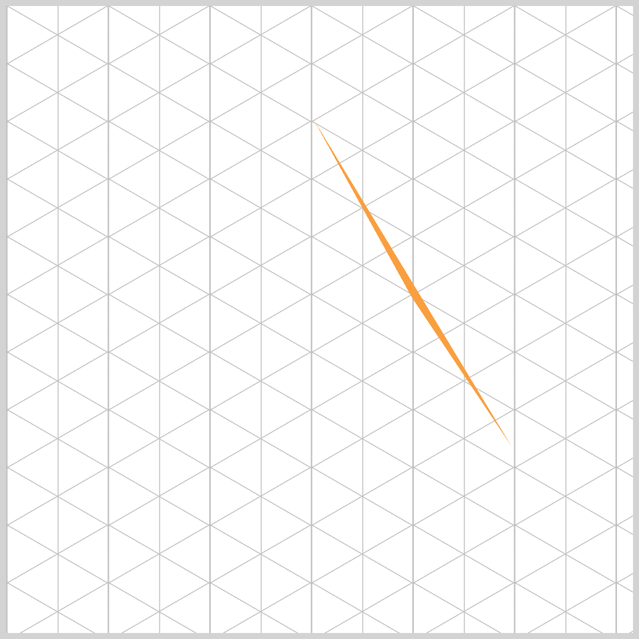
The pyramid face color changes to var(--left-color), a very light orange shade, while rotating a full 180 degrees along the Y‑axis using rotateY(180deg). At this stage, the face is intentionally hidden because its opacity is set to 0.
Even though the element is invisible, this step is important for keeping the rotation sequence clean and consistent. You can refer to the sample image to see how this hidden transition fits into the overall motion.
@keyframes rotate {
  74.9% {
    opacity: 0;
  }
}
By setting opacity: 0 at the 74.9% mark, we make sure the pyramid face stays completely hidden until the very last moment it needs to appear on the left side. This prevents any accidental flashes or overlaps during the rotation.
Think of it like a magician patiently waiting behind a curtain—out of sight, perfectly timed, and ready to make a smooth entrance at just the right moment.
@keyframes rotate {
  75% {
    transform: rotateY(270deg) rotateX(30deg);
    background-color: var(--left-color);
    opacity: 1;
  }
}
rotateY(270deg): The triangle has now finished three-quarters (3/4) of its journey around the circle. It is now positioned perfectly on the left-hand side of our isometric pyramid container.- Next, we apply
background-color: var(--left-color)to give the left face its own subtle shading. This slightly lighter orange acts like a soft highlight, helping the pyramid feel more three‑dimensional. Small color changes like this go a long way in making the shape look realistic and giving it a real sense of depth. - With
opacity: 1, the side is visible again. Because the change from74.9%to75%happens almost instantly, the face appears to smoothly emerge from behind the pyramid. To the user, it feels natural and seamless, as if the side was always there and simply slid back into view at the perfect moment.
/* Pyramid Animation */
@keyframes rotate {
  100% {
    transform: rotateY(360deg) rotateX(30deg);
    background-color: var(--base-color);
  }
}
At the 100% mark, the triangle returns to its original position—both in rotation and color, var(--base-color), bringing the animation full circle. This completes one smooth, five‑second rotation and seamlessly resets everything back to the starting state, ready to loop again. The result is a continuous, fluid motion that feels polished and intentional.
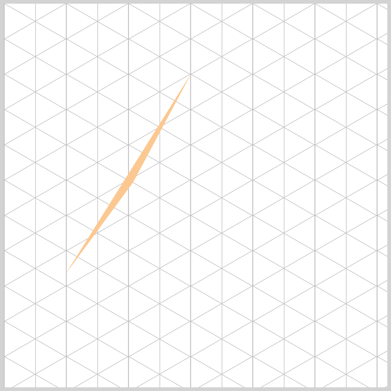
The next set of images highlights the isometric pyramid’s left and right sides.

By comparing them side by side, you can clearly see how the angles shift and how the color variations help create a stronger sense of depth and dimension.

Now that we’ve completed the full animation sequence, it’s time to take things one step further. In the next section, we’ll explore animation delays and how they can be used to fine‑tune timing and create more polished, professional‑looking motion. Small delays can make a big difference, and you’ll see how they help bring everything together smoothly.
Animation Delays
The CSS animation-delay property is extremely useful when controlling when each pyramid face starts moving. We use animation delays to slightly offset each side, allowing them to take turns and come together as a perfect, four‑sided pyramid. Without these delays, all four triangles would animate at the exact same time—and instead of an isometric pyramid, it would look like just a single triangle spinning in place.
/* Pyramid Animation Delays */
.right {
  animation-delay: -1.25s;
}

.back {
  animation-delay: -2.5s;
}

.left {
  animation-delay: -3.75s;
}
Our full animation takes five seconds to complete one full rotation. Since a pyramid has four sides, we simply divide that time by four. By starting each face 1.25 seconds apart, we ensure that all sides are perfectly spaced at 0°, 90°, 180°, and 270° at the same moment in time. This precise timing is what makes the pyramid look balanced and correctly formed as it spins.
You may notice that we use negative animation delays, such as -1.25s, and this is actually a very professional technique:
- A positive delay (like
1.25s) would cause a side to sit still before it starts animating, which can feel awkward or glitchy when the page first loads. - A negative delay, on the other hand, tells the browser to start the animation immediately—but as if it has already been running for a short time.
The result is a pyramid that appears to be smoothly spinning from the very first moment you see it, creating a polished and natural animation experience.
For more details about the CSS animation-delay property, check this article.
 Pyxofy
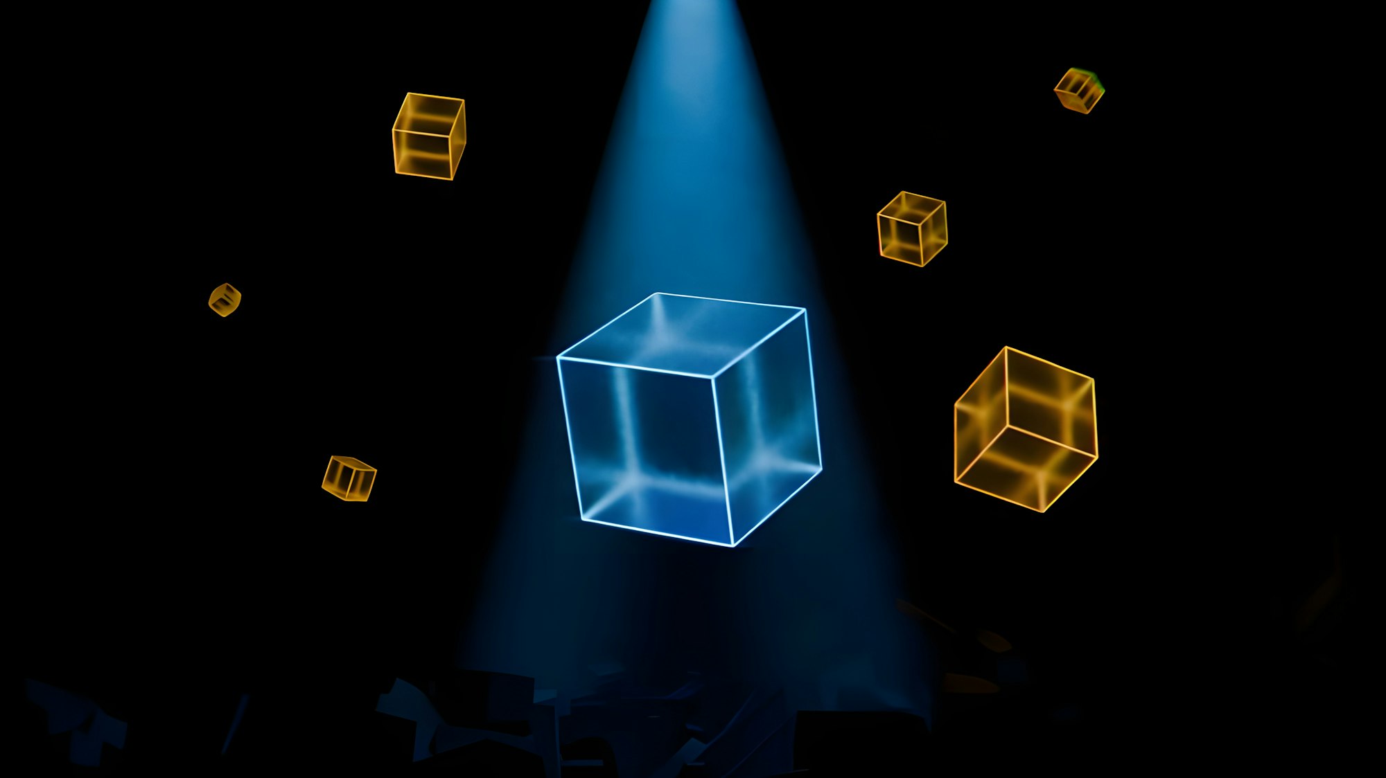
You can see and play with the complete code on Pyxofy’s CodePen page.
See the Pen CSS Animation – Unique Rotate Effect Using clip-path and Animation Delays by Pyxofy (@pyxofy) on CodePen.
Conclusion
In this article, we explored how to use CSS transform, opacity, and clip-path to build realistic isometric pyramid rotate animation sequence. Mastering isometric, 3D-style CSS requires combining structure with logic.
By using Custom Properties (--variables), we create flexible, clean code. The clip-path: polygon() function transforms simple squares into triangles, while perspective on the container adds depth. The heart of the rotation movement lies in @keyframes, where we control rotation and lighting. Finally, negative animation-delay allows multiple elements to sync perfectly into a single pyramid shape.
These properties are the foundation of modern web design, allowing you to build complex, high-performance 3D-style objects using only HTML and CSS.
Ready to build rotating isometric objects with what you learned today? Share your masterpiece with us on LinkedIn, Threads, Bluesky, Mastodon, X (Twitter) @pyxofy, or Facebook.
We hope you liked this article. Kindly share it with your network. We appreciate it.
Related Articles
 Pyxofy
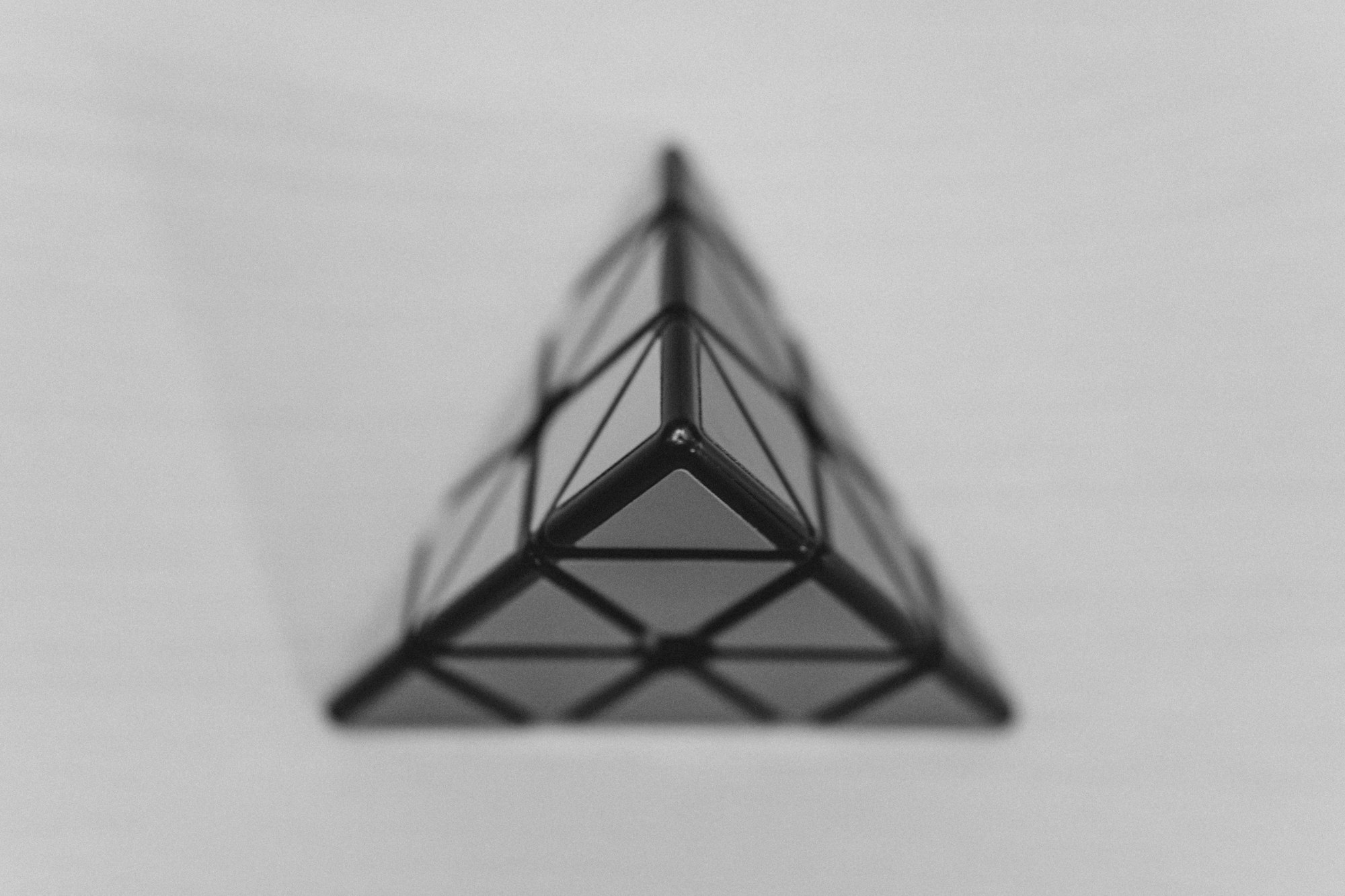
 Pyxofy
 Pyxofy
 Pyxofy