CSS Art – Using the CSS shape() Function to Make Advanced Shapes: Heart, Crosses, Arcs, and Smooth Curves
Want to take your image creation skills to the next level? This step-by-step article will show you how to use the CSS shape() to create complex shapes.

Introduction
Once you have a solid understanding of the basics, it’s time to learn how to create advanced shapes.
In this article, you will discover how to use the CSS shape() function to create hearts, crosses, as well as quadratic and cubic curves. By combining different shape() commands and parameters, you’ll learn how to create complex and sophisticated images.
CSS properties and functions you’ll be exploring in this article.
clip-pathshape()
Preview
By combining multiple shape() function commands, you can create complex shapes like hearts and crosses.


Prerequisites
Essential CSS and HTML knowledge will help you understand the concepts and techniques introduced in this article. Jump over to this article if you require an HTML and CSS primer.
We assume you have configured tools to modify CSS. If not, this article will guide you through the setup process.
HTML Structure
<div class="container">
  <div class="cross"></div>
</div>
<div class="container">
  <div class="quad-curve"></div>
</div>
<div class="container">
  <div class="cubic-curve"></div>
</div>
<div class="container">
  <div class="smooth-curve"></div>
</div>
<div class="container">
  <div class="heart"></div>
</div>
container is the outermost enclosure. It enables the content to be centered and draws a light gray border. The rest of the <div>s represent each image component.
Keep the HTML structure as is for the image to display correctly.
Body and Container <div> CSS
CSS code for the body and container <div>.
/* Body and Container Settings */
/* Center shapes */
body {
  margin: 0;
  padding: 0;
  height: 100vh;
  display: flex;
  justify-content: center;
  align-items: center;
  flex-wrap: wrap;
}

/* Set blue background and light gray border */
.container {
  min-width: 500px;
  height: 500px;
  border: 5px solid lightgray;
  background: white;
  position: relative;
  margin: 5px;
  display: flex;
  justify-content: center;
  align-items: center;
}
Common Properties
Common properties are combined to ensure minimal code size.
/* Common Properties */
.cross,
.quad-curve,
.cubic-curve,
.smooth-curve,
.heart {
  width: 500px;
  height: 500px;
  background: #085bb5;
}
The width and height properties are both set to 500px. The shape’s background color is set to a blue shade, #085bb5.
shape() Function <curve-command> and <smooth-command>
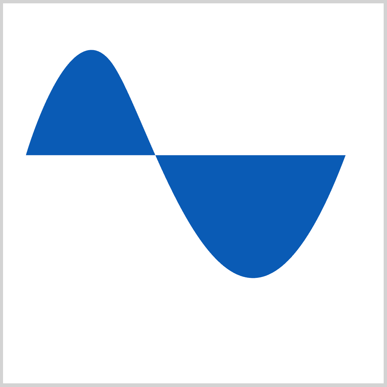
The shape() function <curve-command> and <smooth-command> can both be used to create a Bézier curve.
<curve-command>
Syntax: curve [by | to] <coordinate-pair> with <coordinate-pair> [/ <coordinate-pair>].
- Using the
byortokeyword tells us whether the end point of the curve, set by the first<coordinate-pair>, is relative or absolute, respectively. Thewithkeyword defines the control points for the Bézier curve. - When only one
<coordinate-pair>is given, the command creates a quadratic Bézier curve, which is defined by three points: the start point, the control point, and the end point. - When two
<coordinate-pair>values are given, the command creates a cubic Bézier curve, which is determined by four points: the starting point, two control points, and the ending point.
<smooth-command>
Smooth curves allow for a continuous transition from the shape, whereas quadratic curves don’t. Quadratic curves use a single control point to create a seamless transition, while smooth cubic curves use two control points for a more refined transition.
Syntax: smooth [by | to] <coordinate-pair> [with <coordinate-pair>]
- Using the
byortokeyword decides whether the curve's ending point, defined by the first<coordinate-pair>, is relative or absolute. - When
<coordinate-pair>is left out, the command draws a smooth quadratic Bézier curve that’s defined by the previous control point and the current endpoint. - When the optional
withkeyword is used, it defines the control points of the curve through<coordinate-pair>, creating a smooth cubic Bézier curve based on the previous control point, the current control point, and the current endpoint.
Check this article out to get familiar with other shape() function parameters and commands.
 Pyxofy
Let’s start working on the first advanced shape, a cross, in the next section.
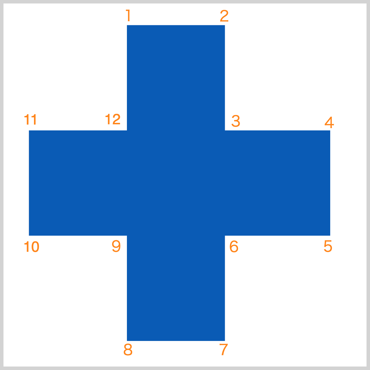
Cross
The cross can be made using the shape() with both the <hv-line-command> and the <line-command>. For this example, we’ll be utilizing the latter command. Interchanging horizontal and vertical will be used to create the cross.

.cross {
  clip-path: shape(
    from 170px 30px,
    line to 305px 30px,
    line to 305px 175px,
    line to 450px 175px,
    line to 450px 320px,
    line to 305px 320px,
    line to 305px 465px,
    line to 170px 465px,
    line to 170px 320px,
    line to 35px 320px,
    line to 35px 175px,
    line to 170px 175px,
    close
  );
}
The <line-command> requires two coordinates, an x or horizontal coordinate and a y or vertical coordinate.
from 170px 30pxsets the starting coordinates at170pxfrom the left edge and30pxfrom the top.- A horizontal line is drawn using
line to 305px 30pxfrom the starting point to point 2. - Downward line drawn to point 3 with
line to 305px 175px. - A line going to the right drawn by
line to 450px 175px. You’re at point 4 now. line to 450px 320pxdraws a downward line to point 5.- Use
line to 305px 320pxto draw a leftward line to point 6. - A horizontal line is drawn using
line to 305px 465pxto point 7. This completes the right side of the cross. - Draw a horizontal line from point 7 to point 8 using
line to 170px 465px. line to 170px 320pxdraws a vertical line to point 9.- To get to point 10, draw a horizontal line using
line to 35px 320px. line to 35px 175pxdraws a vertical line to point 11.line to 170px 175pxdraws a horizontal line to point 12.closedraws a line back to the starting point, closing the cross shape.
Let’s start working on curves in the next section.
Quadratic Curve
The quadratic curve example uses the shape() function <curve-command>.
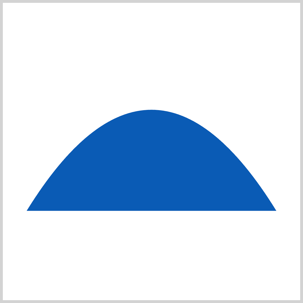
.quad-curve {
  width: 500px;
  height: 500px;
  clip-path: shape(
    from 40px 350px,
    curve to 460px 350px with 250px 10px,
    close
  );
}
from 40px 350px sets the starting point: 40px from the left edge and 350px from the top. The ending point is specified using curve to 460px 350px. The control point is set to 250px on the horizontal axis, and 10px on the vertical axis using with 250px 10px. You can control the height and angle of the quadratic curve by adjusting the control point coordinates.
Up next is the cubic curve.
Cubic Curve
What sets the cubic curve apart from the quadratic curve in the previous section is the number of control points used. Unlike the quadratic curve, which uses three control points, the cubic curve requires four.
.cubic-curve {
  clip-path: shape(
    from 40px 350px,
    curve to 460px 350px with 40px 10px / 460px 10px,
    close
  );
}
- The starting point is set to
40pxfrom the left side and350pxfrom the top usingfrom 40px 350px. curve to 460px 350pxsets the end point at460pxon the horizontal axis and350pxon the vertical axis.- The first control point is set to
40px 10px. 460px 10pxsets the second control point.
Let’s work on the smooth curve in the next section.
Smooth Curve
With the <smooth-command>, you can make a smooth transition between two shapes.
.smooth-curve {
  clip-path: shape(
    from 30px 200px,
    smooth to 140px 75px with 85px 10px,
    smooth to 450px 200px with 300px 600px,
    close
  );
}
You first set the starting point with from 30px 200px. The first smooth command ends at 140px 75px with a control point set by with 85px 10px. The second smooth command has a control point set using with 300px 600px and an endpoint set to 450px 200px.
Check this article out for a visual representation of the control points.
 Pyxofy
Next up is the heart, which is our final shape for this article. Let’s move on to the final section.
Heart
Both the arc-command and the curve-command are used together to create the heart shape.

.heart {
  clip-path: shape(
    from 20px 140px,
    arc to 250px 140px of 40px cw,
    arc to 480px 140px of 40px cw,
    curve to 250px 460px with 480px,
    curve to 20px 140px with 20px,
    close
  );
}
from 20px 140pxsets the starting point.arc to 250px 140px of 40px cwcreates the first arch. The arch end point is set to250px 140px, with its peak set to40pxand rotates clockwise withcw.- The second arch is created using
arc to 480px 140px of 40px cw. curve to 250px 460px with 480pxmake a quadratic curve from the second arch end point to the250px 460pxwith a control point set at480px.- To finish the heart shape, another quadratic curve is set to end at
20px 140pxwith a control point set to20px.
You can see and play with the complete code on Pyxofy’s CodePen page.
See the Pen CSS Art – Using the CSS shape() Function to Make Advanced Shapes: Heart, Crosses, Arcs, and Smooth Curves by Pyxofy (@pyxofy) on CodePen.
Conclusion
The examples in this article demonstrate the image creation capabilities of the CSS shape() function. By combining multiple shape() parameters and commands, you can create advanced shapes like hearts, crosses, and smooth curves.
shape() curves are versatile, allowing you to create both quadratic and cubic Bézier curves with control points. By combining arc and curve commands, you can produce fluid, organic shapes.
What exciting, complex, or advanced shapes and images will you create with the CSS shape() function? Share your masterpiece with us on LinkedIn, Threads, Bluesky, Mastodon, X (Twitter) @pyxofy, or Facebook.
We hope you liked this article. Kindly share it with your network. We appreciate it.
Related Articles
 Pyxofy
 Pyxofy
 Pyxofy
 Pyxofy