CSS Art – Using clip-path: polygon() for Building Responsive Isometric Pyramids
Want to build an isometric pyramid using only CSS? Follow our clear, step-by-step article and learn the techniques behind this striking 3D effect

Introduction
Isometric pyramids can be challenging to make with CSS. This article guides you step‑by‑step through building an isometric pyramid using the CSS clip-path: polygon() function.
You’ll learn how each point shapes a triangular face, how percentages create responsive geometry, and how small adjustments produce accurate 3D-ish forms—all with pure CSS.
CSS function and properties you’ll be learning in this article:
polygon()insetwidth- CSS Custom Properties (Variables)
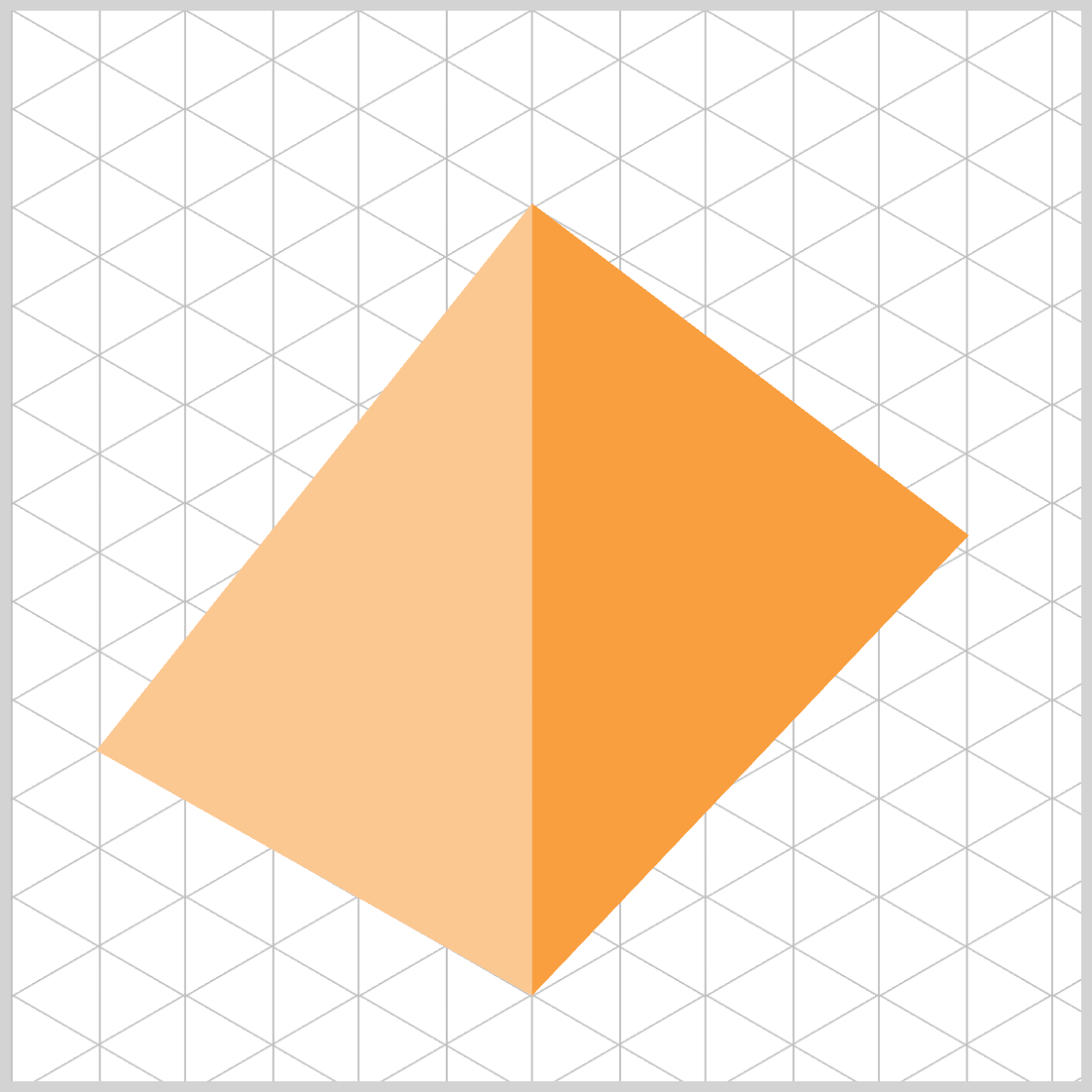
Preview
Before we walk through each step of constructing the pyramid, here’s a quick preview of the final isometric shape you’ll be creating.
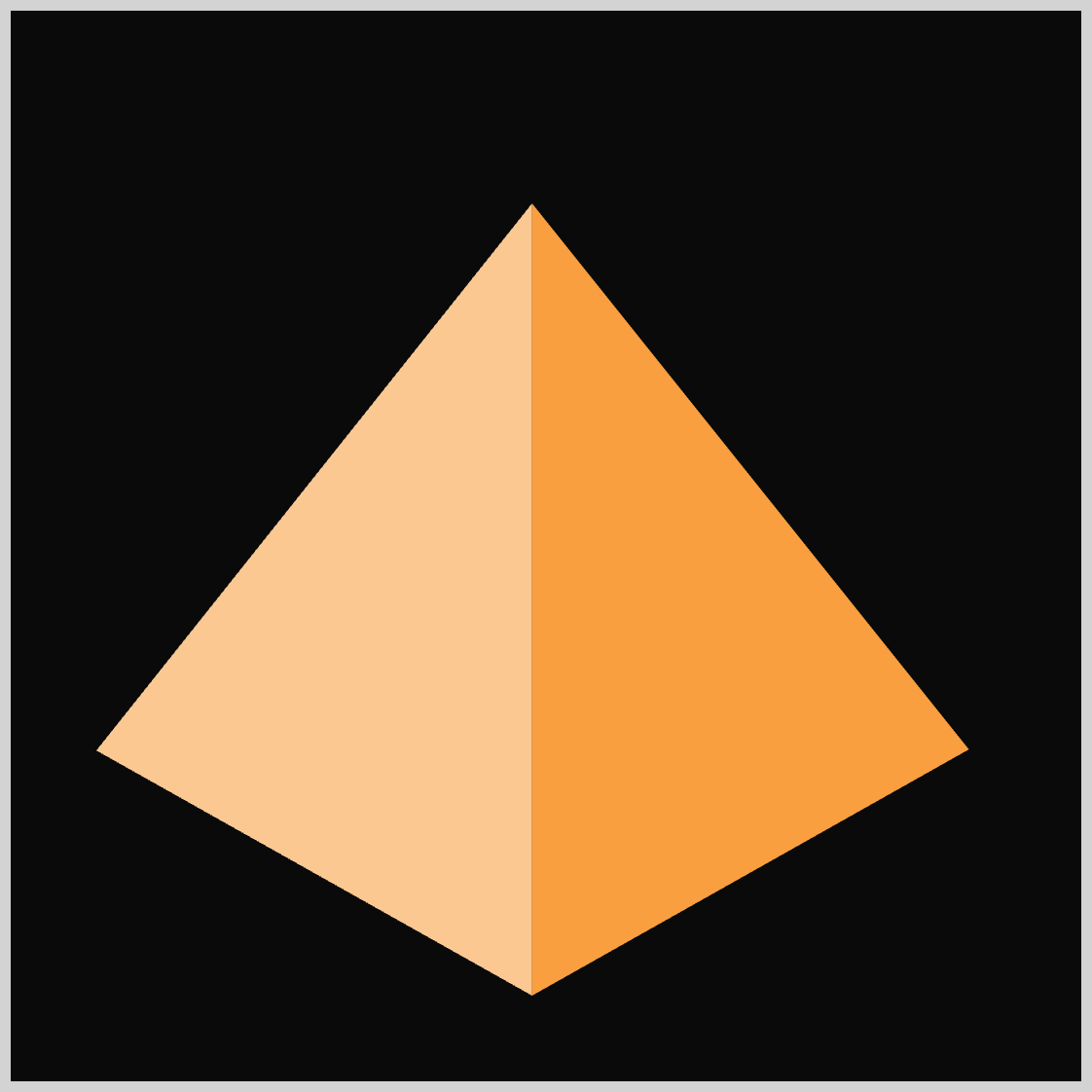
The entire image is built using nothing more than the CSS clip-path: polygon() function, which lets you define each triangular face using simple percentage‑based coordinates.
Check this article for a deep dive into different polygon() function commands.
 Pyxofy
Prerequisites
Essential CSS and HTML knowledge will help you understand the concepts and techniques introduced in this article. Jump over to this article if you require an HTML and CSS primer.
We assume you have configured tools to modify CSS. If not, this article will guide you through the setup process.
HTML Structure
<div class="container">
  <div class="pyramid">
    <div class="face left"></div>
    <div class="face right"></div>
  </div>
</div>
container is the outermost enclosure. It enables the content to be centered and draws a light gray border. The rest of the <div>s represent each image component.
Keep the HTML structure as is for the image to display correctly.
Body and Container <div> CSS
CSS code for the body and container <div>.
/* Body and Container Settings */
/* Center shapes */
body {
  margin: 0;
  padding: 0;
  height: 100vh;
  display: flex;
  justify-content: center;
  align-items: center;
  flex-wrap: wrap;
}

/* Set background and border color */
.container {
  width: 500px;
  height: 500px;
  border: 5px solid lightgray;
  background: #0a0a0a;
  position: relative;
  margin: 5px;
  display: flex;
  justify-content: center;
  align-items: center;
}
Common and Custom Properties
/* Common Properties */
.face {
  position: absolute;
  inset: 0;
}
position: absolute;
Lets the element be precisely positioned inside the nearest ancestor that has a positioning context.inset: 0;
A shorthand that sets top, right, bottom, and left to0. In practice, this makes the element fill the entire area of its positioned parent—perfect for overlays, faces of a 3D-ish pyramid, or full-bleed layers.
/* Custom Properties */
:root {
  /* Pyramid Colors */
  --left-color: #fcc891;
  --right-color: #f99f3e;
}
:rootis the global scope for CSS variables. Declaring your custom properties here makes them available throughout your entire stylesheet.- Custom properties (variables) allow you to manage colors, spacing, and other values in one place—making your code more maintainable and much easier to update later.
--left-color: #fcc891;
Soft, warm beige for the left face.--right-color: #f99f3e;
Rich, vibrant orange for the right face.
/* Isometric Pyramid */
.pyramid {
  width: 500px;
}
.pyramidacts as the main wrapper for the isometric pyramid.- By specifying a width,
500px, you establish the base dimension that all pyramid faces will scale from.
Let’s start working on the Left Face in the next section.
Left Face
For both the left face and the following right face, we’re using the CSS polygon() function. By plotting a few coordinate pairs, we can define the points of each triangle and shape the faces exactly how we want.
- Points are listed in order, separated by commas.
- Each point is
xandyin percentages, relative to the element’s box (0% 0%is the top‑left corner;100% 100%is the bottom‑right). - Using percentages keeps the triangle shape responsive as the parent resizes.
/* Left face */
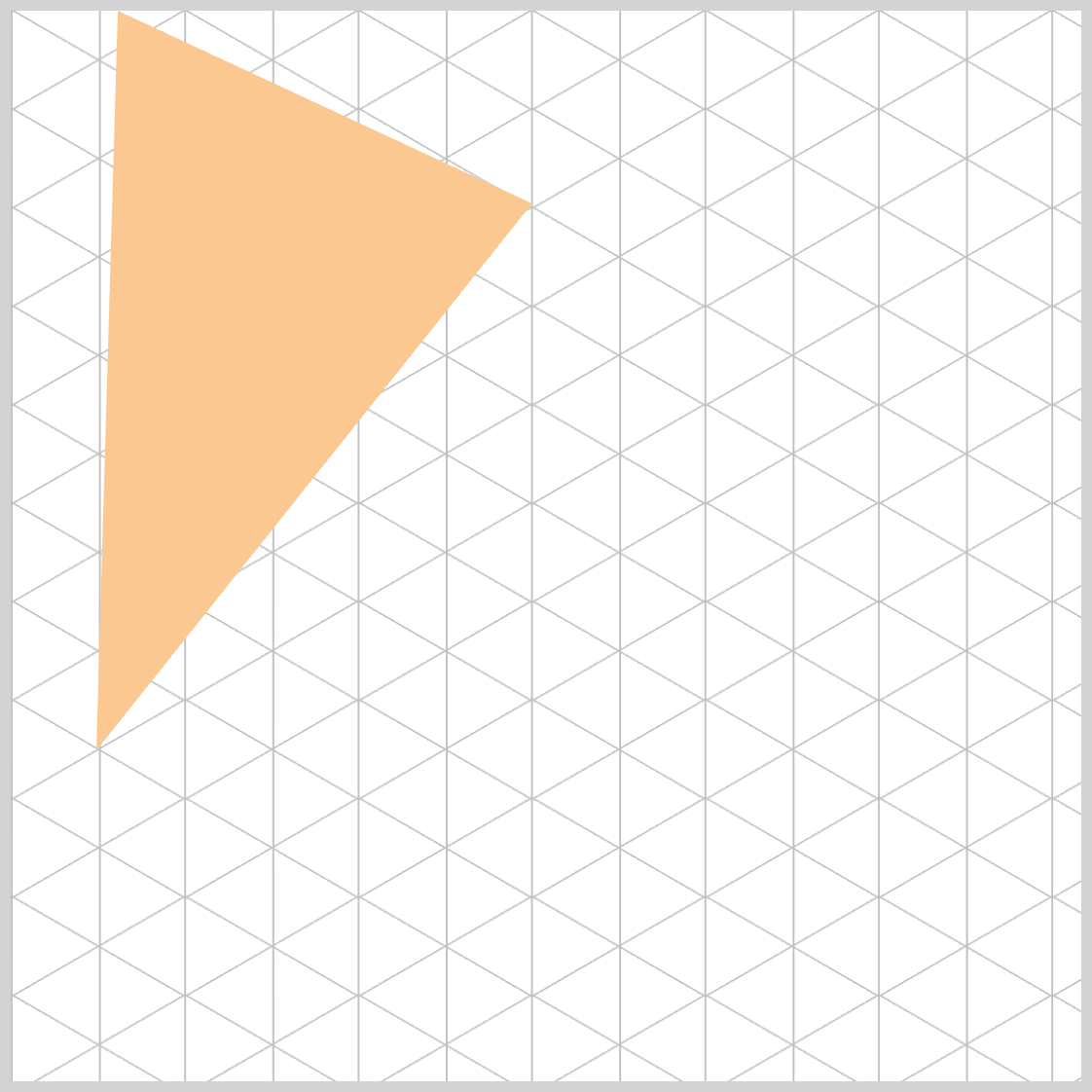
.face.left {
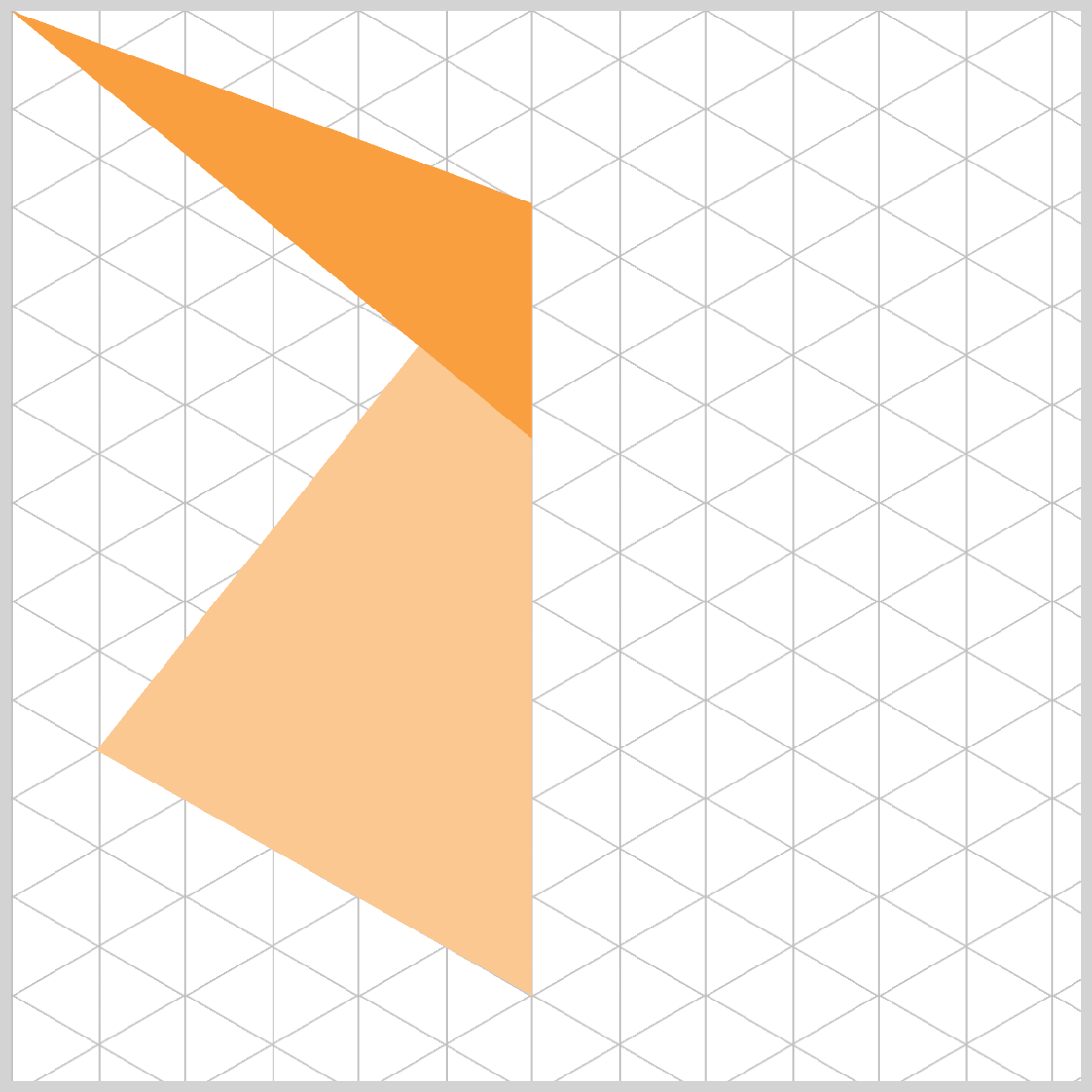
clip-path: polygon(48.7% 18%, 8% 0%, 0% 0%);
background: var(--left-color);
}
.face.lefttargets the left side of your pyramid shape.clip-path: polygon(48.7% 18%, 8% 0%, 0% 0%)trims the element into a triangle shape using three points.48.7% 18%is the first point,8% 0%is the second point, and0% 0%is the third point.background: var(--left-color)taps into your previously defined CSS variable, ensuring consistent theming across all pyramid faces.
As we continue adjusting the parameters inside the polygon() function, we’ll gradually refine the triangle that forms the left face of the pyramid. Each point in the polygon() definition represents a vertex of the clipped shape.
By updating these points step‑by‑step, we can fine‑tune the angles and proportions until the face aligns perfectly with the pyramid’s isometric perspective.
.face.left {
  clip-path: polygon(48.7% 18%, 8% 12%, 0% 0%);
}
- The second point coordinate was updated from
(8% 0%)to(8% 12%). - This slight vertical shift makes the left edge appear more tapered and better aligned with an isometric pyramid’s geometry.
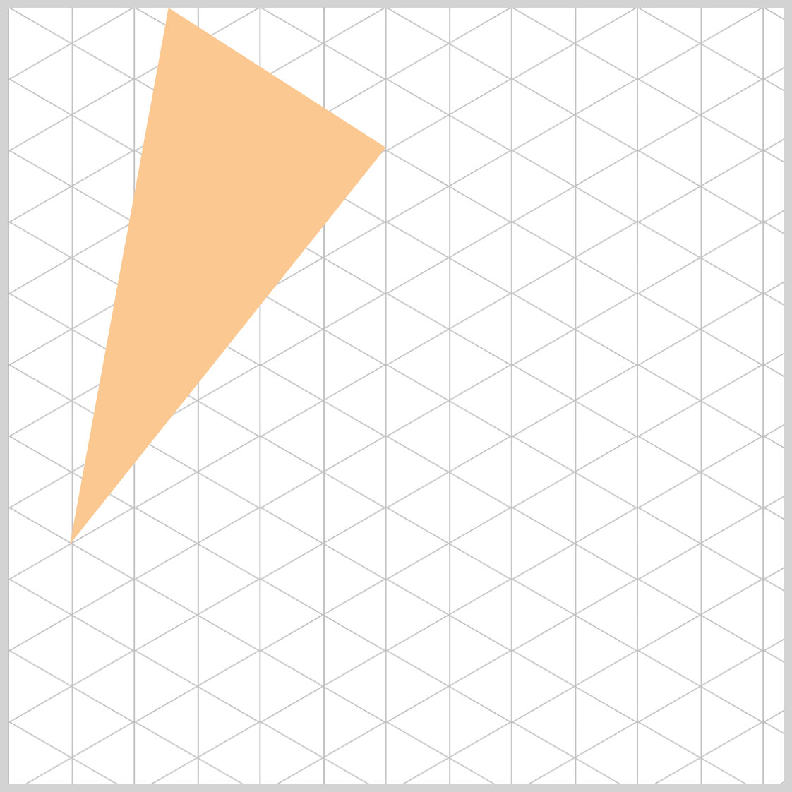
.face.left {
  clip-path: polygon(48.7% 18%, 8% 31%, 0% 0%);
}
The second point vertex moved from 8% 12% → 8% 31%.
This pushes that point further down (since Y increases from top to bottom in CSS coordinates), creating a more pronounced diagonal edge.
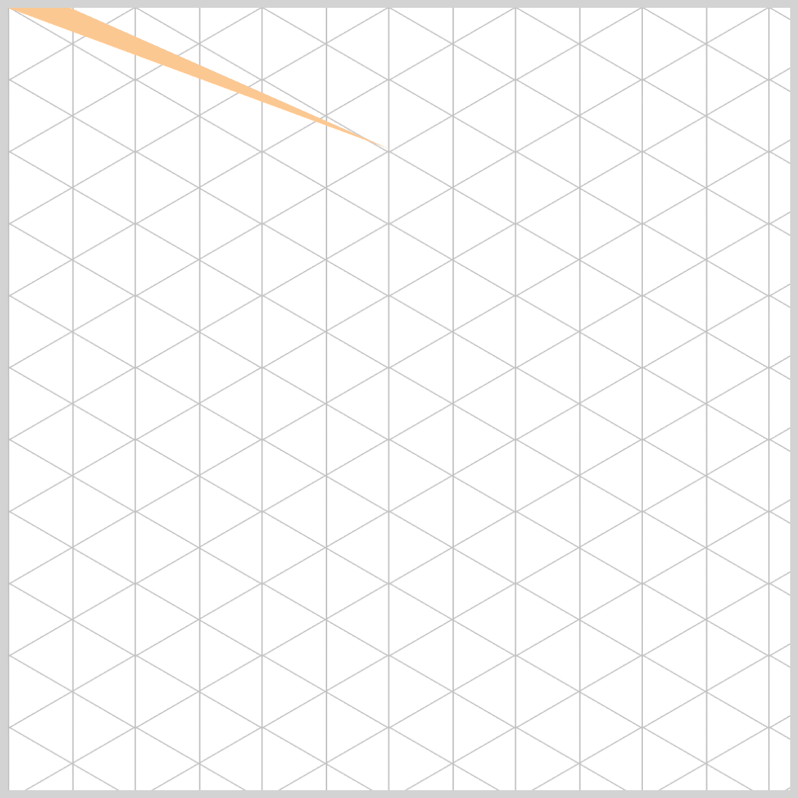
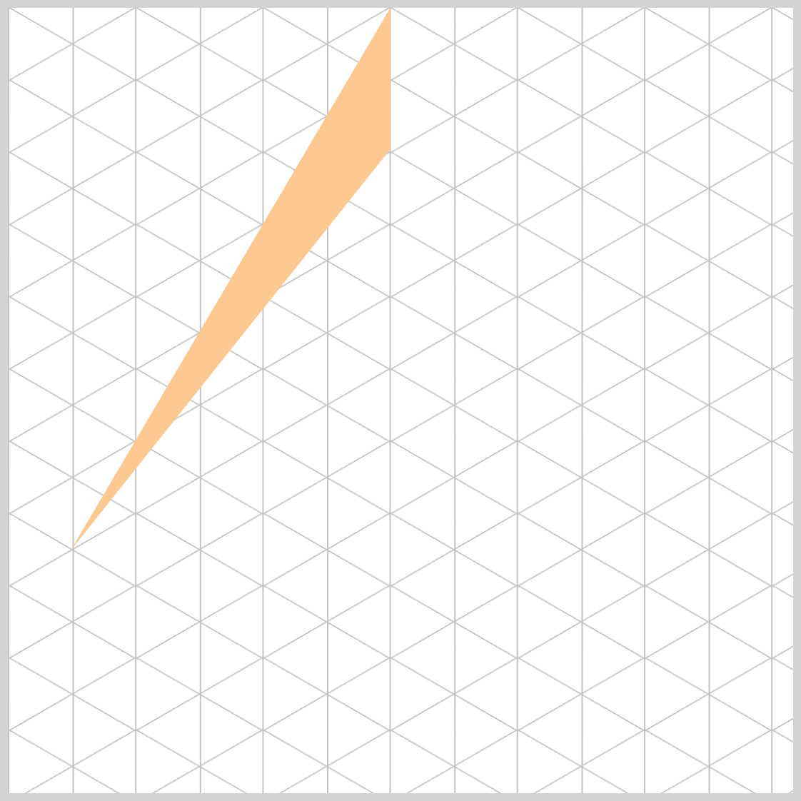
.face.left {
  clip-path: polygon(48.7% 18%, 8% 69.1%, 0% 0%);
}
- The second point’s Y value increased to
69.1%, which moves that vertex downward - This deepens the slope of the left face, creating a more dramatic, elongated triangle.
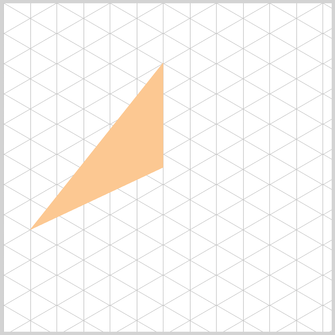
.face.left {
  clip-path: polygon(48.7% 18%, 8% 69.1%, 10% 0%);
}
- You modified the third point from
0% 0%→10% 0%.
This moves the vertex10%to the right along the top edge. - Visual effect: The left boundary of the triangle becomes less flush with the container’s top-left corner.
.face.left {
  clip-path: polygon(48.7% 18%, 8% 69.1%, 21% 0%);
}
The third point shifted from 10% 0% → 21% 0%. This moves the vertex further right along the top edge.
.face.left {
  clip-path: polygon(48.7% 18%, 8% 69.1%, 48.7% 0%);
}
- The third point moved to
48.7% 0%, which shares the samexcoordinate as the first point (48.7%). - This creates a vertical alignment between the apex (
48.7% 18%) and the top edge point (48.7% 0%).
.face.left {
  clip-path: polygon(48.7% 18%, 8% 69.1%, 48.7% 51%);
}
The third point moved from 48.7% 0% to 48.7% 51%.
Lowering its y to 51% creates a short vertical edge that sits above the face’s midline, which:
- Emphasizes a taller left plane,
- Shifts the triangle’s area downward, enhancing a sense of depth.
.face.left {
  clip-path: polygon(48.7% 18%, 8% 69.1%, 48.7% 69%);
}
The third point moved to 48.7% 69%.
- This produces a vertical edge between points 1 → 3 (apex down to
69%). - Because
69%is essentially level with the second point’s69.1%, the segment between point 3 → 2 becomes a very short, near‑horizontal edge at the lower band of the face.
Visual effect:
- The left face now features a prominent vertical segment that extends much closer to the base.
- The bottom of the face appears flatter/wider, which can emphasize depth and help align with an isometric shadow line.
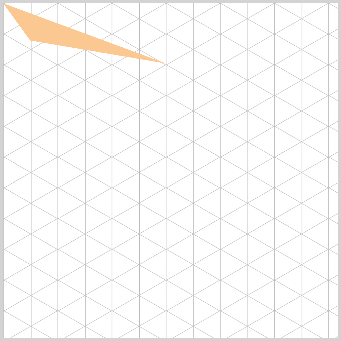
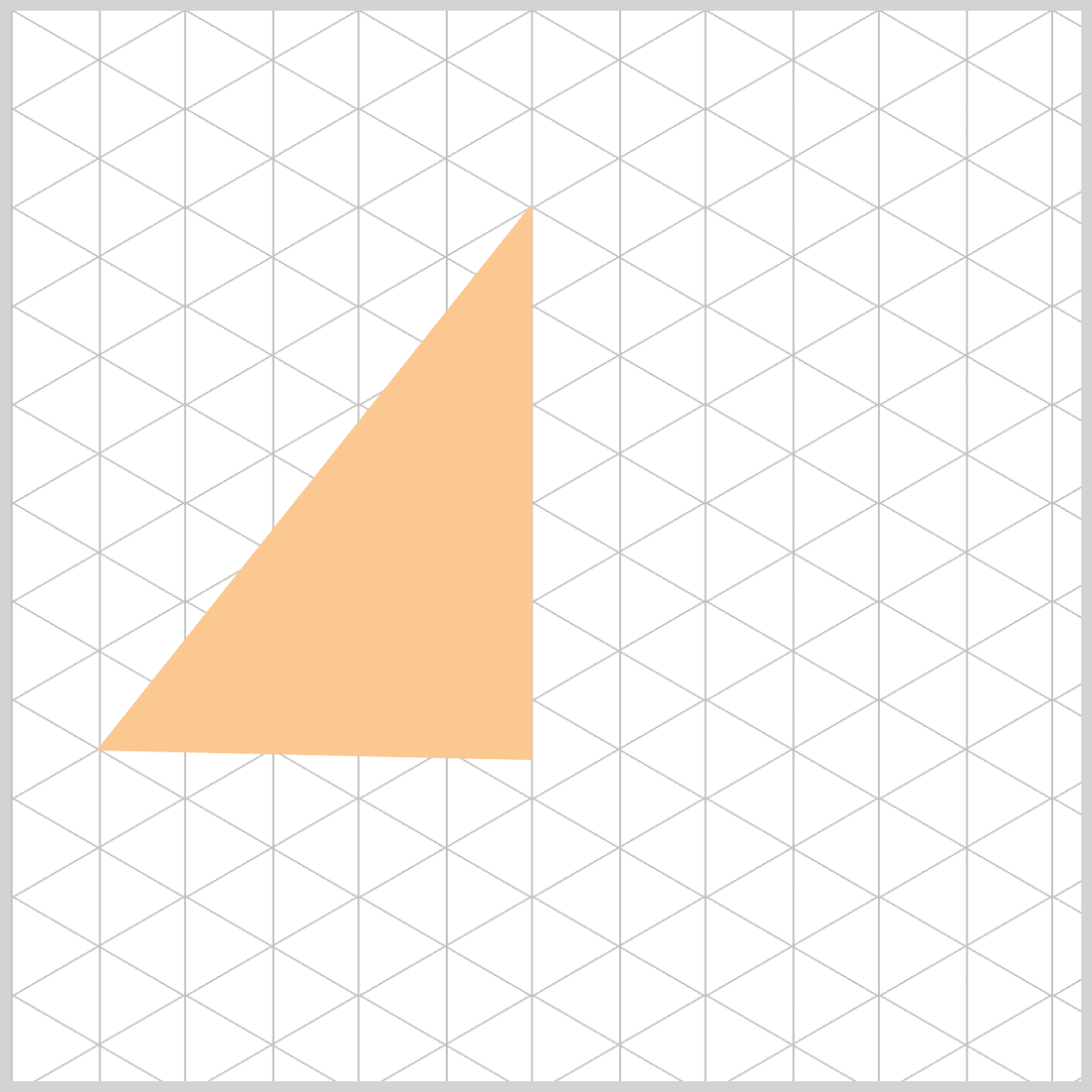
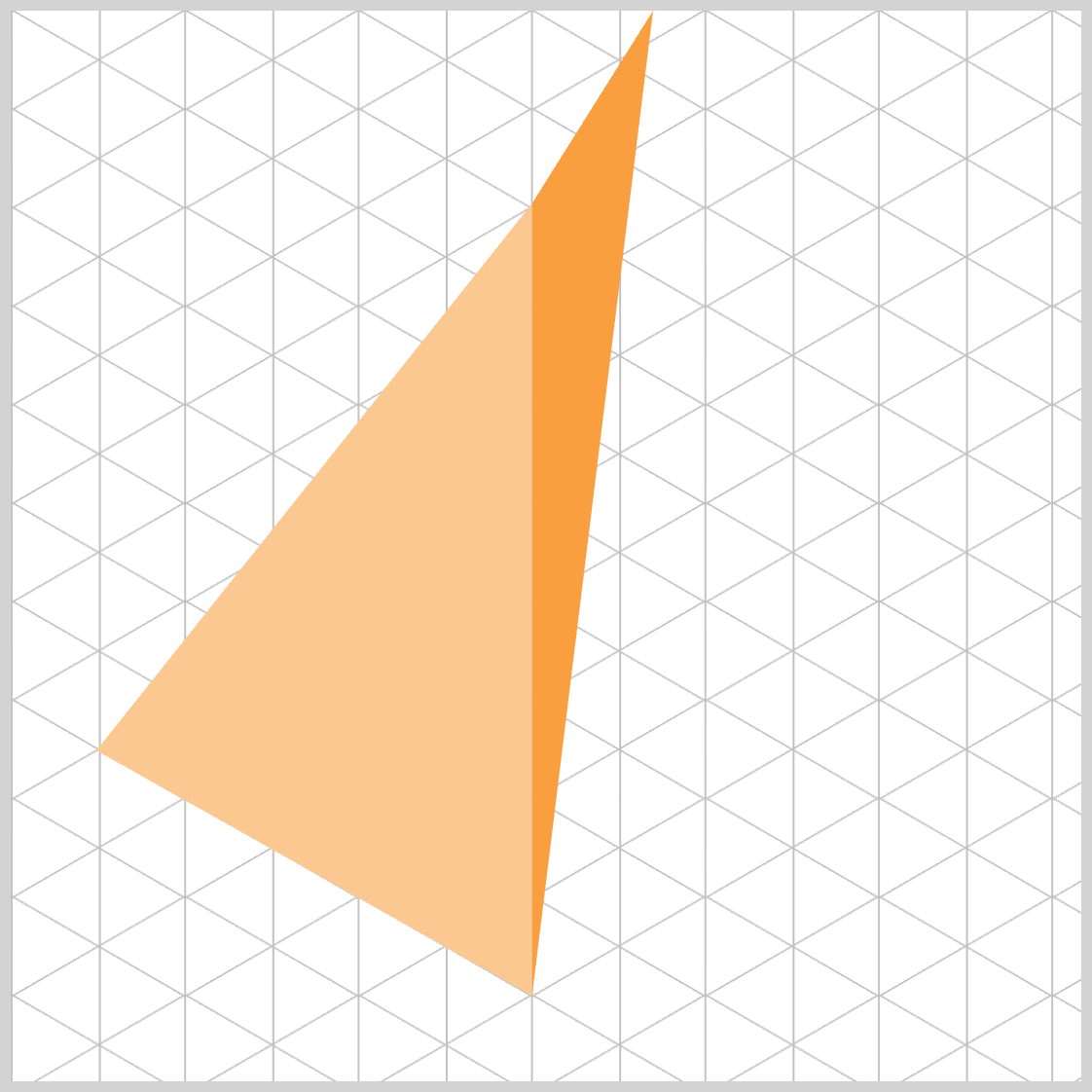
.face.left {
  clip-path: polygon(48.7% 18%, 8% 69.1%, 48.7% 92%);
}
- The third point moved further down to
48.7% 92%and shares the same x with the apex (48.7%), so the segment between point 1 → point 3 is vertical and now extends close to the base. - Because Point 3’s
y(92%) is much lower than the second point’sy(69.1%), the segment 3 → 2 becomes a strong upward diagonal, giving the left face a pronounced taper and reinforcing depth toward the bottom.
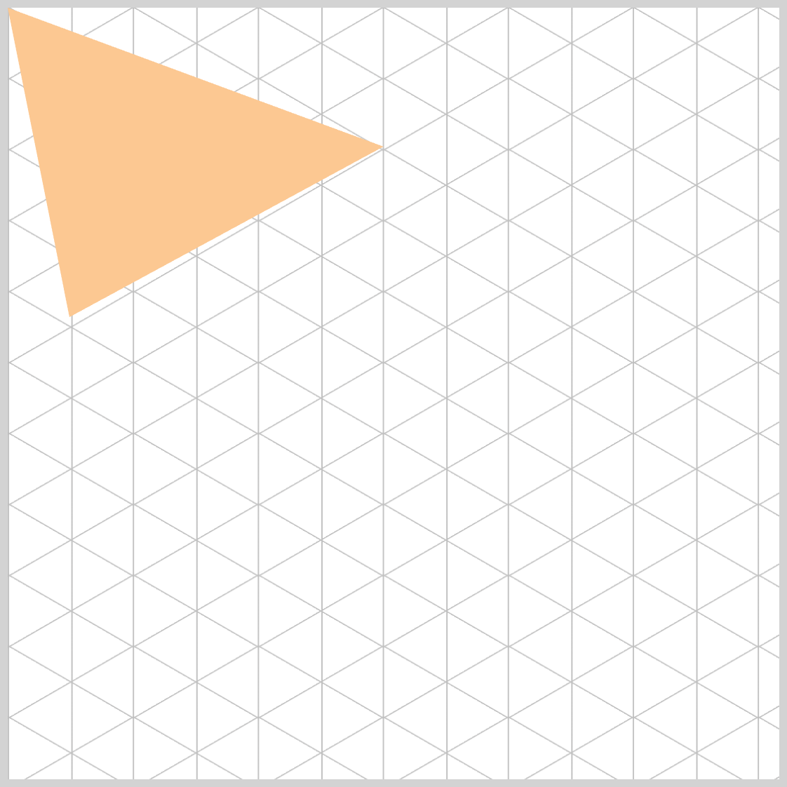
The Left Face is completed. Let’s start working on the Right Face in the next section.
Right Face
/* Right face */
.face.right {
  clip-path: polygon(48.7% 18%, 8% 0%, 0% 0%);
  background: var(--right-color);
}
.face.righttargets the right side of your pyramid.- The
clip-path: polygon(...)function defines a triangle by listing its vertices in order, separated by commas. - Your current coordinates create a triangle that spans from the apex column (
48.7%) toward the top-left edge (8% 0%second point → third point0% 0%). That means it’s currently anchored on the left side of the element.
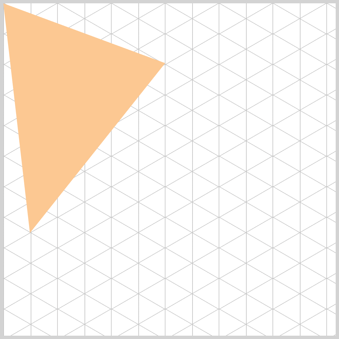
.face.right {
  clip-path: polygon(48.7% 18%, 31% 0%, 0% 0%);
}
- The first point (
48.7% 18%) keeps the apex aligned with your left face—great for consistency at the top. - The second (
31% 0%) and third (0% 0%) points both lie on the top edge, toward the left side of the element.

.face.right {
  clip-path: polygon(48.7% 18%, 31% 40%, 0% 0%);
}
The second point moved from 31% 0% down to 31% 40%.
The visual result:
- The right face now has a longer descending diagonal connecting point 1 to point 2.
- The shape becomes taller, with more weight toward the middle of the element.
- The triangle leans more diagonally downward instead of hugging the top edge.
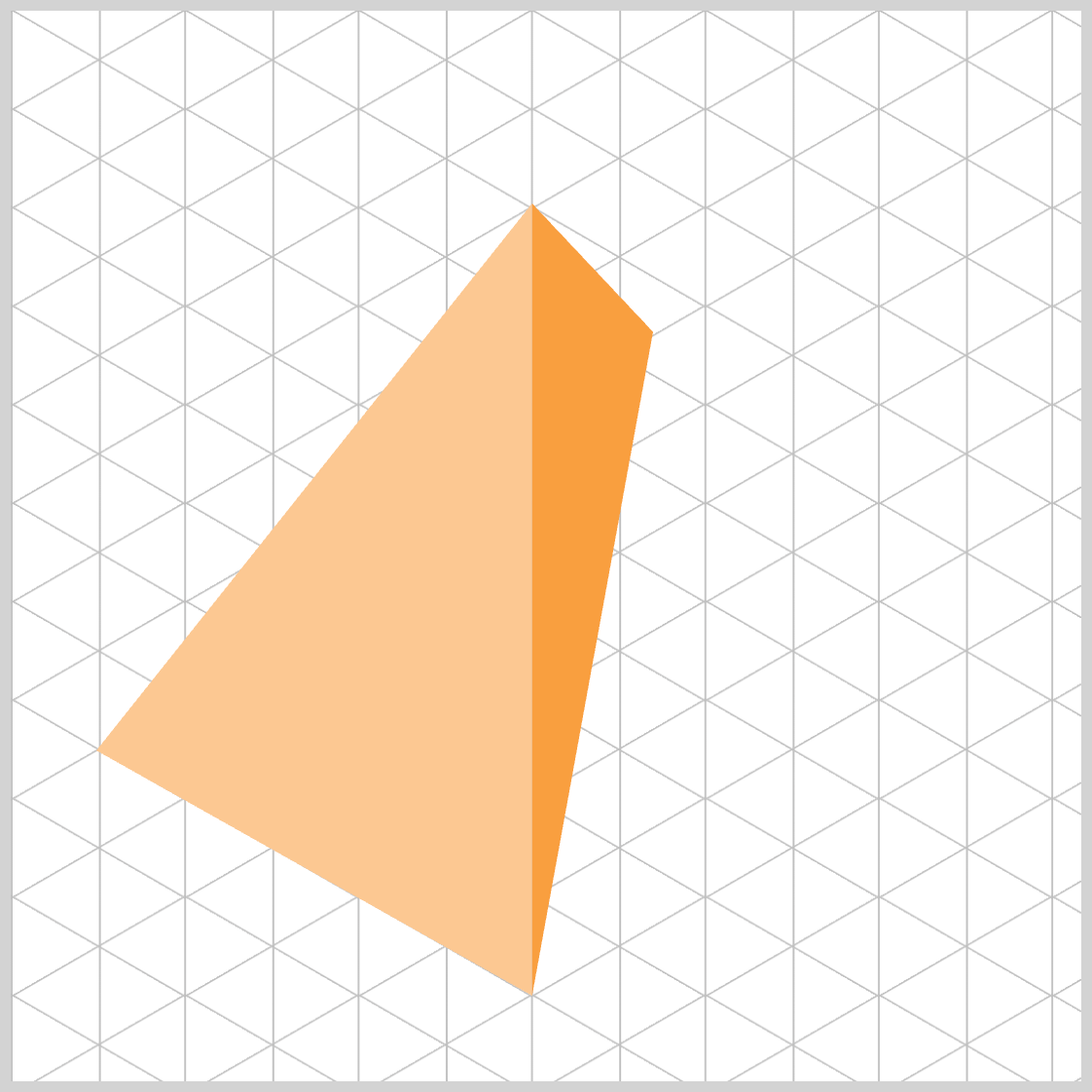
.face.right {
  clip-path: polygon(48.7% 18%, 48.7% 40%, 0% 0%);
}
The second point moved to 48.7% 40%, sharing the same x value as the apex (48.7%).
- This creates a vertical line segment between point 1 → point 2.
- From point 2 → point 3 (
0% 0%), you now get a long upward-left diagonal, which pulls the right face toward the top-left of the element.

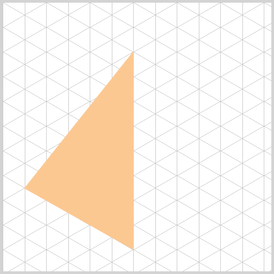
.face.right {
  clip-path: polygon(48.7% 18%, 48.7% 92%, 0% 0%);
}
- Vertical spine (point 1 → point 2):
Points 1 and 2 sharex=48.7%, so the segment is vertical. Lowering point 2 to92%makes this a long, dominant edge. - Diagonal to top-left (point 2 → point 3):
From48.7% 92%to0% 0%, you create a strong up‑left diagonal. This pulls the face’s perimeter toward the left/top region of the container.
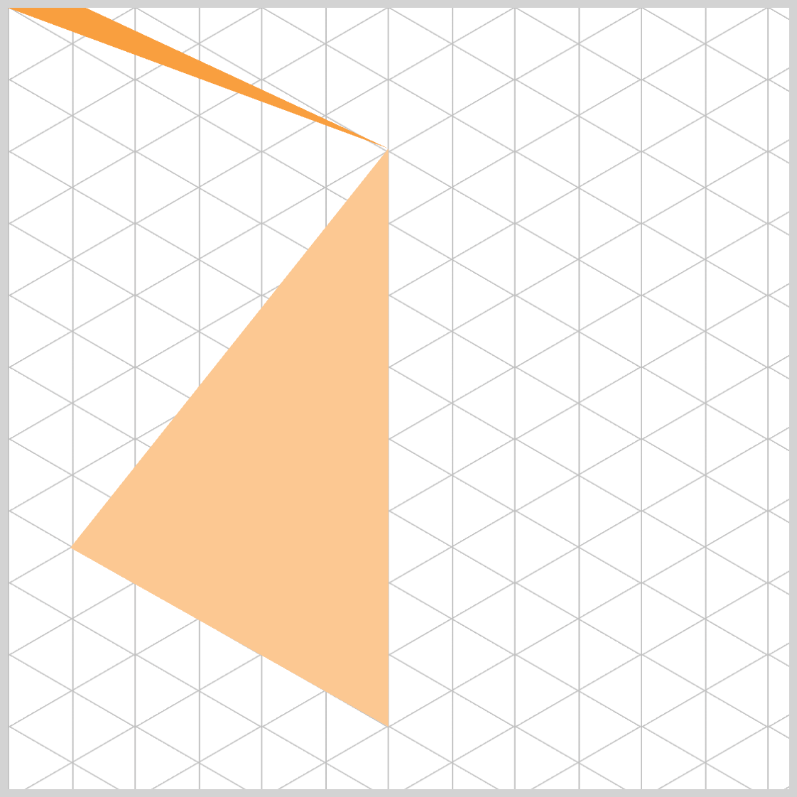
.face.right {
  clip-path: polygon(48.7% 18%, 48.7% 92%, 60% 0%);
}
- You moved point 3 from the top-left corner to
60% 0%, which sits right of center on the top edge. - Because points 1 and 2 share the same
x(48.7%), the segment 1 → 2 remains a vertical spine down the face. - The segment 2 → 3 now travels upright toward the top edge, clearly shifting the right face’s mass to the right side
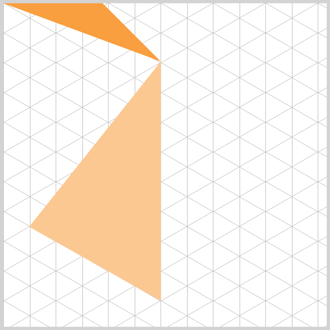
.face.right {
  clip-path: polygon(48.7% 18%, 48.7% 92%, 60% 30%);
}
Point 3 moved from 60% 0% down to 60% 30%.
- This lowers the upper-right anchor, which reduces the steepness of the diagonal from point 2 → point 3.
- The result is a fuller, more substantial right face, with less “pinching” at the top edge and a more natural isometric feel.
Visual effect:
- The upper-right vertex now sits at
30%height, yielding a diagonal that feels balanced against your left face’s lower band.
.face.right {
  clip-path: polygon(48.7% 18%, 48.7% 92%, 60% 50%);
}
Point 3 moved from 60% 30% down to 60% 50%.
- Increasing the
yvalue lowers that right‑side vertex, which softens the diagonal from point 2 → point 3 and adds more visual mass to the lower‑middle of the right face. - This creates a fuller, more grounded right plane, balancing nicely with the left face’s deeper lower band.
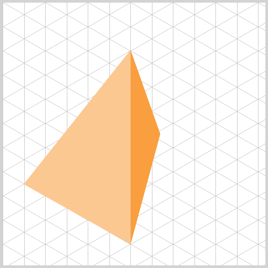
.face.right {
  clip-path: polygon(48.7% 18%, 48.7% 92%, 89% 50%);
}
- Point 3 shifted to
89% 50%, pushing the right‑side vertex far toward the right edge at mid‑height. - The diagonal from point 2 → point 3 now travels up‑right to the midline, giving the right face a broad, confident reach into the right side of the shape.

.face.right {
  clip-path: polygon(48.7% 18%, 48.7% 92%, 89.5% 69%);
}
Grounded right plane (point 3 at 89.5% 69%):
- Placing the third point in the lower‑right band mirrors the left face’s emphasis around the lower zone (you used
~69%there). - This creates a convincing, balanced right face that visually complements the left face’s depth and slope.
Net effect:
- A tall, cohesive right face that feels properly weighted toward the lower region, enhancing the isometric look without “pinching” at the top.
You can see and play with the complete code on Pyxofy’s CodePen page.
See the Pen CSS Art – Using clip-path: polygon() for Building Responsive Isometric Pyramids by Pyxofy (@pyxofy) on CodePen.
Conclusion
Throughout this article, you progressively shaped an isometric pyramid using the CSS clip-path: polygon() function, refining each triangular face through clear, incremental coordinate adjustments.
By experimenting with percentage‑based points, you learned how simple changes in x and y values influence slope, depth, symmetry, and overall perspective. Both the left and right faces were carefully aligned using shared axes, mirrored lower bands, and responsive geometry, resulting in a cohesive 3D-ish form that scales naturally with its container.
With these foundations in place, you’re now fully equipped to build more complex variations, add shadows, or expand this structure into complete CSS‑based isometric scenes. Share your masterpiece with us on LinkedIn, Threads, Bluesky, Mastodon, X (Twitter) @pyxofy, or Facebook.
We hope you liked this article. Kindly share it with your network. We appreciate it.
Related Articles
 Pyxofy
 Pyxofy
 Pyxofy