CSS Art – shape() Function & Gradients: Create an Isometric Trophy - Part 2
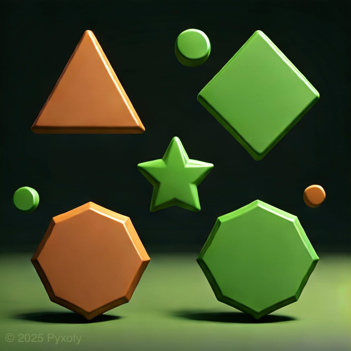
Make shiny, eye‑catching effects! Follow this easy guide to create smooth highlights and shadows using pure CSS—perfect for beginners.

Introduction
Make your isometric images more 3D-like using gradients! Making highlights and shadows has never been easier with CSS.
In this two‑part article series, you’ll build an isometric trophy from start to finish.
- In Part 1, you created the trophy’s foundational components and established its overall structure.
- In Part 2, this article, you’ll bring the trophy to life by adding beautiful colors with CSS gradients and CSS Custom Properties (Variables). This will add depth and make it look even more polished and eye-catching.
CSS functions and properties you’ll be exploring in this article:
linear-gradient()functionradial-gradient()function- CSS Custom Properties (Variables)
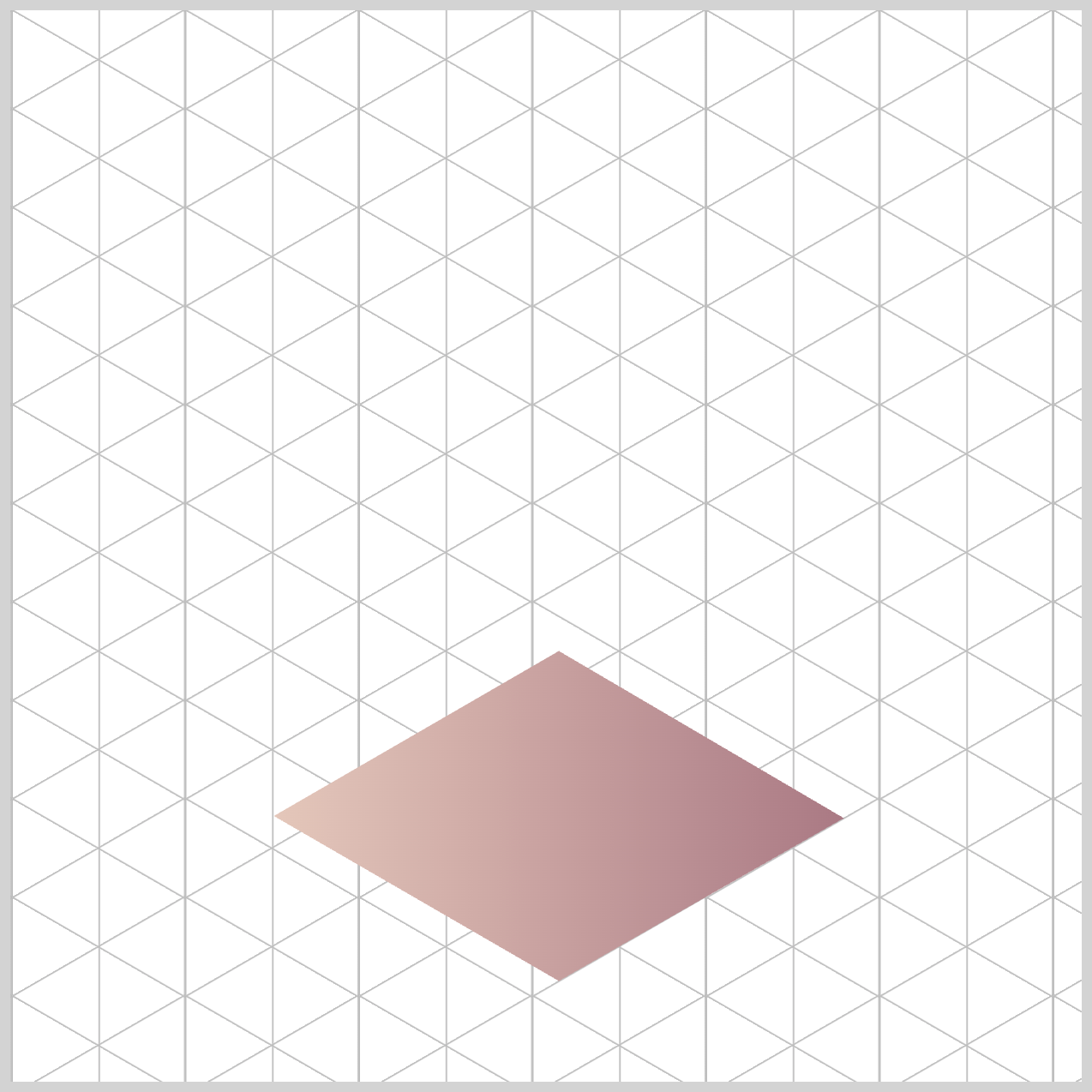
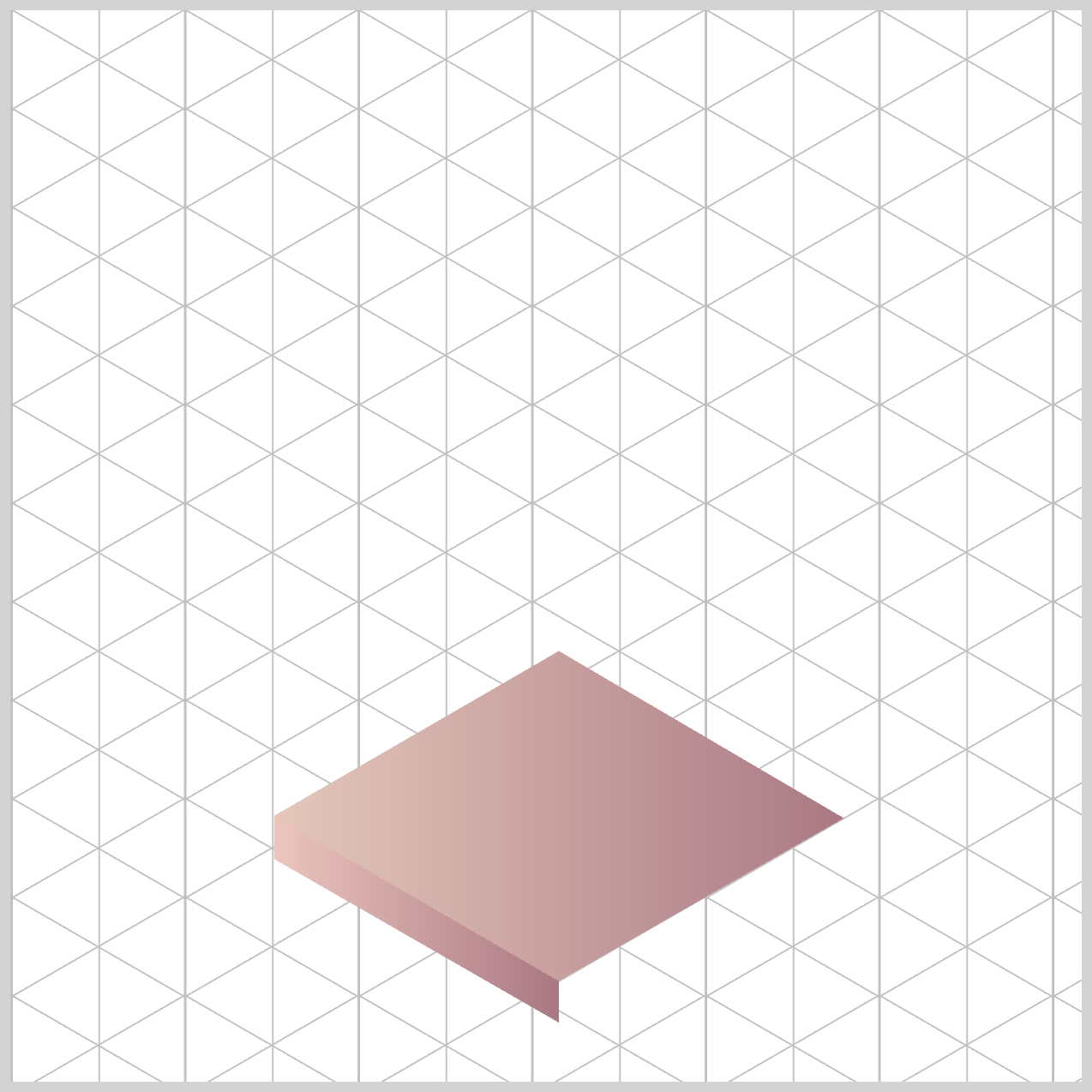
Preview
A quick preview of the isometric trophy you’ll be creating in this two‑part article series.


We recommend you read this article to get familiarized with how CSS gradients work.
 Pyxofy
Prerequisites
Essential CSS and HTML knowledge will help you understand the concepts and techniques introduced in this article. Jump over to this article if you require an HTML and CSS primer.
We assume you have configured tools to modify CSS. If not, this article will guide you through the setup process.
HTML Structure
<div class="container">
  <div class="trophy-base-top"></div>
  <div class="trophy-base-left"></div>
  <div class="trophy-base-right"></div>
  <div class="cup-base-top"></div>
  <div class="cup-base-left"></div>
  <div class="cup-base-right"></div>
  <div class="stem-base"></div>
  <div class="stem"></div>
  <div class="cup-body"></div>
  <div class="cup-rim"></div>
  <div class="cup-inside"></div>
  <div class="star"></div>
</div>
container is the outermost enclosure. It enables the content to be centered and draws a light gray border. The rest of the <div>s represent each image component.
Keep the HTML structure as is for the image to display correctly.
Body and Container <div> CSS
CSS code for the body and container <div>.
/* Body and Container Settings */
/* Center shapes */
body {
  margin: 0;
  padding: 0;
  height: 100vh;
  display: flex;
  justify-content: center;
  align-items: center;
  flex-wrap: wrap;
}

/* Set background and border color */
.container {
  width: 500px;
  height: 500px;
  border: 5px solid lightgray;
  background: transparent;
  position: relative;
  margin: 5px;
  display: flex;
  justify-content: center;
  align-items: center;
}
Color Palette
You’ll color the isometric trophy using CSS Custom Properties (Variables). Using CSS variables makes your code easier to maintain. This structure will hold up if your design grows in the future (e.g., adding handles, trim, medals, etc.).
/* Color Palette */
:root {
  /* Trophy and Cup Base */
  --trophy-base-1: #e5c8bb; /* Cameo Rose */
  --trophy-base-2: #ecc5bd; /* Rose Smoke */
  --trophy-base-3: #debcb0; /* Adobe Rose */
  --trophy-base-4: #c39296; /* Mauve Morn */
  --trophy-base-5: #a97883; /* Nostalgia Rose */
  --trophy-base-6: #c36d6f; /* Desert Rose */
  --trophy-base-7: #854350; /* Oxblood */

  /* Stem Base and Stem */
  --stem-base-1: #f6d167; /* Bright Gold */
  --stem-base-2: #f6a36a; /* Golden Apricot */
  --stem-base-3: #e37e50; /* Autumn Blaze */

  /* Cup Body */
  --cup-body-1: #ffe86e; /* Blazing Yellow */
  --cup-body-2: #fac87e; /* Mineral Yellow */
  --cup-body-3: #f8d834; /* Empire Yellow */
  --cup-body-4: #f39b59; /* Butterscotch */

  /* Star */
  --star-1: #de9f77; /* Warm Taupe */
  --star-2: #be6f3f; /* Ginger Spice */
  --star-3: #d05b3b; /* Burnt Sienna */
}
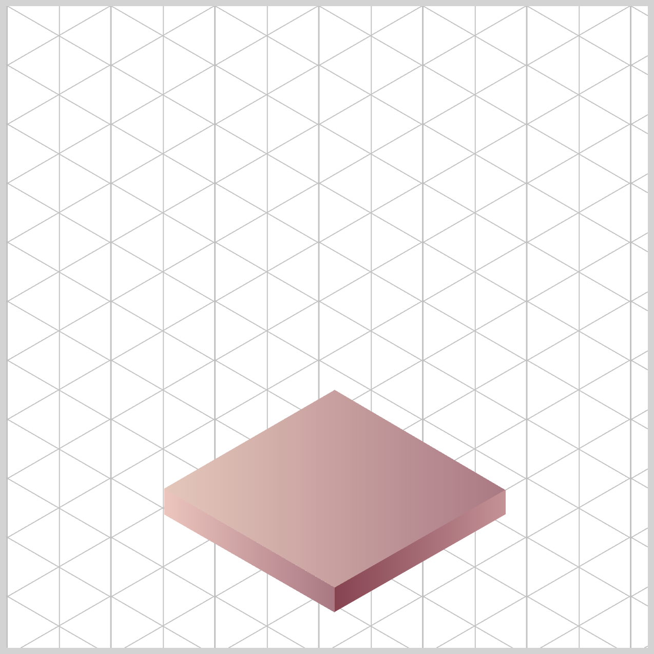
Trophy Base
The Trophy Base uses the CSS linear-gradient() function — a handy tool that lets you blend two or more colors smoothly in a straight line. Think of it like creating a soft color fade from one shade to another across your element. It’s a simple way to add depth and style without needing any images.
/* Trophy Base */
.trophy-base-top {
  background: linear-gradient(
    90deg,
    var(--trophy-base-1),
    var(--trophy-base-5)
  );
}
90degtells the gradient to run from left to right. In other words, the colors flow horizontally across the element. We’ll stick with this angle for all of the Trophy Base components to keep everything looking consistent and polished.var(--trophy-base-1)uses a soft Cameo Rose (#e5c8bb) color, whilevar(--trophy-base-5)brings in a deeper Nostalgia Rose (#a97883) shade. When these two blend in the gradient, you get a smooth left‑to‑right highlight that gives the surface a subtle beveled or metallic look — almost like light is catching the edge.
.trophy-base-left {
  background: linear-gradient(
    90deg,
    var(--trophy-base-2),
    var(--trophy-base-5)
  );
}
var(--trophy-base-2)brings in a soft Rose Smoke,#ecc5bd, color.var(--trophy-base-5)uses the deeper Nostalgia Rose shade,#a97883.
.trophy-base-right {
  background: linear-gradient(
    90deg,
    var(--trophy-base-7),
    var(--trophy-base-4)
  );
}
For the Right Face, the first gradient uses var(--trophy-base-7), which is the rich Oxblood shade #854350. The second gradient uses var(--trophy-base-4), a lighter Mauve Morn color (#c39296). Blending these two creates a nice depth and contrast that helps the right face stand out with a subtle, polished finish.
Now that the Trophy Base is all wrapped up, let’s jump into the next section and start adding color to the Cup Base.
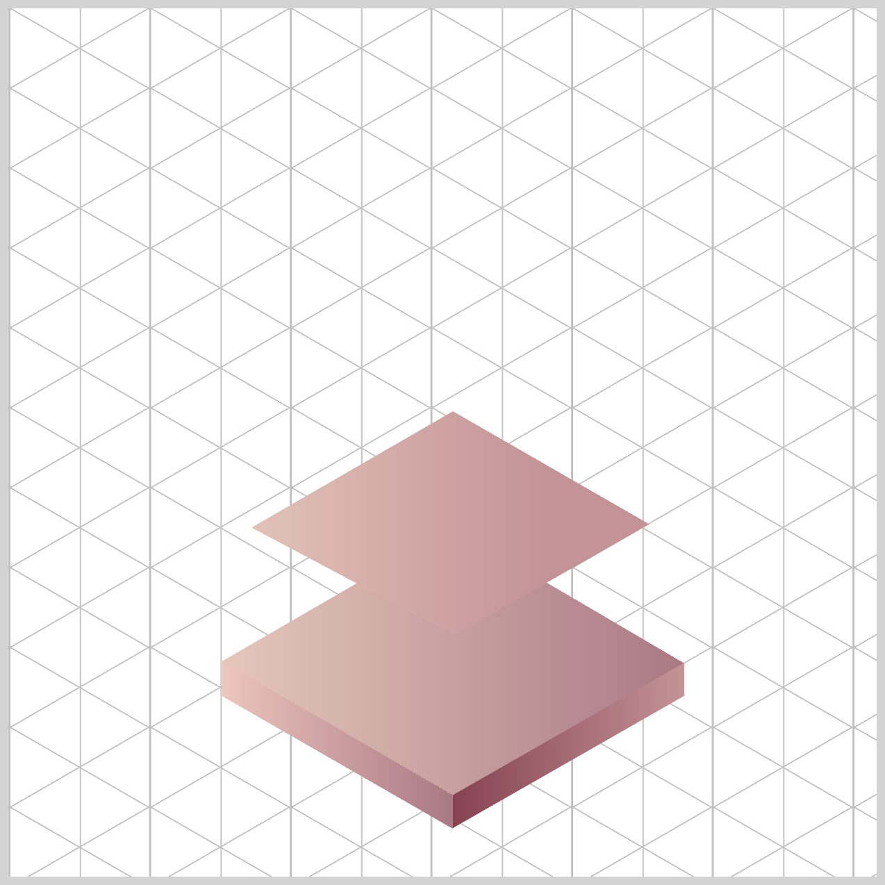
Cup Base
Just like we did with the Trophy Base, the Cup Base also uses the CSS linear-gradient() function to build its color styling. It’s the same technique—smoothly blending colors to give the surface depth and a polished look.
/* Cup Base */
.cup-base-top {
  background: linear-gradient(
    90deg,
    var(--trophy-base-1),
    var(--trophy-base-4) 70%
  );
}
90degmeans the gradient runs left → right. So the left edge starts with the first color, and the color blend moves to the right. The remaining Cup Base components will use this angle.var(--trophy-base-1)kicks in at the left edge (0%)—this is your lighter tone set to#e5c8bb, a Cameo Rose hue.var(--trophy-base-4) 70%means the darker color,#c39296, a Mauve Morn shade, reaches its “full” gradient around70%across the component width.
You get a long, soft highlight across most of the surface, with a firmer shadow band toward the right.
.cup-base-left {
  background: linear-gradient(
    90deg,
    var(--trophy-base-3),
    var(--trophy-base-5)
  );
}
The Left Face uses a darker color scheme compared to the Top Face. The first color is #debcb0, an Adobe Rose hue, applied using var(--trophy-base-3). The second color is Nostalgia Rose (#a97883), assigned via var(--trophy-base-5). This gradient scheme makes the Left Face look slightly curved or angled — more realistic, more dimensional.
.cup-base-right {
  background: linear-gradient(
    90deg,
    var(--trophy-base-7),
    var(--trophy-base-6)
  );
}
For the Right Face, you’re fading from a very dark to slightly less dark color scheme.
var(--trophy-base-7)is assigned an Oxblood (#854350) shade.#c36d6fa Desert Rose color is associated withvar(--trophy-base-6).
Up next is the Stem Base and Stem.
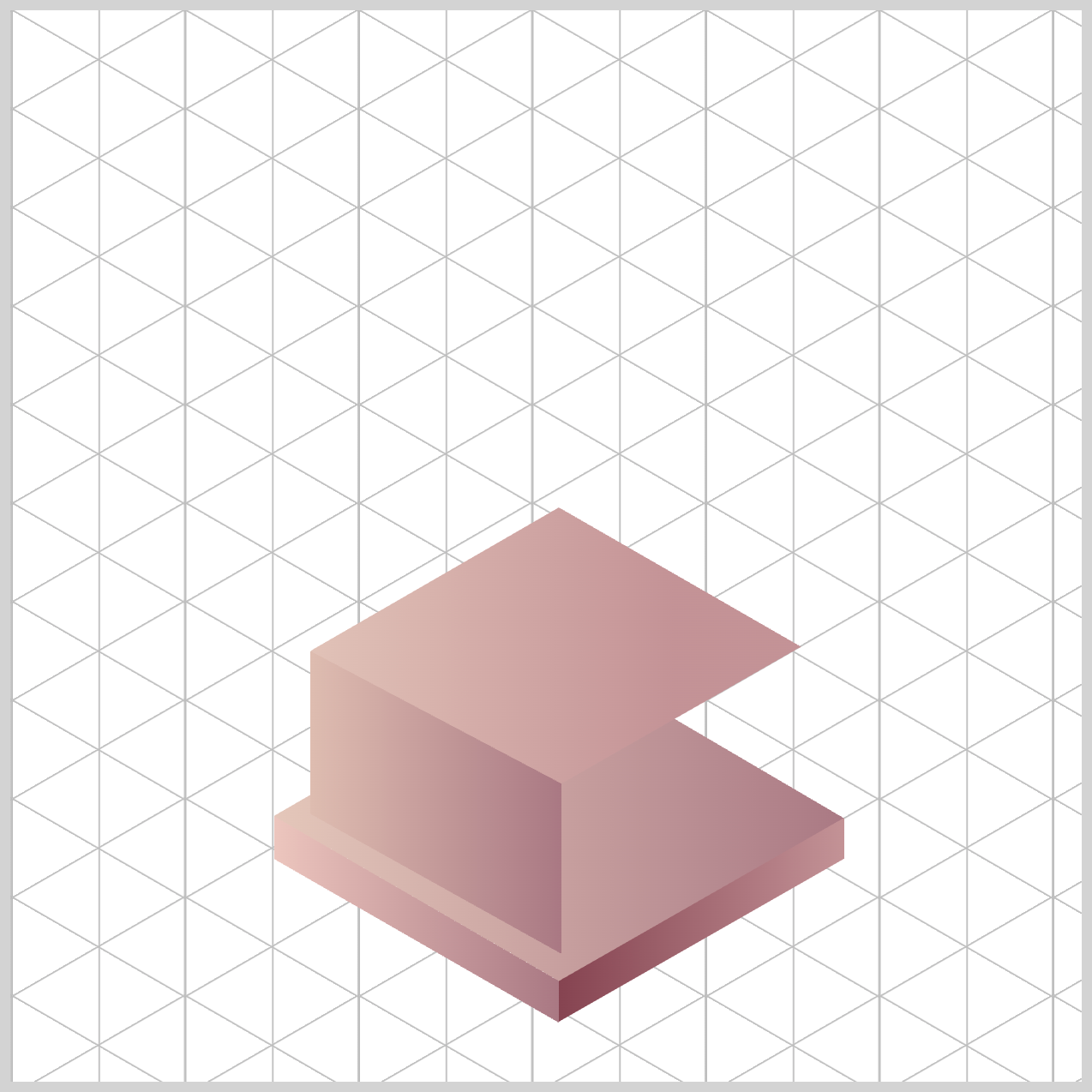
Stem Base and Stem
The Stem Base and Stem will be styled using the CSS radial-gradient() function. In this section, you’ll learn how to create radial gradients and position them inside the trophy components to give the surface a more realistic, rounded look. It’s a great way to add depth and make the trophy feel more three‑dimensional.
/* Stem Base and Stem */
.stem-base {
  background: radial-gradient(
    circle at 40% 0%,
    var(--stem-base-1) 60%,
    var(--stem-base-2) 70%
  );
}
circle at 40% 0%creates a circle gradient, instead of the default ellipse shape, and places it40%from the left and0%from the top of the Stem Base component. This simulates a light source hitting the component from the top-left corner.var(--stem-base-1)a Bright Gold hue (#f6d167) fills the gradient up to60%of the radius — this is your bright highlight.var(--stem-base-2)is assigned#f6a36a(Golden Apricot) takes over by70%, creating a soft edge around the highlight, acting like a subtle shadowed rim.
.stem {
  background: radial-gradient(
    circle at 40% 10%,
    var(--stem-base-2) 50%,
    var(--stem-base-3) 70%
  );
}
A circular hotspot highlight is created and placed using circle at 40% 10%. With at 40% 10%, the gradient’s center (the hotspot) sits 40% from the left and 10% from the top of the component—consistent with a top‑left light source.
Up to 50%, the stem is the lighter tone (var--stem-base-2) → this is your bright zone. Between 50% to 70%, it gently transitions to the darker Autumn Blaze tone (#e37e50) using var(--stem-base-3. From 70% to the edges, the element stays at --stem-base-3, which reads like a subtle shadowed rim around the highlight.
Let’s move on to the next section and color the Cup Body.
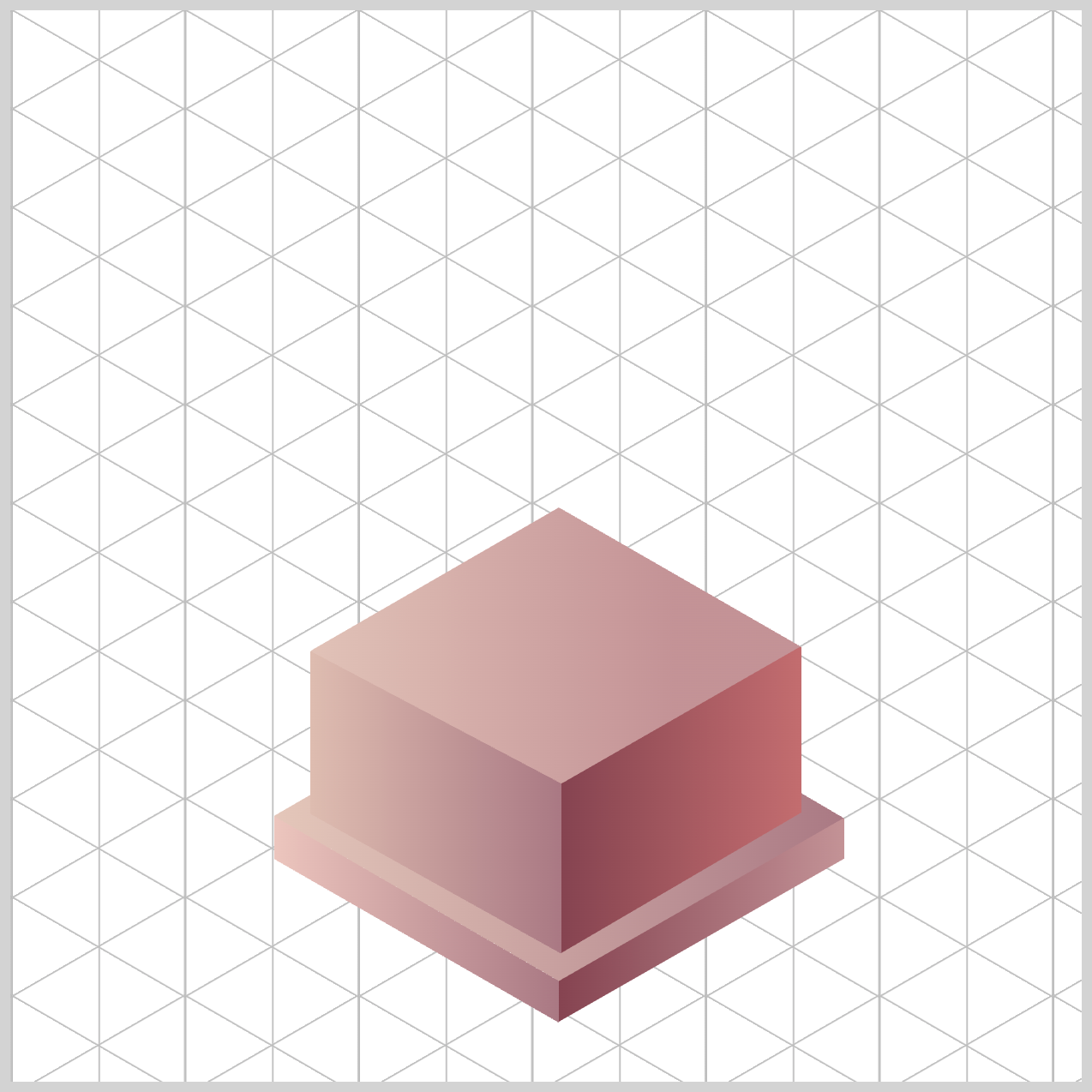
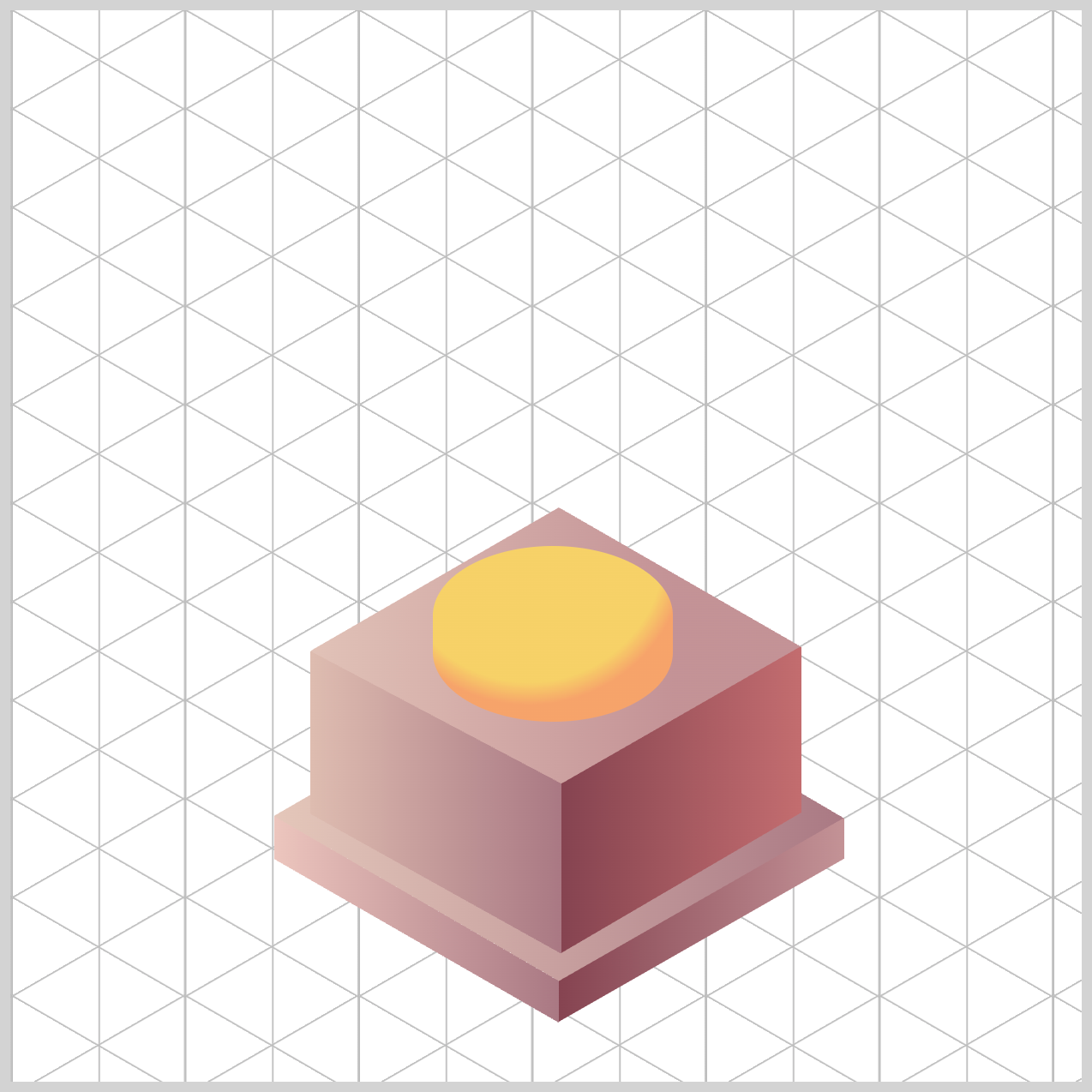
Cup Body
The Cup Body also uses the CSS radial-gradient() function, just like in the previous section. This time, you’ll work with color stops to control exactly where each color fades in and out. It gives you much finer control over the final look, helping the Cup Body feel smooth, rounded, and more realistic.

/* Cup */
.cup-body {
  background: radial-gradient(
    circle at 10% 25%,
    var(--cup-body-3) 5%,
    var(--cup-body-1) 20% 50%,
    var(--cup-body-4) 80%
  );
}
1.circle at 10% 25%:
circle→ the gradient is a perfect circle (not the default ellipse).at 10% 25%→ the center of the gradient is positioned10%from the left and25%from the top of the element. That places your highlight near the top‑left, consistent with the earlier components.
2.var(--cup-body-3) 5%:
A tiny bright core (up to 5%, #f8d834) of the Empire Yellow color. This is the most shiny area right of the highlight.
3.var(--cup-body-1) 20% 50%:
From 20% to 50%, holds --cup-body-1 (#ffe86e, a Blazing Yellow hue), giving you a wider, stable highlight zone—great for a polished, rounded cup.
4.var(--cup-body-4) 80%:
By 80%, you’ve transitioned to --cup-body-4, a Butterscotch (#f39b59) shade. From 80% out to the edge, the color remains --cup-body-4, which reads as the shadowed area of the cup body.
Next up, we’ll style the Cup Rim and the Inside of the cup.
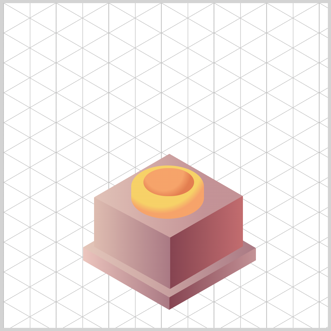
Cup Rim and Inside
This section combines two gradient types: a linear-gradient() for the Cup Rim and a radial-gradient() for the Inside. Together, they help create a polished edge and a realistic sense of depth inside the cup.

.cup-rim {
  background: linear-gradient(180deg, var(--cup-body-1), var(--cup-body-3));
}
180degmeans the linear gradient runs top to bottom.- It starts with
var(--cup-body-1)(Blazing Yellow,#ffe86e) at the top and transitions tovar(--cup-body-3)(Empire Yellow,#f8d834) at the bottom.
The linear gradient is a simple, effective top highlight that rolls into a slightly darker tone—perfect for a rim that catches light at the top edge and darkens as it curves away.

.cup-inside {
  background: radial-gradient(
    circle at 50% 10%,
    var(--cup-body-2) 0%,
    var(--cup-body-4) 50%
  );
}
circle at 50% 10%makes a circle gradient, and its center is middle horizontally and close to the top vertically. This places the highlight near the inner lip, which is exactly where a real rim catches light.--cup-body-2gives a warm highlight (Mineral Yellow,#fac87e) right at the center (top inside).- By
50%, you’ve transitioned to--cup-body-4, a richer, darker Butterscotch shade (#f39b59)—that helps the inside look concave and shadowed.
Visual result:
A bright inner lip that rolls into a deeper interior tone, selling the idea of a rounded, shadowed cup interior.
Let’s head into the final section and add color to the Star component. This is the last touch that brings the entire trophy design together!
Star
You’ll use the CSS radial-gradient() function to give the star a warm, glowing highlight. By blending a few complementary tones, you can make the star look dimensional and almost “ember‑like,” as if it’s gently shining from the right side outward.

/* Star */
.star {
  background: radial-gradient(
    circle at 20% 30%,
    var(--star-1) 5%,
    var(--star-3),
    var(--star-2) 80%
  );
}
circle at 20% 30%:
Creates a circle gradient,20%from the left,30%from the top. This placement matches a top‑left light source, which you’ve consistently used for your cup, base, stem, and rim.var(--star-1) 5%:
This is your tiny highlight spot, Warm Taupe (#de9f77). It only extends5%of the radius, so it feels like a bright glint or shine.var(--star-3):
This becomes your core glow — the strong, warm color (Burnt Sienna,#d05b3b), inside the star.var(--star-2) 80%:
This color takes over by80%of the radius, becoming the outer edge, which naturally reads as a softer, deeper edge shadow (Ginger Spice,#be6f3f).
Result: A glowing, dimensional star with a warm center and a smooth fade — perfect for a trophy emblem.
You can see and play with the complete code on Pyxofy’s CodePen page.
See the Pen CSS Art - shape() Function & Gradients: Create an Isometric Trophy by Pyxofy (@pyxofy) on CodePen.
Conclusion
In Part 2 of this two-part article series, you learned how to shape color highlights and shadows using the CSS linear-gradient() and radial-gradient() functions.
By combining linear-gradient() and radial-gradient(), you can create smooth color transitions that add depth, highlights, and realistic lighting to your elements. Using color stops, angles, and custom CSS variables gives you precise control over how each surface appears.
Whether you’re shaping a base, rim, or star, these gradient functions allow you to build rich, dimensional visuals without relying on images—just clean, flexible CSS.
Start making CSS-only images with this newfound knowledge today. Share your masterpiece with us on LinkedIn, Threads, Bluesky, Mastodon, X (Twitter) @pyxofy, or Facebook.
We hope you liked this article. Kindly share it with your network. We appreciate it.
Related Articles
 Pyxofy
 Pyxofy

 Pyxofy