CSS Art - Radial Gradient Techniques for Realistic Isometric Design - Part 1
Create a mesmerizing multi-colored gumball machine using only CSS! Follow our step-by-step tutorial to design this iconic, eye-catching machine.

Introduction
Gumball machines feature timeless designs characterized by vibrant colors and curved edges. In this two-part article series, you will learn how to make an isometric gumball machine using CSS and HTML.
- In Part 1, this article, you will learn how to create the fundamental shape of the gumball machine.
- In Part 2, you'll discover how to utilize the CSS
radial-gradient()function along with CSS Custom Properties (Variables) to create a custom color palette.
CSS properties and functions explored in this article:
border-radiustransform::beforepseudo-elementrotate()skewX()scaleY()
Preview
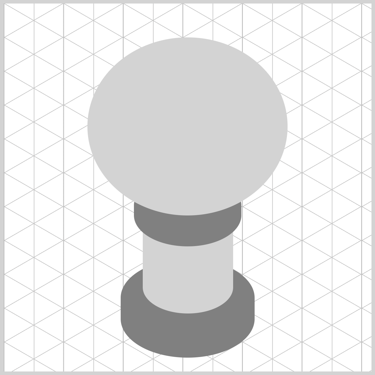
The completed gumball machine includes a coin mechanism and multi-colored gumballs stored within the semi-transparent globe.
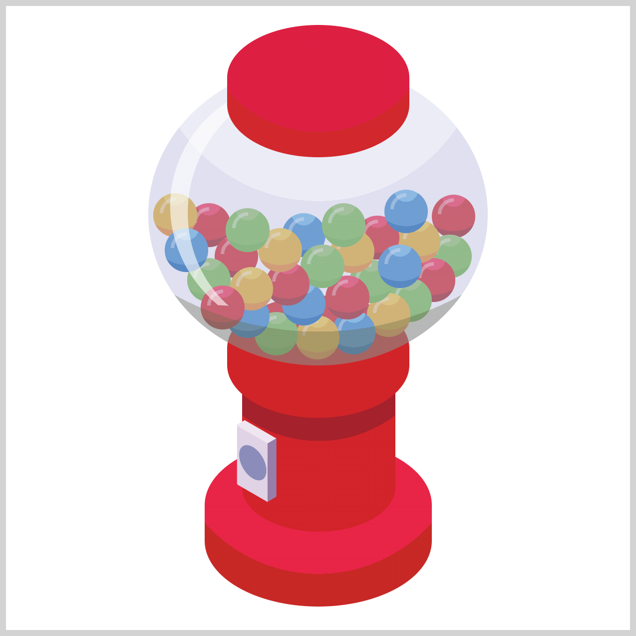
This article will concentrate on creating the fundamental shape of the gumball machine. All component coloring will be done in grayscale.
Prerequisites
Essential CSS and HTML knowledge will help you understand the concepts and techniques introduced in this article. Jump over to this article if you require an HTML and CSS primer.
We assume you have configured tools to modify CSS. If not, this article will guide you through the setup process.
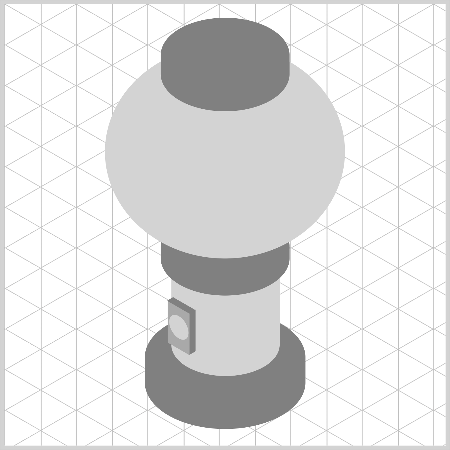
HTML Structure
<div class="container">
  <div class="base"></div>
  <div class="cylinder"></div>
  <div class="neck"></div>
  <div class="globe"></div>
  <div class="cover"></div>
  <div class="coin-mech-front"></div>
  <div class="coin-mech-side"></div>
  <div class="coin-mech-top"></div>
</div>
container is the outermost enclosure. It enables the content to be centered and draws a light gray border. The rest of the divs represent each image component.
Keep the HTML structure as is for the image to display correctly.
Body and Container Div CSS
CSS code for the body and container div.
/* Body and Container Settings */
/* Center shapes */
body {
  margin: 0;
  padding: 0;
  height: 100vh;
  display: flex;
  justify-content: center;
  align-items: center;
  flex-wrap: wrap;
}

/* Set background and border color */
.container {
  width: 500px;
  height: 500px;
  border: 5px solid lightgray;
  background: transparent;
  position: relative;
  margin: 5px;
  display: flex;
  justify-content: center;
  align-items: center;
}
Common Properties
The image components of the isometric gumball machine share similar CSS properties. To keep the code concise, we are consolidating these properties.
/* Common Properties */
.cover,
.globe,
.neck,
.cylinder,
.coin-mech-front,
.coin-mech-front::before,
.coin-mech-side,
.coin-mech-top,
.base {
  position: absolute;
}
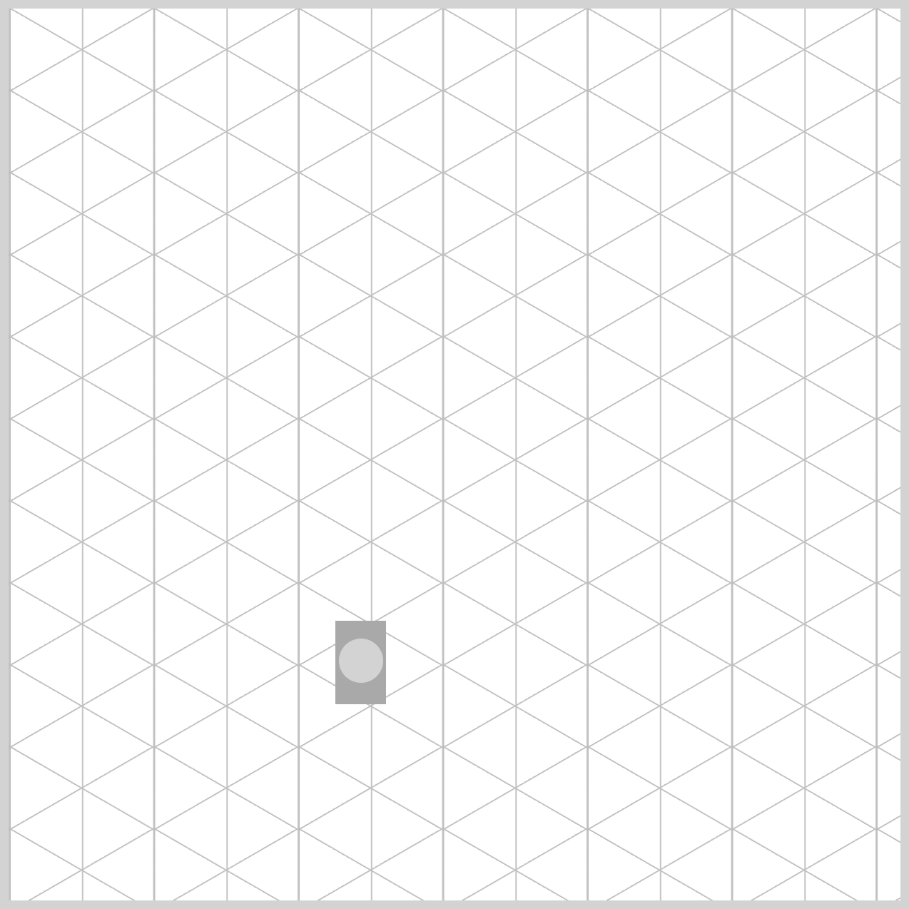
Isometric Grid Guide
It’s easier to make an isometric image using a grid guide. Check this How-to tutorial to learn how to make the isometric grid guide.
 Pyxofy
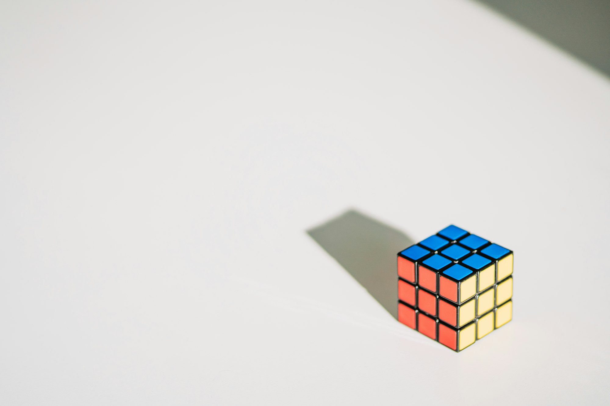
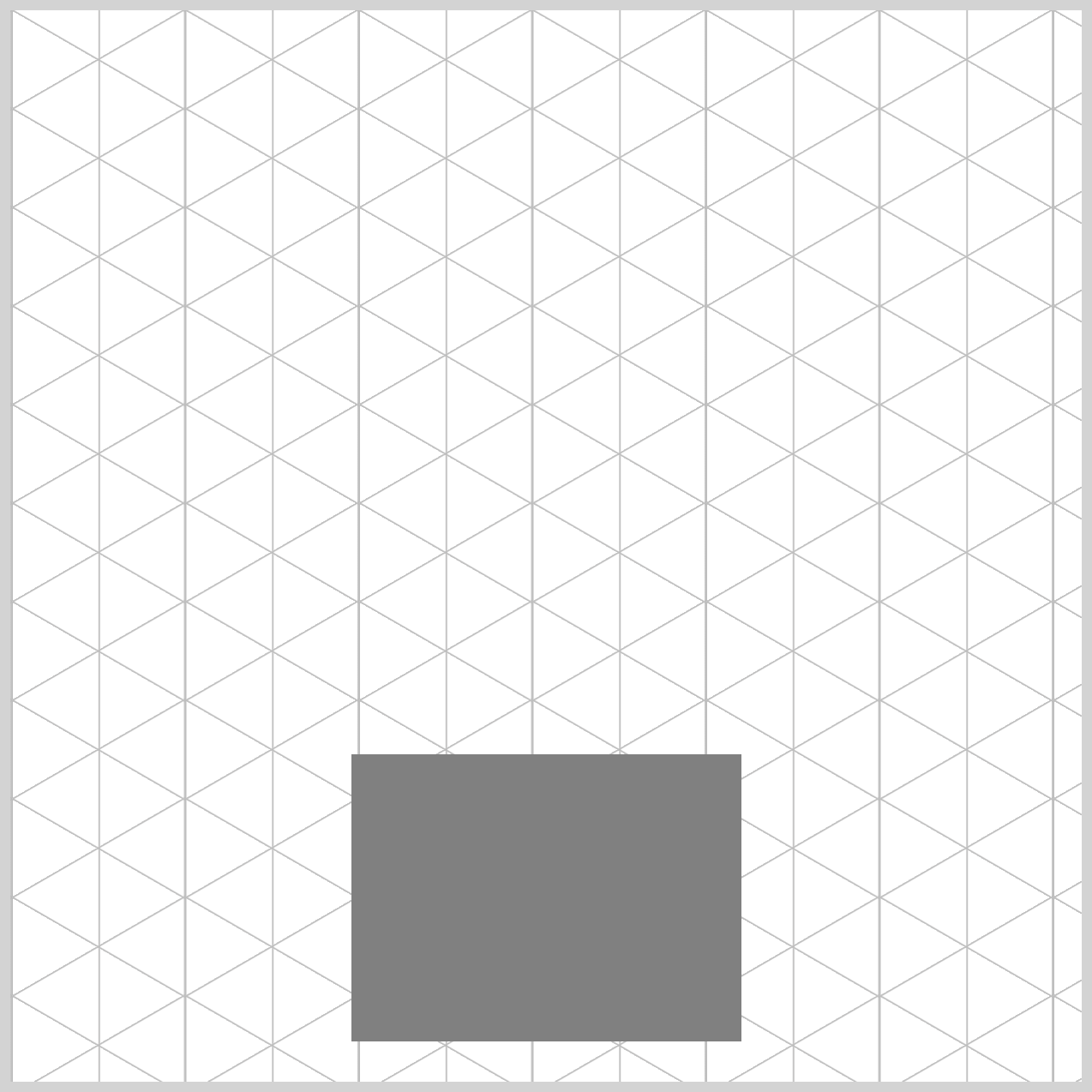
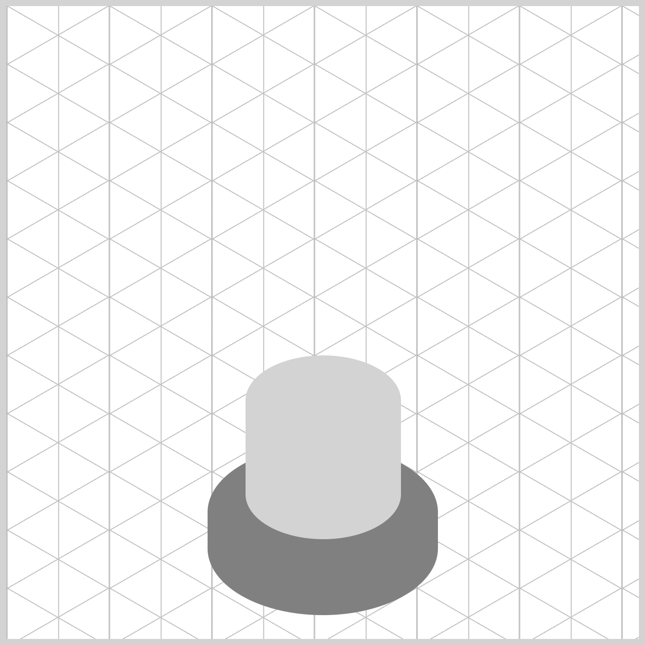
Gumball Machine Base
Typically, CSS elements begin in the form of a rectangle or square. The base of the gumball machine and the other image components are rectangles with rounded edges.
/* Base */
.base {
  width: 182px;
  height: 134px;
  top: 347px;
  left: 159px;
  background: gray;
}
The gumball machine base measures 182px wide and 134px tall. It is located 347px from the top and 159px from the left edge. The background color is gray.
.base {
  border-radius: 95px/55px;
}
The CSS border-radius property rounds the corners of rectangles. Use 95px/55px as the value to smooth the edges of the gumball machine base.
Cylinder
Similar to the previous section’s gumball machine base, the cylinder starts as a rectangle, which is then transformed by rounding the corners to create a cylindrical shape.
/* Cylinder */
.cylinder {
  width: 123px;
  height: 145px;
  top: 276px;
  left: 189px;
  background: lightgray;
}
The cylinder’s width is set to 123px, and its height is set to 145px. Its top property value is 276px, and it is positioned 189px from the left edge. The background color is set to light gray.
.cylinder {
  border-radius: 95px/55px;
}
Next, you will create the neck component.
Neck
The neck of the gumball machine is positioned above the cylinder component, and it is significantly smaller than both the base and the cylinder.
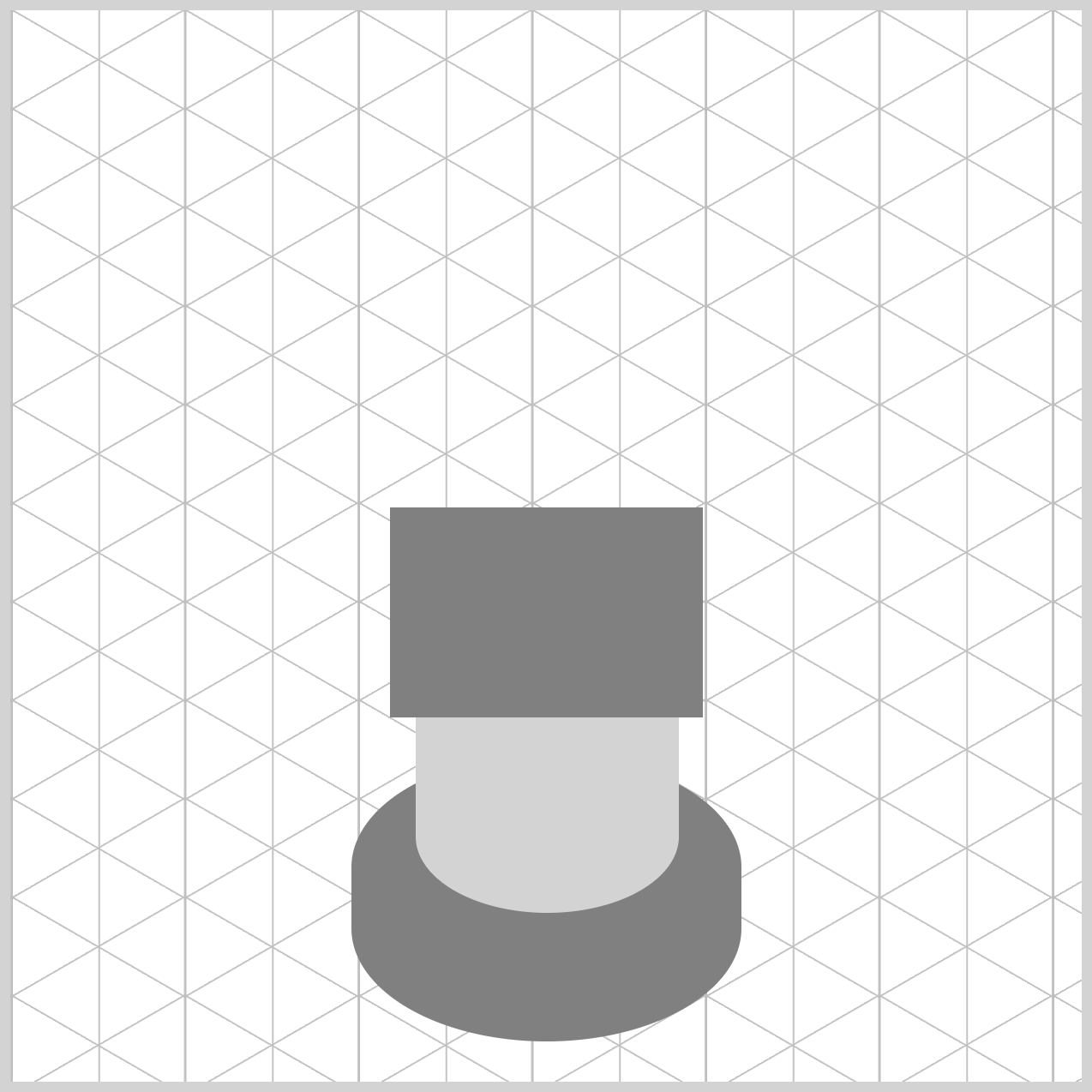
/* Neck */
.neck {
  width: 146px;
  height: 98px;
  top: 232px;
  left: 177px;
  background: gray;
}
The background color is set to gray. 146px is designated as the width, and 98px is specified as the height property value. The neck component is positioned 232px from the top and 177px from the left.
.neck {
  border-radius: 95px/55px;
}
Like the base and cylinder components, the neck’s border radius is configured to 95px/55px.
Up next is the globe.
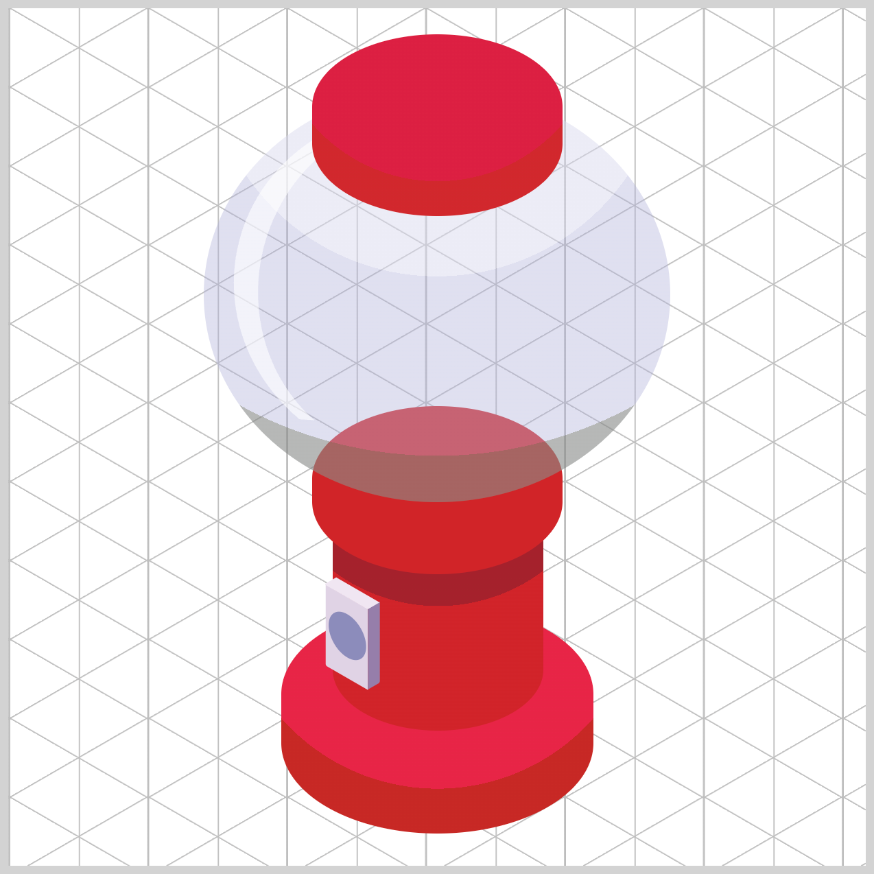
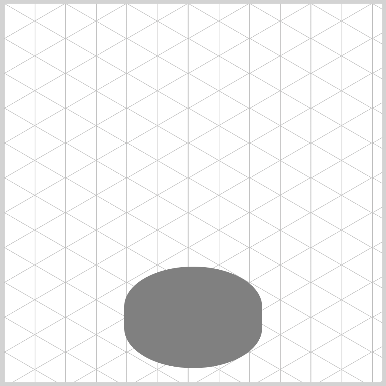
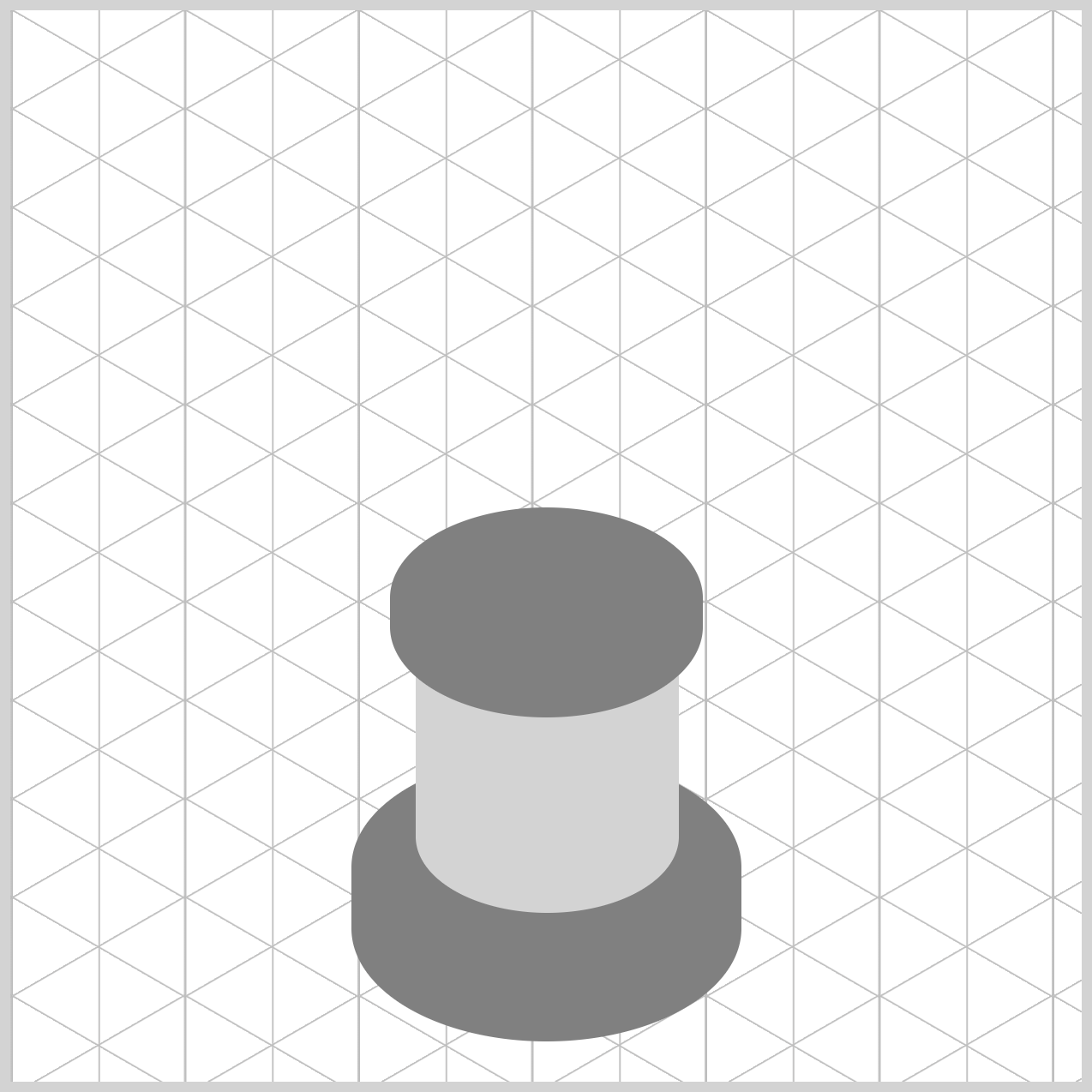
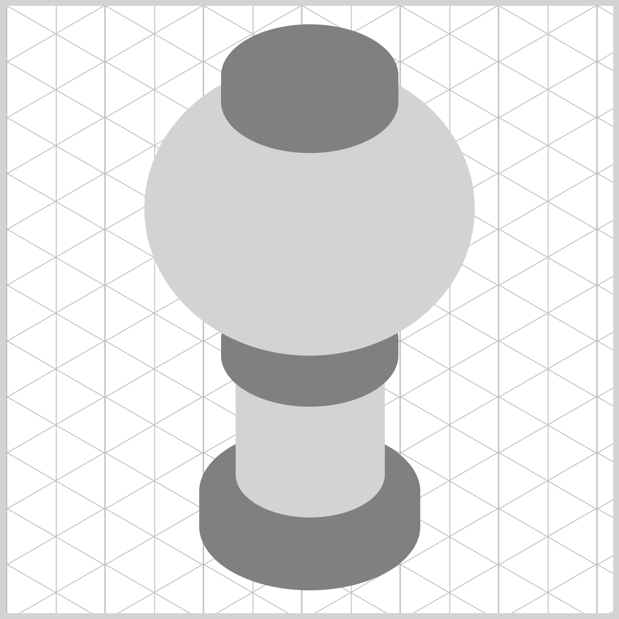
Globe
The globe is the largest gumball machine component and will store the multi-colored gumballs.
/* Globe */
.globe {
  width: 272px;
  height: 242px;
  top: 46px;
  left: 114px;
  background: lightgray;
}
The globe background color is set to light gray and situated 46px from the top and 114px from the left edge. It’s 272px wide and 242px high.
.globe {
  border-radius: 50%;
}
The globe’s border radius is set to 50%.
Let’s make the cover component in the next section.
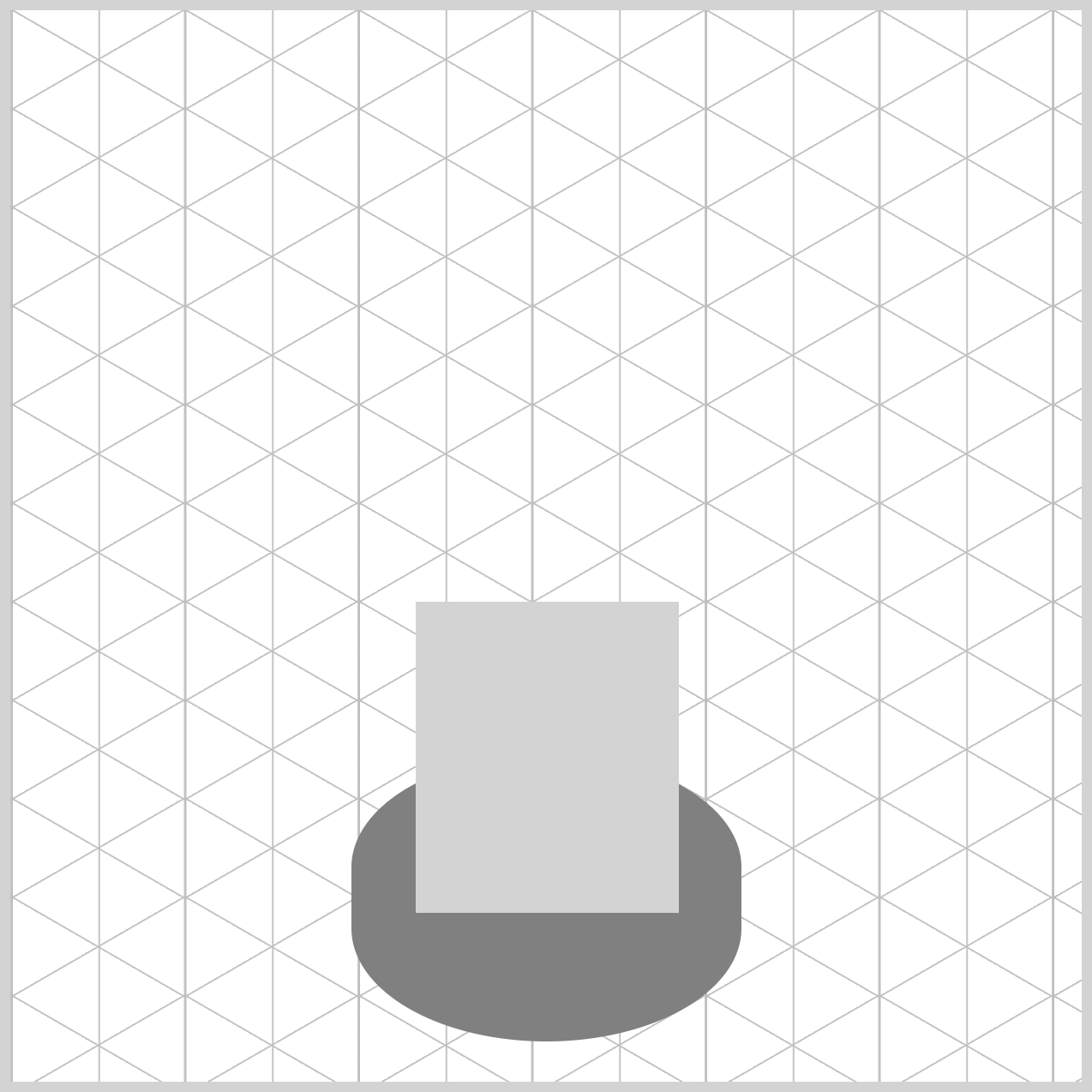
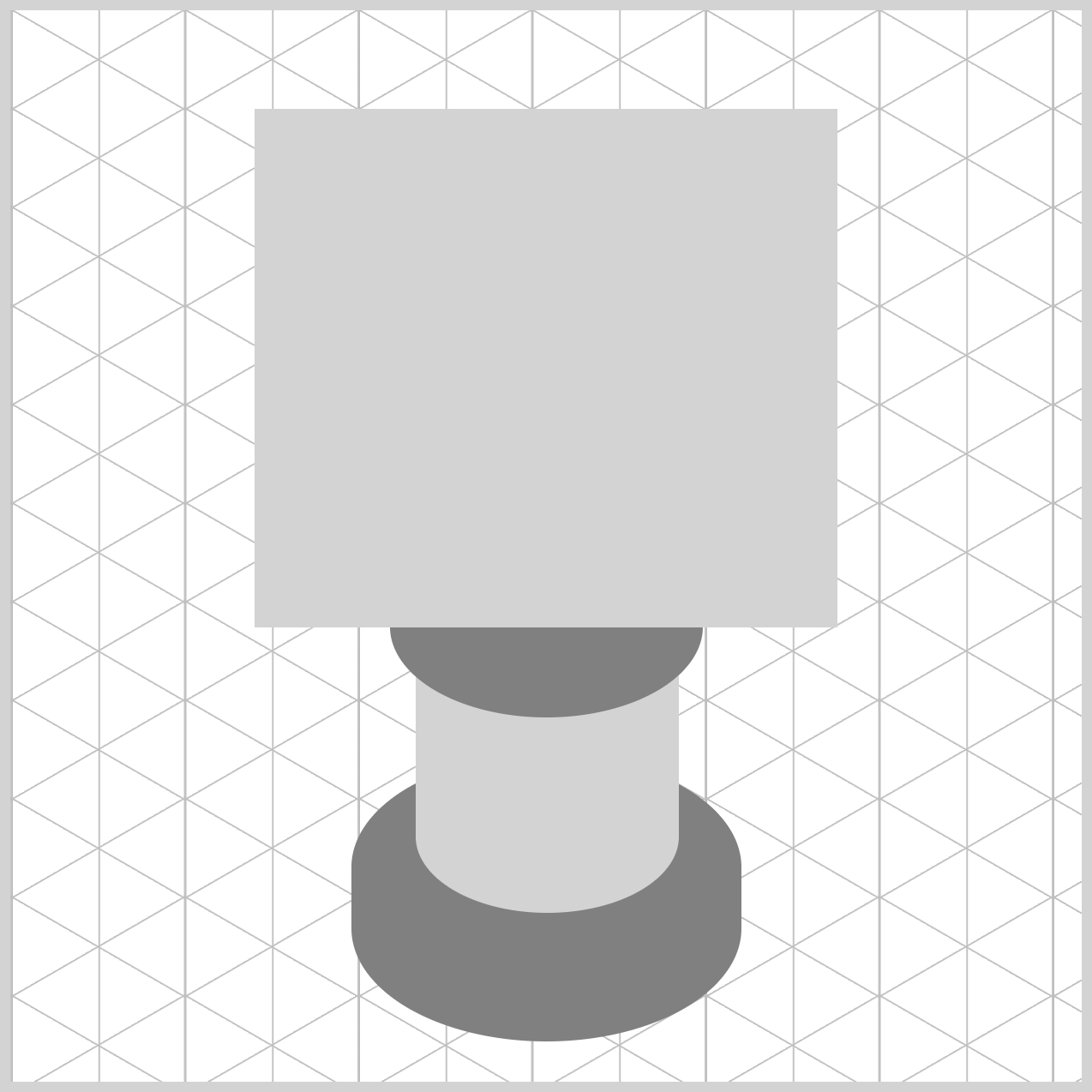
Cover
The cover closely matches the size of the neck component and sits atop the globe component.
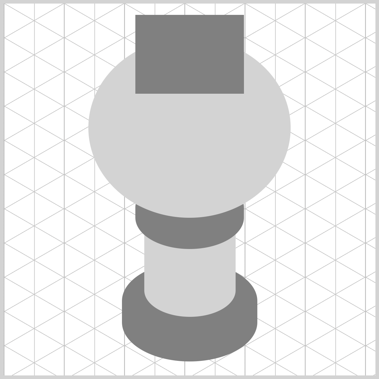
/* Cover */
.cover {
  width: 146px;
  height: 106px;
  top: 15px;
  left: 177px;
  background: gray;
}
The width property value is set to 146px, while the height is 106px. The cover’s top property value is set to 15px, and the left is 177px. The background color is a shade of gray.
.cover {
  border-radius: 95px/55px;
}
The border radius is defined as 95px/55px, akin to the base, cylinder, and neck components.
Let’s finish the gumball machine by completing the coin mechanism in the following article sections.
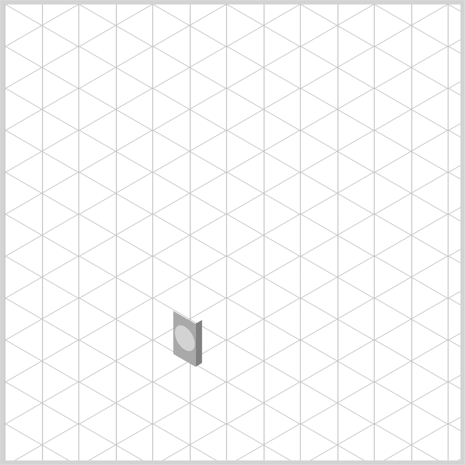
Coin Mechanism - Front Section
Begin by constructing the front section of the coin mechanism at a flat angle. Once this front section is finished, adjust it to an isometric angle with the CSS transform property.

/* Coin Mechanism */
.coin-mech-front {
  width: 28.5px;
  height: 47px;
  top: 343px;
  left: 183px;
  background: darkgray;
}
Create the basic shape by setting the background to darkgray, the width to 28.5px, and the height to 47px. Set the top property value to 343px and the left value to 183px.
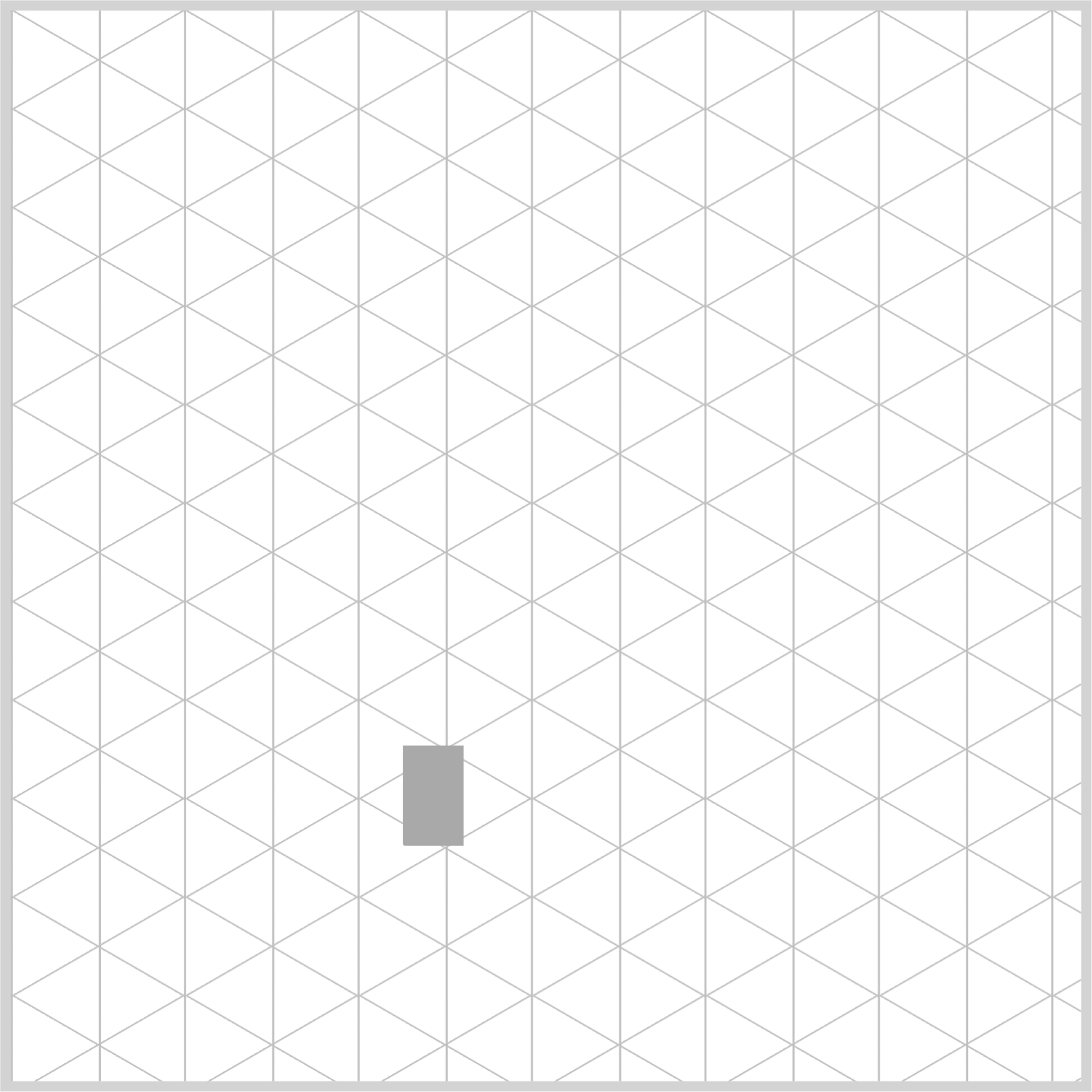
.coin-mech-front {
  border-radius: 0px 0px 0px 1px;
}
Slightly round the bottom left corner using border-radius: 0px 0px 0px 1px.

.coin-mech-front::before {
  content: "";
  width: 25px;
  height: 25px;
  top: 10px;
  left: 2px;
  background: lightgray;
}
You will use the ::before CSS pseudo-element to create the coin insert component.
- The width and height property values are set to
25px. - The top property value is set to
10px, and the left property value is set to2px. - The background color is set to
lightgray.
.coin-mech-front::before {
  border-radius: 50%;
}
Smooth the corners of the coin insert by applying a 50% value to its border radius property.

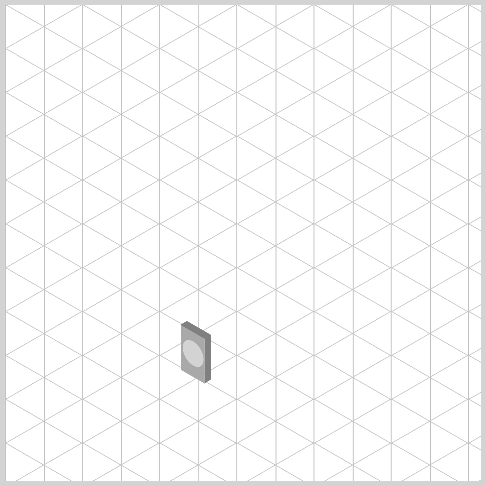
.coin-mech-front {
  transform: rotate(30deg) skewX(30deg) scaleY(0.866);
}
The front section of the coin mechanism is finished and can now be set to an isometric angle.
rotate(30deg)rotates the front section by 30 degrees.- Skew the front section horizontal angle using
skewX(30deg). scaleY(0.866)reduces the side section’s height to 86.6%, creating an isometric angle.
The front section is complete. Up next is the side section.
Side Section
The side section is a slender, vertically stretching rectangle. Similar to the front and the following top section, begin by forming it at a standard angle, then adjust to an isometric angle upon completion.

.coin-mech-side {
  width: 8px;
  height: 47px;
  top: 348px;
  left: 209px;
  border-radius: 0px 0px 1px 0px;
  background: gray;
}
- Set the width property value to
8px 47pxwill be the height property value- The top property value is set to
348pxand the left value to209px - The lower right corner is slightly rounded by setting its border radius to
1px - The background color is set to
gray
.coin-mech-side {
  transform: rotate(-30deg) skewX(-30deg) scaleY(0.866);
}
Rotate and skew the side section using rotate(-30deg) and skewX(-30deg) to minus 30 degrees. Adjust the side section’s height to 86.6% by applying scaleY(0.866), resulting in an isometric angle.
Top Section
Let’s wrap up this article by completing the coin mechanism’s top section.

.coin-mech-top {
  width: 29px;
  height: 8px;
  top: 337.1px;
  left: 186px;
  border-radius: 0px 1px 0px 0px;
  background: gray;
}
Set the width property value to 29px and the height to 8px. Position the top at 337.1px and the left at 186px. The upper right corner features a 1px rounding, and the background color is gray.
.coin-mech-top {
  transform: rotate(210deg) skewX(-30deg) scaleY(0.866);
}
- Rotate the top section by 210 degrees using
rotate(210deg) - Use
skewX(-30deg)to skew the top section’s horizontal angle scaleY(0.866)reduces the top section’s height to 86.6%, creating an isometric angle.
You can see and play with the complete code on Pyxofy’s CodePen page.
See the Pen CSS Art - Radial Gradient Techniques for Realistic Isometric Design - Gumball Machine by Pyxofy (@pyxofy) on CodePen.
Conclusion
In the first part of this two-part article series, you’ve completed the fundamental shape of the gumball machine. You constructed the base, cylinder, neck, globe, and cover using the CSS border-radius property to round the corners of the rectangles and squares.
You combined several CSS transform property functions, such as rotate(), scaleY(), and skewX(), to simulate the coin mechanism’s isometric angle.
Keep an eye out for Part 2 of this two-part article series, where you’ll learn how to use the CSS radial-gradient() function and how to create a custom color palette with CSS Custom Properties (Variables).
In the meantime, share your masterpiece with us on LinkedIn, Threads, Bluesky, Mastodon, X (Twitter) @pyxofy, or Facebook.
We hope you liked this article. Kindly share it with your network. We appreciate it.
Related Articles
 Pyxofy
 Pyxofy
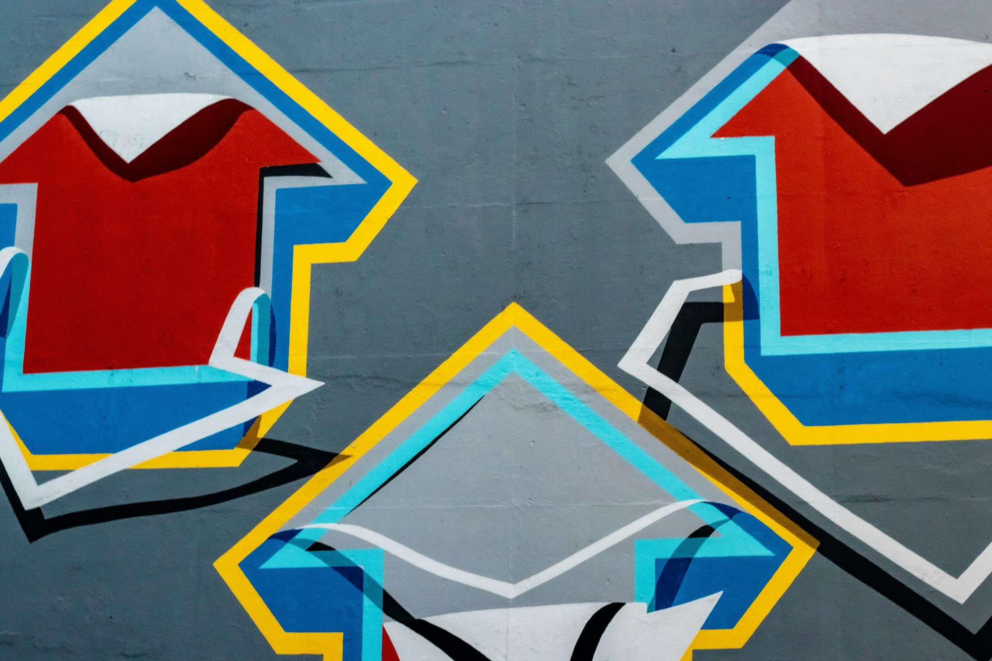
 Pyxofy