CSS Animation – Fade In and Out
Poof! Now you see it, now you don’t. Let’s learn how to make sophisticated fade effects and much more in this step-by-step article.
Introduction
Fade in and fade out animation effects are a staple in all sorts of visual media, from movies, TV shows, all the way to web and game animation.
We’ll be combining multiple CSS properties to produce interesting fade in and fade out animation in this article.
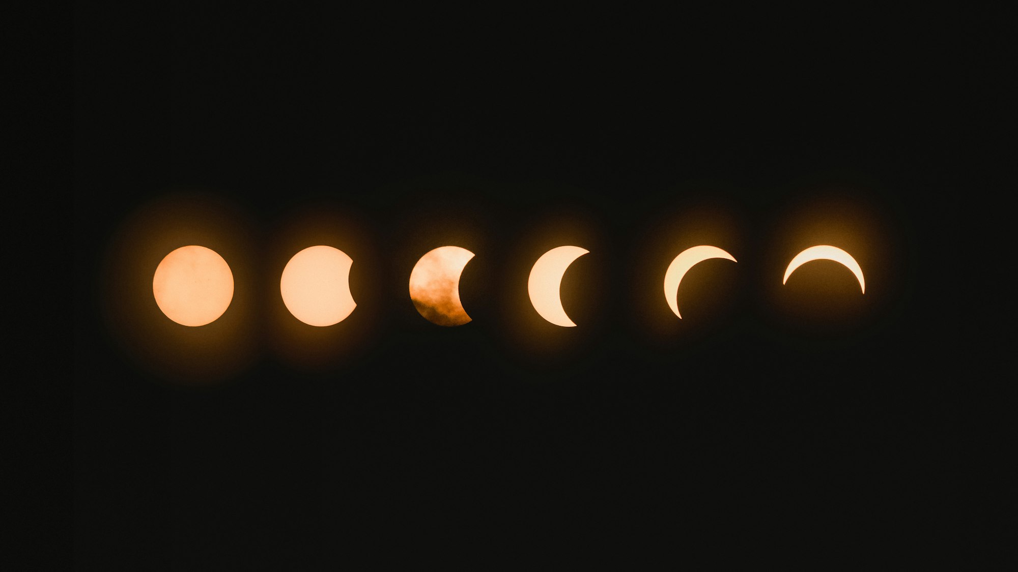
Preview
Preview of the animations we’ll make in this article.
Fade In

Fade In, Move and, Fade Out
Prerequisites
We don’t assume prior knowledge of CSS or HTML, but it helps if you have some familiarity with how they work. Jump over to this article if you require an HTML and CSS primer.
We assume that you have set up tools to create CSS animation. If you haven’t, this article will show you how to set them up.
If you’re unfamiliar with CSS animation and @keyframes at-rule property, please read this article.
HTML Structure
<div class="container">
  <div class="circle fade-in-out-to-lower-right"></div>
</div>
<div class="container">
  <div class="circle fade-in"></div>
</div>
<div class="container">
  <div class="circle fade-out"></div>
</div>
<div class="container">
  <div class="circle fade-in-to-upper-right"></div>
</div>
container is our outermost enclosure. This enables us to center the content and draw a light gray border. The rest of the divs represent each animation sequence.
It’s important to keep the HTML structure as is for each animation to display properly.
Body and Container Div CSS
CSS code for the body and container div.
/**************************************/
/* Color, Body and Container Settings */
/**************************************/
/* Center shapes */
body {
  margin: 0;
  padding: 0;
  height: 100vh;
  display: flex;
  justify-content: center;
  align-items: center;
  flex-wrap: wrap;
}

/* Set light gray border */
.container {
  width: 500px;
  height: 500px;
  border: 5px solid lightgray;
  background: royalblue;
  position: relative;
  display: flex;
  justify-content: center;
  align-items: center;
  border-radius: 1px;
  margin: 5px;
}
CSS Shape
The circle shape we’ll animate in this article.
/* Shape */
.circle {
  position: absolute;
  width: 150px;
  height: 150px;
  background-color: burlywood;
  border-radius: 50%;
  animation-duration: 3s;
  /* animation-iteration-count: 3; */
  animation-iteration-count: infinite;
  animation-timing-function: ease-in-out;
}
Fade In
Fade in animation is a common animation technique. Let’s see how we can create this animation with CSS.
CSS Code
/* Fade In */
.fade-in {
  animation-name: fade-in;
}

@keyframes fade-in {
  from {
    opacity: 0;
  }

  to {
    opacity: 1;
  }
}
The CSS opacity property controls an object's transparency.
opacity property value can be set in two ways.
- Number:
0.0to1.0 - Percentage:
0%to100%
A 0 value makes the object fully transparent or invisible.
When you set a 1 value, the object will be opaque or fully visible.
Any number between 0 and 1, let’s say 0.5, makes the object translucent. Any shape or color behind the object can be seen.
To generate a fade in effect, we set our from or initial state opacity value to 0. Our CSS circle will be invisible at this state. We set our to or end state opacity to 1, which will make our circle opaque.
Our animation-duration is set to 3s, hence our circle will animate from transparent to opaque in 3 seconds.
In the next section, let’s make our circle fade out and disappear.
Fade Out
Fade out is another fundamental animation technique. We see this effect often used in movies, TV shows and video games for endings or scene transitions.
CSS Code
/* Fade Out */
.fade-out {
  animation-name: fade-out;
}

@keyframes fade-out {
  from {
    opacity: 1;
    transform: scale(3);
  }

  to {
    opacity: 0;
    transform: scale(0);
  }
}
For this example, we’ll create a fade out effect with a small twist. Instead of doing a straight fade out, we’ll change the circle’s size as it fades out.
We use two CSS properties, opacity and transform: scale function, to create this effect.
Our from or initial state sets the circle as fully opaque with this code, opacity: 1. With the code, transform: scale(3), our shape will be scaled three times its default size.
We make our circle fade out and scale down with the below code inside our to state.
opacity: 0transform: scale(0)
In the next section, let’s turn our fade effect a notch higher.
Fade and Move
The next example will explain how we can fade a shape while it’s moving and changing size.
CSS Code
/* Fade in while moving to upper right */
.fade-in-to-upper-right {
  animation-name: fade-in-to-upper-right;
}

@keyframes fade-in-to-upper-right {
  from {
    opacity: 0;
    top: 350px;
    left: 0px;
    scale: 0;
  }

  to {
    opacity: 1;
    top: 0px;
    left: 350px;
    scale: 1;
  }
}
We use three CSS properties to make this animation effect.
Our circle will move from the lower left-hand corner to the upper-right corner. As it moves, we’ll scale its size and fade it in simultaneously. The animation sequence will be three seconds long.
Let’s break down the from state.
from {
  opacity: 0;
  top: 350px;
  left: 0px;
  scale: 0;
}
opacityproperty value is set to0. The circle shape is fully transparent.- We use the CSS
positionproperty to set the location of the circle.top: 350pxmoves our circle 350 pixels on the y-axis, vertically pushing it down.left: 0pxkeeps our circle 0 pixels on the x-axis. scale: 0scales our circle shape to0from its default150pxsize.
Next, let’s move on to our to or end state.
to {
  opacity: 1;
  top: 0px;
  left: 350px;
  scale: 1;
}
- We set our
opacityproperty value to1. This makes the circle shape fully opaque. - Our
positionproperty is reversed.topis set to0pxinstead of350px.leftproperty value is set to350px. This puts our circle in the upper right-hand corner. - The
scaleCSS property is set to1. This scales the shape to its default 150 pixel size.
Onward to our final section.
Fade In, Move and, Fade Out
In our final section we will use an in-between state, 50%, in our @keyframes. Remember, you can add multiple in-between states by using different percentages.
CSS Code
/* Fade in and out while moving to lower right */
.fade-in-out-to-lower-right {
  animation-name: fade-in-out-to-lower-right;
}

@keyframes fade-in-out-to-lower-right {
  from {
    opacity: 0;
    top: 400px;
    left: 0px;
    scale: 0;
  }
  50% {
    opacity: 1;
    top: 150px;
    left: 150px;
    scale: 2;
  }

  to {
    opacity: 0;
    top: 400px;
    left: 400px;
    scale: 0;
  }
}
The final animation sequence will make our circle shape move from the lower left-hand corner to the middle of the screen, then to the lower right-hand corner.
The circle will be transparent in its start and end state. It will be fully opaque and scaled twice its size in its middle or in-between state.
Play around with the example code.
How about modifying the code so that it moves to the upper left-hand corner as its end state? Change the in-between state, make the circle transparent instead of being opaque.
You can see and play with the code at Pyxofy’s CodePen page.
See the Pen CSS Animation — Fade In and Out by Pyxofy (@pyxofy) on CodePen.
Conclusion
We learned how to combine CSS property opacity, position and scale in this article.
By combing three CSS properties, we created interesting fade in and fade out effects.
We expanded the fade effects by combining them with scale and movements animations sequences.
By adding in-between or middle states in our @keyframes, we can create more sophisticated animations.
Please let us know what animation you’ll be creating with the techniques you learned in this article. Share your masterpiece with us on Twitter @pyxofy, on LinkedIn, Mastodon or Facebook.
We hope you liked this article. Kindly share it with your network. We really appreciate it.
Related Articles
 Pyxofy
 Pyxofy