CSS Art – shape() Function & Gradients: Create an Isometric Trophy - Part 1
Learn clip-path and shape() basics to build modern, image-free UI designs—perfect for beginners. Draw curves and custom silhouettes with pure CSS

Introduction
Say goodbye to boring boxes! With modern CSS, you can draw curves, carve custom silhouettes, assemble beautiful UI pieces, and create unique images using pure code.
With the CSS clip-path: shape() and a bit of smart geometry, turns your stylesheets into creative tools—powerful, precise, and genuinely fun to use.
In this two‑part article series, you’ll build an isometric trophy from start to finish.
- In Part 1, this article, you’ll create the trophy’s foundational components and establish its overall structure.
- In Part 2, you’ll bring the trophy to life by adding color with CSS Custom Properties (variables) and CSS gradients, giving it depth and visual polish.
CSS functions and properties you’ll be exploring in this article:
shape()functionclip-pathborder-radius- CSS Custom Properties (Variables)
Preview
Here’s a quick preview of the isometric trophy you’ll be creating in this two‑part article series.


We recommend you read these two articles to get familiarized with how the CSS shape() function works.
 Pyxofy
 Pyxofy
Check this page out for the shape() function's latest browser compatibility level.
Prerequisites
Essential CSS and HTML knowledge will help you understand the concepts and techniques introduced in this article. Jump over to this article if you require an HTML and CSS primer.
We assume you have configured tools to modify CSS. If not, this article will guide you through the setup process.
HTML Structure
<div class="container">
  <div class="trophy-base-top"></div>
  <div class="trophy-base-left"></div>
  <div class="trophy-base-right"></div>
  <div class="cup-base-top"></div>
  <div class="cup-base-left"></div>
  <div class="cup-base-right"></div>
  <div class="stem-base"></div>
  <div class="stem"></div>
  <div class="cup-body"></div>
  <div class="cup-rim"></div>
  <div class="cup-inside"></div>
  <div class="star"></div>
</div>
container is the outermost enclosure. It enables the content to be centered and draws a light gray border. The rest of the <div>s represent each image component.
Keep the HTML structure as is for the image to display correctly.
Body and Container <div> CSS
CSS code for the body and container <div>.
/* Set background and border color */
.container {
width: 500px;
height: 500px;
border: 5px solid lightgray;
background: transparent;
position: relative;
margin: 5px;
display: flex;
justify-content: center;
align-items: center;
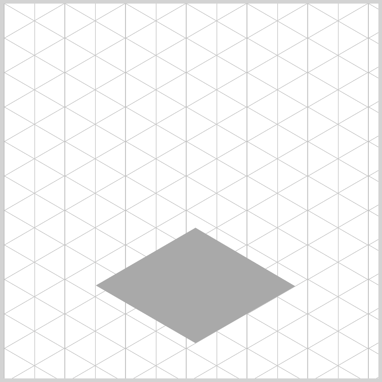
/* Isometric Grid Guide */
background: repeating-linear-gradient(
150deg,
#ccc,
#bbb 0.5px,
transparent 1px,
transparent 40px
),
repeating-linear-gradient(
30deg,
#ccc,
#bbb 0.5px,
transparent 1px,
transparent 40px
),
repeating-linear-gradient(
90deg,
#ccc,
#bbb 1px,
transparent 1px,
transparent 41px
);
background-size: 81px 46px;
}
Common Properties and Color Palette
To keep your code clean and easy to maintain, we’ll consolidate shared CSS properties. This approach reduces repetition and makes your styles simpler to update and manage.
/* Common Properties */
.trophy-base-top,
.trophy-base-left,
.trophy-base-right,
.cup-base-top,
.cup-base-left,
.cup-base-right,
.stem-base,
.stem,
.cup-body,
.cup-rim,
.cup-inside,
.handle-right,
.handle-left,
.star {
  position: absolute;
}
position: absolute;lets you place each image element precisely within the container.
/* Color Palette */
:root {
  /* Grayscale */
  --light-gray: lightgray;
  --gray: gray;
  --dark-gray: darkgray;
}
Just like with the previous common properties, defining a custom color palette using CSS Custom Properties (Variables) streamlines your workflow. This makes it easy to update colors without hunting through your code for every instance.
For Part 1, we’ll be using a grayscale color palette using the CSS custom properties (variables). All three colors are different shades of gray, ranging from light gray to dark gray.
In the next section, we’ll start working on the Trophy Base, laying the foundation for the rest of the image.
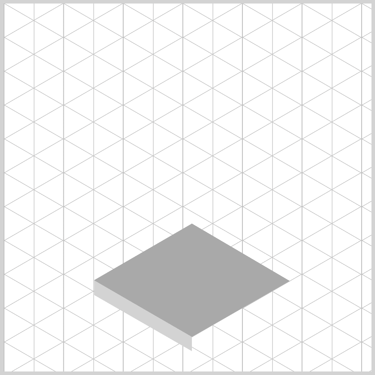
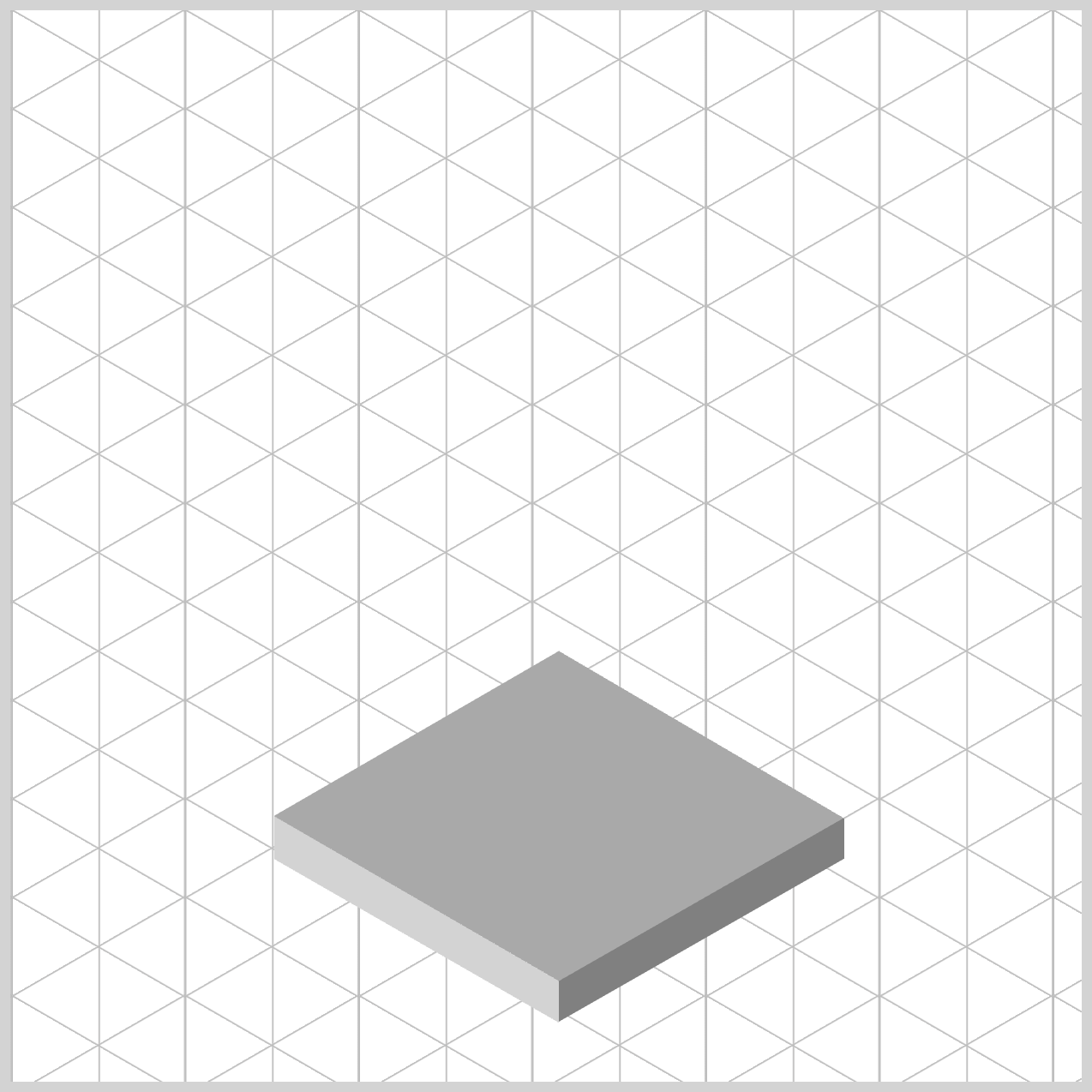
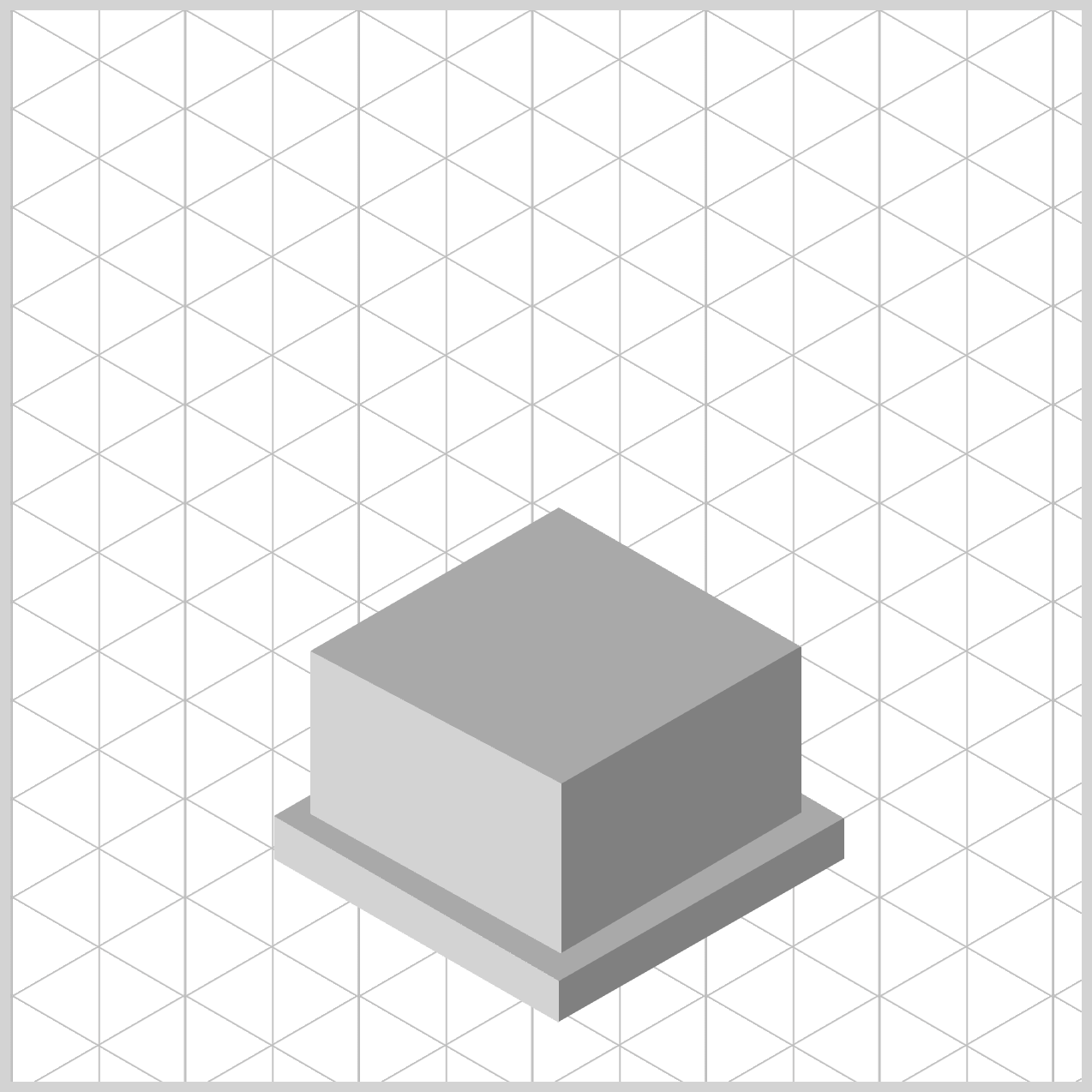
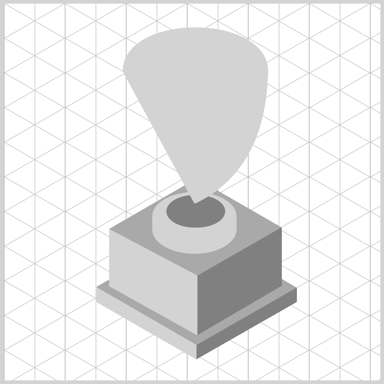
Trophy Base
The Trophy Base is made up of three distinct parts:
- Top face
- Left face
- Right face
You’ll use the CSS shape() function to create each of these three faces, building them one at a time to form the complete base.
/* Trophy Base */
.trophy-base-top {
  width: 272px;
  height: 199px;
  top: 275px;
  left: 119px;
  background: var(--dark-gray);
  clip-path: shape(
    from 137px 178px,
    line to 270px 102px,
    line to 137px 24px,
    line to 4px 101px,
	close
  );
}
For the trophy base top and for the rest of the isometric trophy components, everything starts as a rectangle.
Using the shape() function, you’ll define the shape using shape commands that define the path of the shape.
- The width is
272px, and the height is set to199px. - The rectangle is set
275pxfrom the top and119pxfrom the left. - Background color is set to a dark gray shade using
background: var(--dark-gray);.
Let’s break down the shape() commands. The commands consist of x and y coordinate pairs.
from 137px 178px: Defines the starting point, measured from the top-left corner, to137pxon thexaxis and178pxon theyaxis.line to 270px 102px: Draws a line towards the upper right corner. Precisely270pxfrom the left and102pxfrom the top.line to 137px 24px: Draws a line back to the center aligning to the starting point,137pxon thexaxis and24pxon theyaxis.line to 4px 101px: Draws a line from the center to the lower left-hand side,4pxfrom the left, and101pxfrom the top.close: Closes the clipping by drawing a line back to the starting point.
.trophy-base-left {
  width: 133px;
  height: 99px;
  top: 375px;
  left: 123px;
  background: var(--light-gray);
  clip-path: shape(
    from 0px 1px,
    line to 240px 140px,
    line to 261px 171px,
    line to 0px 21px,
	close
  );
}
The width and height are set to 133px and 99px. Position offsets: top and left are set to 375px and 123px, respectively. The background color is set to a light gray hue using background: var(--light-gray);.
Breaking down the shape() function commands.
1.from 0px 1px,
- Sets the starting point of the path at
x=0px,y=1px(near the top‑left corner of the element). - No visible drawing happens yet; this just positions the “pen” to start.
2.line to 240px 140px,
- Draws a straight line from the current point (
0px,1px) to the point (240px,140px). - After this, the “current point” becomes (
240px,140px).
3.line to 261px 171px,
- Draws a second straight line from (
240px,140px) to (261px,171px). - Current point is now (
261px,171px).
4.line to 0px 21px,
- Draws a straight line from (
261px,171px) back toward the left aty=21px, landing at (0px,21px). - Current point becomes (
0px,21px).
5.close
- Closes the clipping by drawing a line back to the starting point.
.trophy-base-right {
  width: 133px;
  height: 97px;
  top: 377px;
  left: 256px;
  background: var(--gray);
  clip-path: shape(
    from 0px 76px,
    line to 187px -31px,
    line to 133px 19px,
    line to 0px 95px,
	close
  );
}
For the sake of clarity and brevity, the remainder of this article will focus on explaining the commands used in the shape() function.
from 0px 76px,
Sets the starting point of the path atx=0px,y=76px—that’s0pxon the left edge,76pxdown from the top of the element. No line is drawn yet; it just positions the “pen.”line to 187px -31px,
Draws a diagonal line up-right from the current point (0px,76px) to (187px,−31px).line to 133px 19px,
Draws a straight line from (187px,−31px) down to (133px,19px).line to 0px 95px,
Draws another straight line back to the left edge at (0px,95px).close
Closes the shape by drawing a final segment from the current point (0px,95px) back to the starting point (0px,76px).
That wraps up the Trophy Base! In the next section, we’ll move on to building the Cup Base, where you’ll apply many of the same techniques you’ve just learned. Let’s continue step by step.
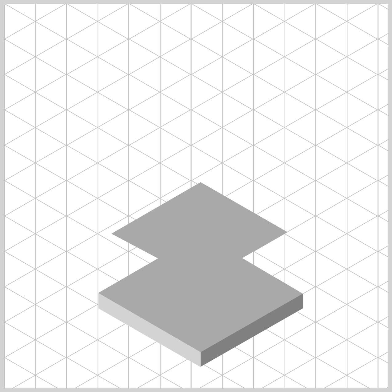
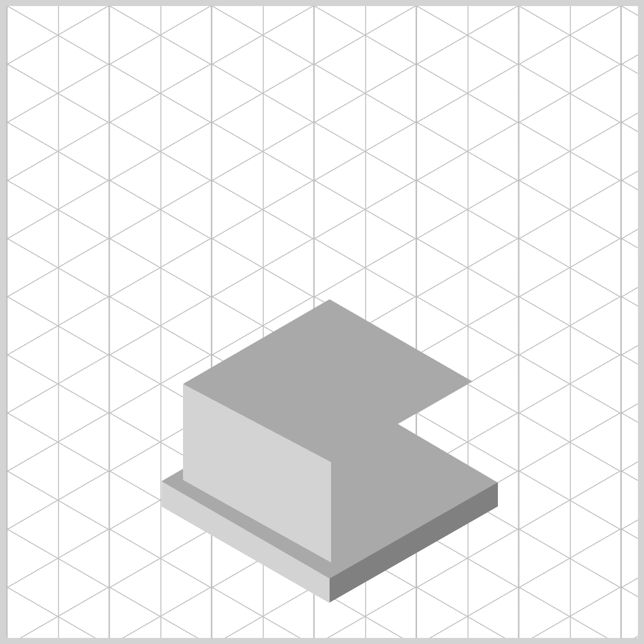
Cup Base
The Cup Base follows a structure similar to the Trophy Base you completed in the previous section. This time, it will be slightly smaller and positioned higher, so you’ll be building on familiar concepts with a few key adjustments.
/* Cup Base */
.cup-base-top {
  width: 272px;
  height: 199px;
  top: 207px;
  left: 119px;
  background: var(--dark-gray);
  clip-path: shape(
    from 138px 154px,
    line to 250px 90px,
    line to 137px 25px,
    line to 21px 92px,
	close
  );
}
from 138px 154px,
Sets the starting point of the path at (x=138px,y=154px). No line is drawn yet; this positions the "pen".line to 250px 90px,
Draws a straight line up-right from the current point (138px,154px) to (250px,90px). The current point becomes (250px,90px).line to 137px 25px,
Draws a straight line from (250px,90px) to the upper-left (137px,25px). The current point becomes (137px,25px).line to 21px 92px,
Draws a straight line down-left from (137px,25px) to (21px,92px). The current point becomes (21px,92px).close
Closes the shape by drawing a final line segment from (21px,92px) back to the starting point (138px,154px).
.cup-base-left {
  width: 117px;
  height: 141px;
  top: 299px;
  left: 140px;
  background: var(--light-gray);
  clip-path: shape(
    from 0px 0px,
    line to 267px 141px,
    line to 131px 149px,
    line to 0px 76px,
	close
  );
}
from 0px 0px,
Starts the path at the top‑left corner of the element. No line is drawn yet; this sets the initial point.line to 267px 141px,
Draws a straight line from the origin at (0px,0px) and extends it to the point (267px,141px) on the right-hand side.line to 131px 149px,
Draws a downward line to (131px,149px).line to 0px 76px,
Draws a line back to the left edge midway down at (0px,76px).close
Closes the path by connecting back to the starting point (0px,0px). A closed region is now formed, which the browser uses as the visible area for clipping.
.cup-base-right {
  width: 112px;
  height: 143px;
  top: 297px;
  left: 257px;
  background: var(--gray);
  clip-path: shape(
    from 0px 64px,
    line to 300px -108px,
    line to 400px -91px,
    line to 0px 143px,
	close
  );
}
from 0px 64px,
Sets the starting point at (0px,64px)—that’s on the left edge, 64 pixels from the top. No drawing yet; you’ve just placed the “pen.”line to 300px -108px,
Draws a straight line segment towards the right from (0px,64px) to (300px,−108px).line to 400px -91px,
Draws the next line segment to (400px,−91px)—still above the top edge, even farther to the right.line to 0px 143px,
Draws a line segment back to the left edge at (0px,143px), which lies exactly on the element’s bottom‑left corner (since height is143px).close
Closes the path by connecting back to the start (0px,64px), forming a four‑sided polygon.
The Cup Base is now complete. In the next section, we’ll move on to building the Stem Base and the Stem, bringing the isometric trophy together step by step.
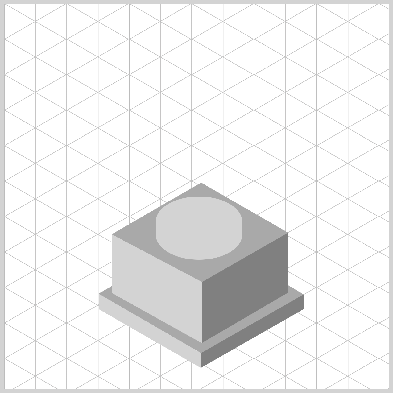
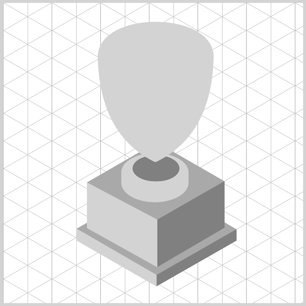
Stem Base and Stem
The Stem Base and Stem will be created using the CSS border-radius property. Unlike the rectangular shapes from previous sections, these elements will have a rounded form, giving the design a smoother, more polished look.
/* Stem Base and Stem */
.stem-base {
  width: 112px;
  height: 82px;
  top: 250px;
  left: 197px;
  background: var(--light-gray);
  border-radius: 95px/55px;
}
- You start with a
112pxby82pxrectangle. - The rectangle is positioned
250pxfrom the top and197pxfrom the left edge. - The background color is set to light gray.
- You give it elliptical corners using
border-radius: 95px/55px, yielding a smooth, capsule‑like silhouette.
.stem {
  width: 78px;
  height: 43px;
  top: 254px;
  left: 216px;
  background: var(--gray);
  border-radius: 95px/55px;
}
- Begins with a rectangle that is
78pxwide and43pxtall. - The rectangle position is set to
254pxfrom the top and216pxfrom the left. - The background color is set to a gray shade.
- A border radius property value set to
95px/55pxtransforms the rectangle to an oval shape.
Next, we’ll move on to creating the Cup Body, where the cup’s main form begins to take shape.
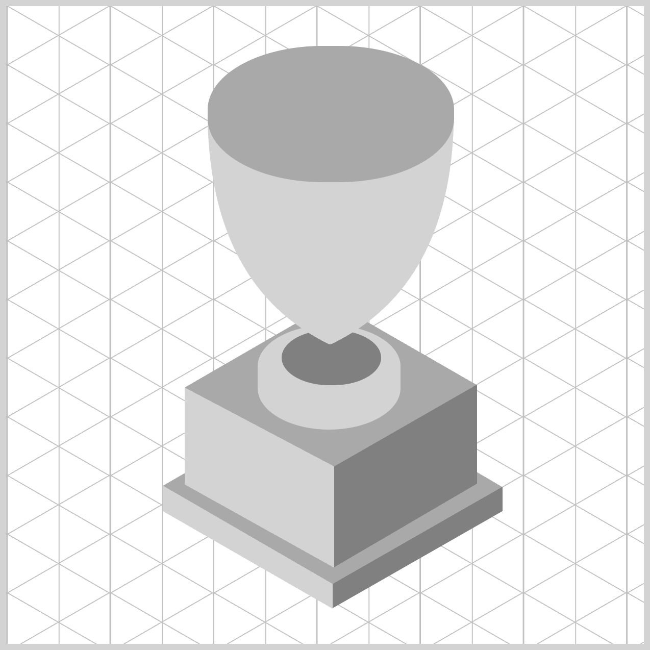
Cup Body
To create the Cup Body, you’ll combine several shape() function commands, including Bézier curve commands and straight line commands. Each command is broken down in detail and paired with step‑by‑step images to guide you through the process.
/* Cup */
.cup-body {
  width: 193px;
  height: 235px;
  top: 30px;
  left: 158px;
  background: var(--light-gray);
  clip-path: shape(
    from 0px 60px,
    curve to 193px 60px with 0px -18px / 193px -18px,
    close
  );
}
1.from 0px 60px,: Places the drawing cursor at the left edge, 60px down from the top. Visually, this represents the upper-left edge of the cup body. At this stage, no drawing occurs—this step simply establishes the starting point of the path.
2.curve to 193px 60px with 0px -18px / 193px -18px,
- This draws a smooth, curved line across the top of the cup.
- End point:
193px 60px, same vertical level as the start point, and moves to the right edge of the cup. - Control points:
0px -18pxand193px -18px. - Think of the control point as a “magnet” that pulls the curve toward it.
- These points pull the curve upward, creating a gentle concave rim. The upward arc forms the cup’s lip.

.cup-body {
  clip-path: shape(
    from 0px 60px,
    curve to 193px 60px with 0px -18px / 193px -18px,
	curve to 97px 235px with 190px 190px,
    close
  );
}
3.curve to 97px 235px with 190px 190px,
- Draws a curved descent from the top‑right toward the bottom center.
- The control point (
190px 190px) pushes the curve outward, creating a rounded side wall, resulting in a bulging right side, giving the cup body volume instead of straight edges.
.cup-body {
  clip-path: shape(
    from 0px 60px,
    curve to 193px 60px with 0px -18px / 193px -18px,
	curve to 97px 235px with 190px 190px,
	line to 95px 235px,
    close
  );
}
4.line to 95px 235px,
- Draws a short straight line along the bottom of the cup body.
- This tiny horizontal segment stabilizes the bottom edge and prevents sharp curvature artifacts where the curves meet.
.cup-body {
  clip-path: shape(
    from 0px 60px,
    curve to 193px 60px with 0px -18px / 193px -18px,
	curve to 97px 235px with 190px 190px,
	line to 95px 235px,
	curve to 0px 60px with 3px 190px,
    close
  );
}
5.curve to 0px 60px with 3px 190px,
- Creates a symmetrical, inward‑curving left wall that mirrors the right side, curving back up to the original starting height.
- The control point (
3px 190px) keeps the curve close to the left edge while still rounding it.
6.close: Draws the final invisible line back to the starting point. Ensures the path is fully enclosed, which is essential for clipping.
In the next section, we’ll create the Cup Rim and the Cup Inside components, adding the extra details to the cup.
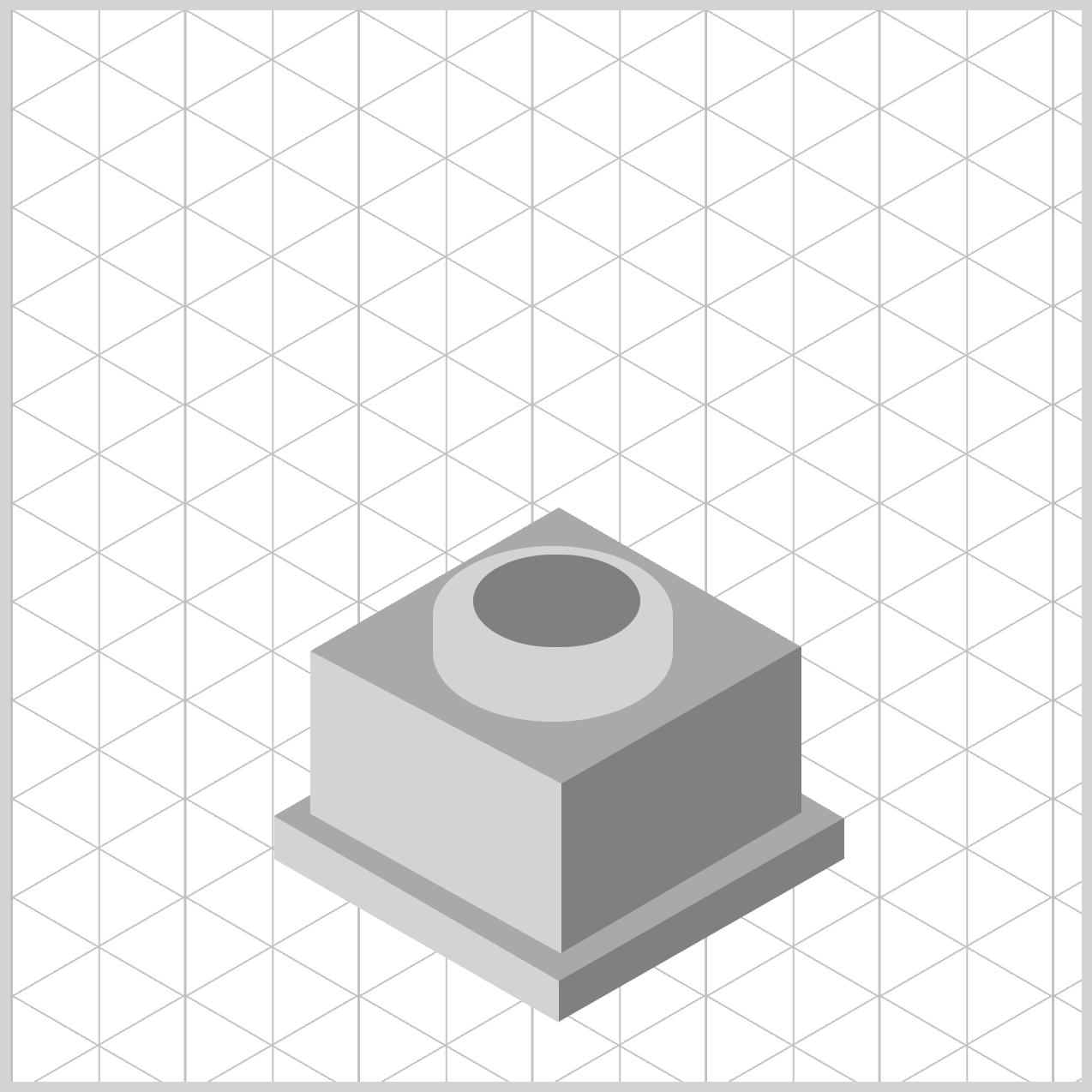
Cup Rim and Inside
/* Cup Rim */
.cup-rim {
  width: 193px;
  height: 107px;
  top: 31px;
  left: 158px;
  background: var(--dark-gray);
  border-radius: 90px/50px;
}
- The initial rectangle shape is
193pxwide and107pxtall. - The location is set to
31pxfrom the top and158pxfrom the left edge. background: var(--dark-gray);sets the background color to a dark gray shade.border-radius: 90px/50px;rounds the rectangle to an oval and solid shape, reinforcing the illusion of depth and structure in your trophy design.

/* Cup Inside */
.cup-inside {
  width: 171px;
  height: 91px;
  top: 37px;
  left: 170px;
  background: var(--gray);
  border-radius: 90px/50px;
}
The Cup Inside component is constructed in a similar way to the Cup Rim. For brevity, detailed step‑by‑step instructions are not included here.
Let’s move on to the final section, where we’ll create the Star component to complete the design.
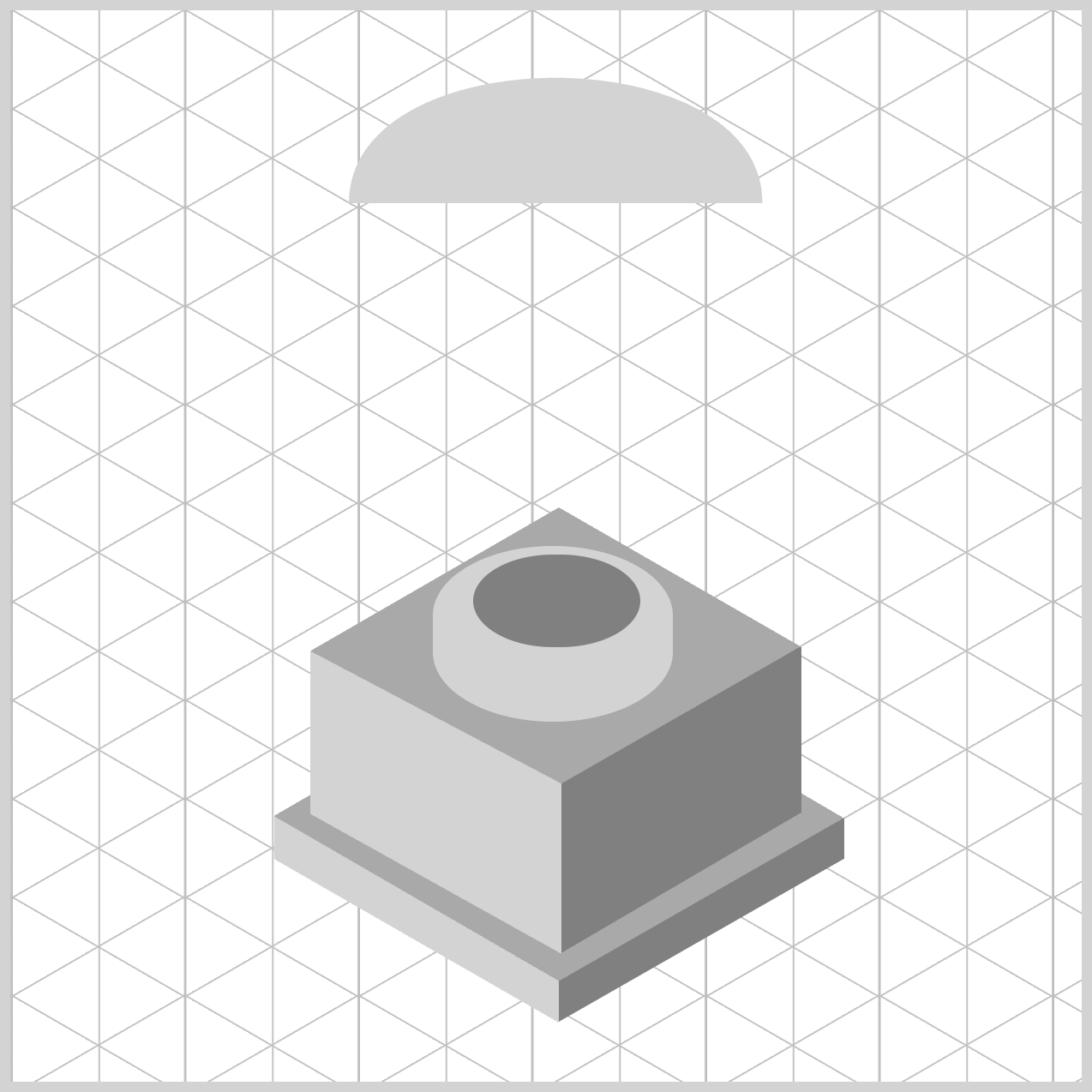
Star
The Star component is designed to closely follow the curve of the rounded Cup Body. To create it, you’ll combine shape() function line commands with curve commands, carefully shaping the star so it fits smoothly against the cup.

/* Star */
.star {
  width: 53px;
  height: 60px;
  top: 153px;
  left: 165px;
  background: var(--gray);
  clip-path: shape(
    from 20px 2px,
    line to 28px 20px,
    line to 43px 27px,
    close
  );
}
1.from 20px 2px,
Set the starting point at (20px, 2px)—near the top, slightly right of the left edge. This doesn’t draw anything yet; it places the “pen.”
2.line to 28px 20px,
Draw a straight line down‑right to (28px, 20px). You now have your first visible edge.
3.line to 43px 27px,
Continue with a straight segment further down‑right to (43px, 27px). This lengthens the outline on the right side.

.star {
  clip-path: shape(
    from 20px 2px,
    line to 28px 20px,
    line to 43px 27px,
    line to 33px 41px,
    close
  );
}
4.line to 33px 41px,
Draw a straight line down‑left to (33px, 41px), beginning to tuck the contour back inward.

.star {
  clip-path: shape(
    from 20px 2px,
    line to 28px 20px,
    line to 43px 27px,
    line to 33px 41px,
    line to 35px 57px,
    close
  );
}
5.line to 35px 57px,
Draw a straight line down‑right to (35px, 57px), creating a small notch/angle change in the lower‑right area.

.star {
  clip-path: shape(
    from 20px 2px,
    line to 28px 20px,
    line to 43px 27px,
    line to 33px 41px,
    line to 35px 57px,
    line to 22px 45px,
    close
  );
}
6.line to 22px 45px,
Go up‑left to (22px, 45px), pulling the shape back toward the interior.

.star {
  clip-path: shape(
    from 20px 2px,
    line to 28px 20px,
    line to 43px 27px,
    line to 33px 41px,
    line to 35px 57px,
    line to 22px 45px,
    line to 19px 47px,
    close
  );
}
7.line to 19px 47px,
A short step down‑left to (19px, 47px), adding a tiny kink that sharpens the articulation along the lower‑left.

.star {
  clip-path: shape(
    from 20px 2px,
    line to 28px 20px,
    line to 43px 27px,
    line to 33px 41px,
    line to 35px 57px,
    line to 22px 45px,
    line to 19px 47px,
    curve to 5px 14px with 11px 33px,
    close
  );
}
8.curve to 5px 14px with 11px 33px,
- Creates a curved segment from the current point (
19px,47px) to the end point (5px,14px). - The control point is (
11px,33px). - Here it pulls the path up‑left, creating a smooth, organic arc that rounds the left side as it heads back toward the upper area.

.star {
  clip-path: shape(
    from 20px 2px,
    line to 28px 20px,
    line to 43px 27px,
    line to 33px 41px,
    line to 35px 57px,
    line to 22px 45px,
    line to 19px 47px,
    curve to 5px 14px with 11px 33px,
    line to 12px 16px,
    close
  );
}
9.line to 12px 16px,
Draw a short straight line up‑right to (12px, 16px), tightening the contour near the top‑left.
10.close
Automatically draw a final segment from (12px, 16px) back to the starting point (20px, 2px), sealing the outline, turning it into a solid clipping region.
You can see and play with the complete code on Pyxofy’s CodePen page.
See the Pen CSS Art - shape() Function & Gradients: Create an Isometric Trophy by Pyxofy (@pyxofy) on CodePen.
Conclusion
In Part 1 of this two‑part article series, you learned how to create the basic shape of an isometric trophy. In Part 2, we’ll build on that foundation by applying CSS gradients to give the trophy a more three‑dimensional look.
CSS isn’t just about styling boxes anymore—it’s a creative toolkit. With clip-path: shape(), you can literally draw the visible area of an element using clear commands like from, line to, curve to, and close.
Even as a beginner, thinking in simple coordinates and paths quickly becomes intuitive. Pair that with elliptical border-radius values to create smooth, pill‑like forms, and use CSS custom properties (variables) to keep colors consistent and easy to change.
Put together, these tools let you build polished, expressive UI shapes—step by step, entirely in CSS, and without needing images or SVGs. What will you create using the shape() function? Share your masterpiece with us on LinkedIn, Threads, Bluesky, Mastodon, X (Twitter) @pyxofy, or Facebook.
We hope you liked this article. Kindly share it with your network. We appreciate it.
Related Articles
 Pyxofy
 Pyxofy